Polaroid Filter Online can turn mixed customer photos into a warm and consistent brand wall. One customer may send a mirror selfie. Another may share a product photo from a vacation. Meanwhile, someone else may upload a quick picture from your pop-up store.
Each photo can feel honest and useful. However, the full collection may look messy when the lighting, crops, colors, and image sizes are completely different.
A shared Polaroid-style treatment gives those photos one visual language. The white frame adds structure. Soft grain makes polished and casual images feel closer together. In addition, the lower border creates space for a name, date, place, or short customer note.
The goal is not to make customer photos look old. Instead, it is to make them feel collected, connected, and worth remembering.

Why Customer Photos Need a Visual System
Customer photos are rarely created under the same conditions.
Some people use a new phone in bright daylight. Others take photos indoors with weak light. A few may edit the colors before sending the image. As a result, one community gallery can contain many different visual styles.
That variety is natural. In fact, it can make the brand feel more human.
Still, the gallery needs enough structure to feel intentional.
Without a clear system, several problems may appear:
- Portrait and landscape images compete for space
- Bright photos sit beside dark images
- Product sizes change from one frame to another
- Heavy filters clash with natural photos
- Captions follow different formats
- Some images feel like ads while others feel personal
A visual system solves these problems without removing the personality of each customer.
Therefore, the aim is not perfect sameness. The aim is controlled variety.
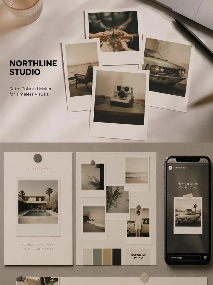
What Polaroid Filter Online Adds to a Brand Wall
A normal gallery depends only on the photos. A Polaroid-style gallery also uses the frame as part of the design.
That frame creates a clear edge around every image. Therefore, different backgrounds and color palettes do not run directly into one another.
The wider lower border is also useful. It gives every photo a natural place for a small piece of context.
For example, you could add:
- The customer’s first name
- A city or store location
- The product name
- A short review
- The event date
- A campaign hashtag
- A simple thank-you note
Polaroid Filter Online can also add softer tones, light grain, and an instant-photo mood. As a result, phone photos, event pictures, and polished campaign images can feel like part of the same collection.
However, the frame should support the photo. It should not become the main attraction.
Choose Photos That Feel Real
Not every tagged photo needs to enter the final brand wall.
A useful gallery should show real people, clear products, and believable moments. Therefore, choose images for their story value rather than their technical perfection.


Start With a Clear Subject
The viewer should understand the photo quickly.
A strong image often has one main subject:
- A customer wearing the product
- Someone using the item at home
- A group at a store event
- A product placed in a real setting
- A package being opened
- A close-up of a favorite detail
The photo does not need studio lighting. However, the face, product, or action should remain easy to identify.
Avoid images with heavy blur, extreme crops, or several competing subjects. Otherwise, the smaller Polaroid frame may make the image even harder to read.
Keep the Customer Moment
Do not remove every sign that the photo came from a real person.
A slightly imperfect room, casual pose, travel bag, or busy event background can add useful context. These details show where the product fits into daily life.
For instance, a clean catalog image explains what a jacket looks like. A customer photo at a train station shows how that jacket feels during a real trip.
Therefore, keep details that support the story.
At the same time, remove or crop anything that creates a privacy risk. Personal documents, home addresses, license plates, and private screens should not appear in a public gallery.
Get Permission Before Publishing
A tagged photo is not automatic permission to use it in marketing.
Before publishing, contact the customer and explain where the image may appear. Be clear about whether it will be used on a website, social account, email, event screen, or paid campaign.
Also, keep a record of the approval.
When possible, let the customer review the final caption. This small step can prevent name errors and unwanted personal details.
Most importantly, do not suggest that the person said something they never said. A brand wall should build trust, not manufacture it.
Build a Polaroid Filter Online Style Guide
A style guide does not need to be long. One page of visual rules is often enough.
It should define the frame, crop, color treatment, caption format, and spacing. Then, anyone on the team can prepare new photos without inventing a different look each time.
Set One Frame Rule
Choose one main frame style for the full collection.
For example:
- Clean white border
- Slightly wider bottom edge
- Square or near-square photo area
- Very soft paper texture
- Minimal shadow
- No tape, flowers, stickers, or decorative clutter
You may create a second style for special events. However, do not change the frame for every new upload.
A repeated frame helps viewers understand that separate images belong to one brand story.
Create a Polaroid Filter Online Caption Formula
Captions should feel personal but easy to scan.
A simple formula could be:
First name · City
“Short customer comment”
Another option is:
Product · Date
One short moment or location
For example:
Maya · London
“Wore it through the whole rainy weekend.”
Keep the caption brief. Long reviews are better placed beside the gallery or on the product page.
Also, use one capitalization style. If one card uses title case and another uses all lowercase, the set may feel less controlled.
Keep Color Treatment Consistent
Do not apply a different retro effect to every photo.
Choose one general direction, such as:
- Soft neutral warmth
- Gentle faded color
- Low-contrast daylight
- Light film grain
- Slight flash effect
- Muted shadow detail
Then, adjust each photo only as much as needed.
A very dark event photo may need more brightness. Meanwhile, a bright outdoor photo may need less warmth. The exact settings can change, but the final mood should remain connected.
The customer’s real skin tone and product color should still look believable.
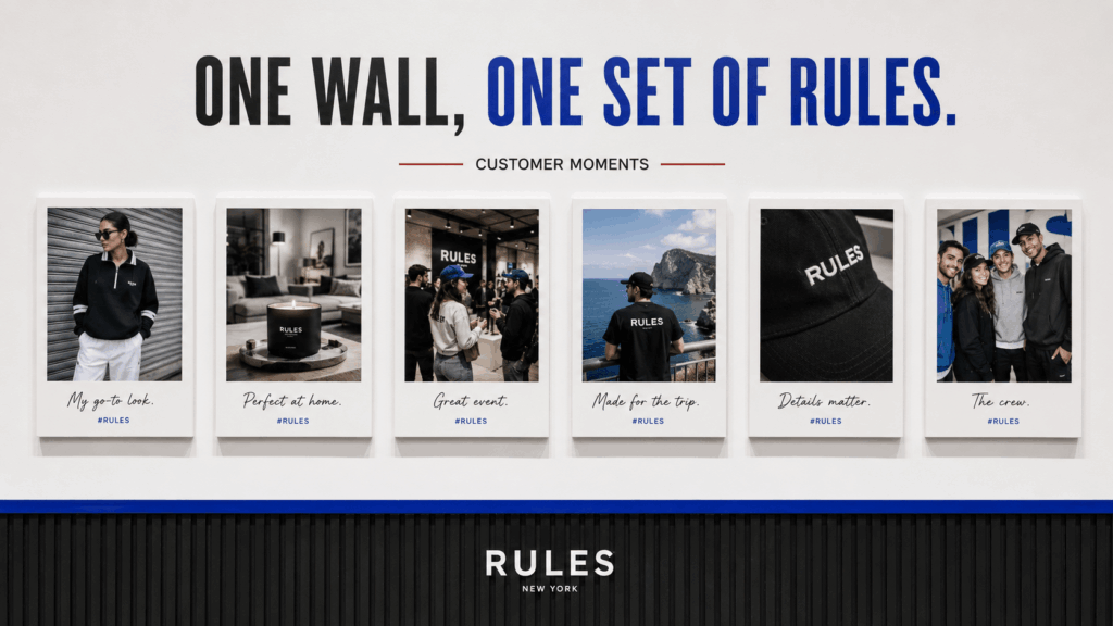
Organize the Wall Into Small Stories
A large wall becomes more interesting when the photos are grouped by meaning.
Instead of placing every image in random order, divide the collection into small stories. This helps visitors understand the community around the product.
Product in Use
This group shows how customers use, wear, carry, or style the product.
For a fashion brand, it may include airport outfits, work looks, weekend styling, or dinner photos. A home brand could show products in kitchens, bedrooms, workspaces, or small apartments.
These images help the viewer imagine the product beyond a clean listing photo.
However, keep the product easy to find. If the item disappears completely into the scene, the photo may not support the gallery’s purpose.
People Behind the Purchase
Some photos are valuable because of the person rather than the product angle.
A birthday gift, first apartment, graduation outfit, creative project, or family tradition can add emotional context.
In this section, the caption matters more. A short real story can make the photo feel specific without becoming too long.
For example:
Leah · First studio opening
“The lamp was the first piece I unpacked.”
Specific moments usually feel stronger than generic praise.
Events, Stores, and Pop-Ups
Customer walls can also document physical spaces.
Use Polaroid-style images to collect:
- Store opening moments
- Workshop photos
- Market stalls
- Pop-up visitors
- Product launch events
- Community dinners
- Behind-the-scenes setup
- Team and customer group shots
These photos can make a temporary event feel like part of a longer brand history.
After the event, the same set can support a recap post, thank-you email, or in-store display.
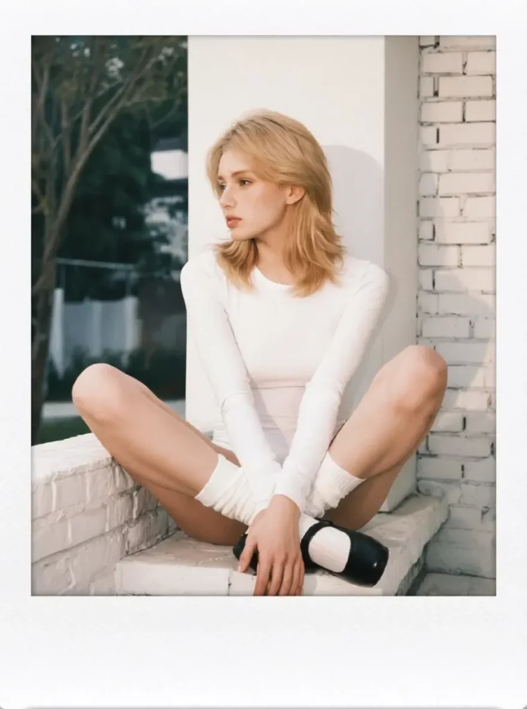


Review Polaroid Filter Online Results
A consistent frame can make a photo look finished very quickly. However, you still need to review the image itself.
Check the subject, product, crop, text, and color before adding it to the wall.
Check the Polaroid Filter Online Crop
The frame may change the visible photo area.
Therefore, make sure the crop does not remove:
- The top of a hairstyle
- Hands holding the product
- Shoes or garment hems
- A product logo
- An important background detail
- Another person at the edge
- The action that gives the photo meaning
Review the image at its final display size. A crop that looks fine on a large screen may feel too tight inside a small gallery card.
When the original photo is wide, do not force every person into a square crop. Instead, choose the most important subject or use a slightly different frame ratio for that section.

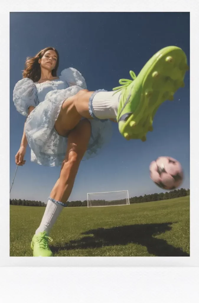
Protect Product Details
A nostalgic look should not change what the customer purchased.
Check the product color, print, material, logo, and shape. Warm color grading can make a white shirt look cream or turn a cool blue product green.
In addition, heavy grain can hide small details.
Therefore, compare the edited image with the original before publishing it beside a product recommendation.
The photo can feel nostalgic while remaining honest.
Keep Captions Easy to Read
The lower frame may look like a natural place for handwriting. Still, highly decorative fonts can become hard to read.
Choose a simple handwritten style or clean sans-serif font. Then, test it on mobile.
Also, check spelling, names, dates, and locations. These small details matter because they belong to a real person.
When a customer asks to remain anonymous, use a safe label such as:
Community member · Weekend pop-up
Do not guess or reveal personal information.
Use Polaroid Filter Online Across Channels
One photo wall can support more than one page.
However, each channel needs a different layout. The frame style can stay consistent while the number of photos and caption length change.
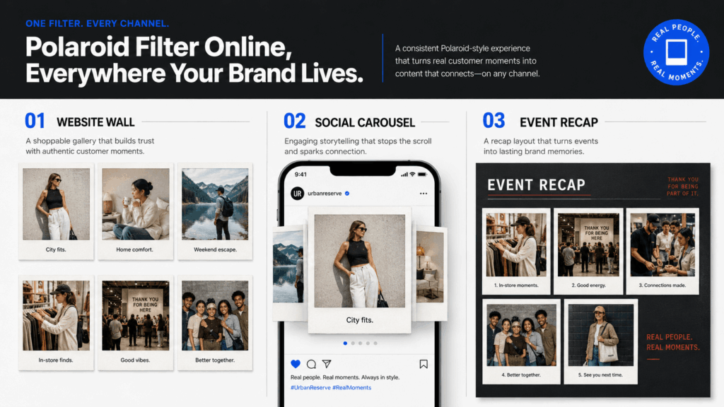
Website Community Wall
A website wall should feel easy to browse.
Use a clean grid with enough space around each frame. In addition, mix close-ups, full-body images, product details, and wider scenes.
Avoid displaying twenty nearly identical selfies in one row. Instead, create visual rhythm.
For example:
- Full-body customer photo
- Product close-up
- Event scene
- Short review card
- Lifestyle image
- Behind-the-scenes moment
This sequence keeps the wall useful and human.
Polaroid Filter Online for Social Carousels
A carousel needs a strong first image.
Begin with a clear cover, such as:
Worn by You
Weekend Community Roll
Scenes From Our Pop-Up
Then, use five to eight customer images. Keep the frame, caption placement, and color treatment consistent.
The final slide can include a simple invitation to share another photo. However, avoid turning the whole carousel into a sales message.
Community content works best when the customers remain the main focus.
Event Recaps and Thank-You Posts
After an event, Polaroid-style photos can make the recap feel more personal than a standard gallery.
Choose a mix of:
- Arrival moments
- Product interactions
- Small details
- Group photos
- Staff moments
- Customer reactions
- The final scene
Arrange the photos like a short visual diary.
Then, add a simple thank-you message. The goal is to make attendees feel seen and future visitors feel welcome.
Avoid the Fake Nostalgia Trap
A Polaroid look can feel warm and personal. However, too many retro effects can make the result feel staged.
Avoid combining every possible nostalgic element at once.
You do not need:
- Heavy yellow color
- Strong scratches
- Large dust marks
- Torn paper
- Tape on every corner
- Fake handwriting across the image
- Extreme blur
- Several sticker styles
- Decorative flowers and random objects
Real instant photos are often simple.
Therefore, use the white frame, light texture, and color treatment with restraint. Let the customer moment carry the emotion.
Also, do not add a fake historical date to a recent image. If a date appears, use the real event or upload date.
When a Polaroid Look Is the Wrong Choice
Not every brand or image needs a nostalgic frame.
A Polaroid-style wall may be less suitable when:
- Precise product color is critical
- The image contains small technical details
- The brand uses a strict clinical visual system
- The photos are formal staff headshots
- The content is legal or instructional
- The image must fill a wide banner
- The customer photo is already heavily filtered
- The product needs a clean comparison view
In these cases, a simple border or neutral gallery may work better.
You can also use Polaroid images as a secondary community section while keeping product pages clean and accurate.
The style should serve the content, not control it.
Final Thoughts on Polaroid Filter Online
Customer photos do not need to look like a professional campaign. Their value often comes from the real moment, place, and person behind them.
Polaroid Filter Online can give those different photos one clear structure. The frame connects the collection. The caption adds context. Meanwhile, soft grain and gentle color treatment create a warmer visual rhythm.
Still, the strongest brand wall begins before the filter.
Choose meaningful photos. Get clear permission. Protect real product details. Then, organize the images into small stories that customers can understand.
The final result should not feel like a folder of random uploads.
It should feel like a growing visual archive made by the people who actually use, wear, visit, and remember the brand.
Go to WeShop AI For Exploration: