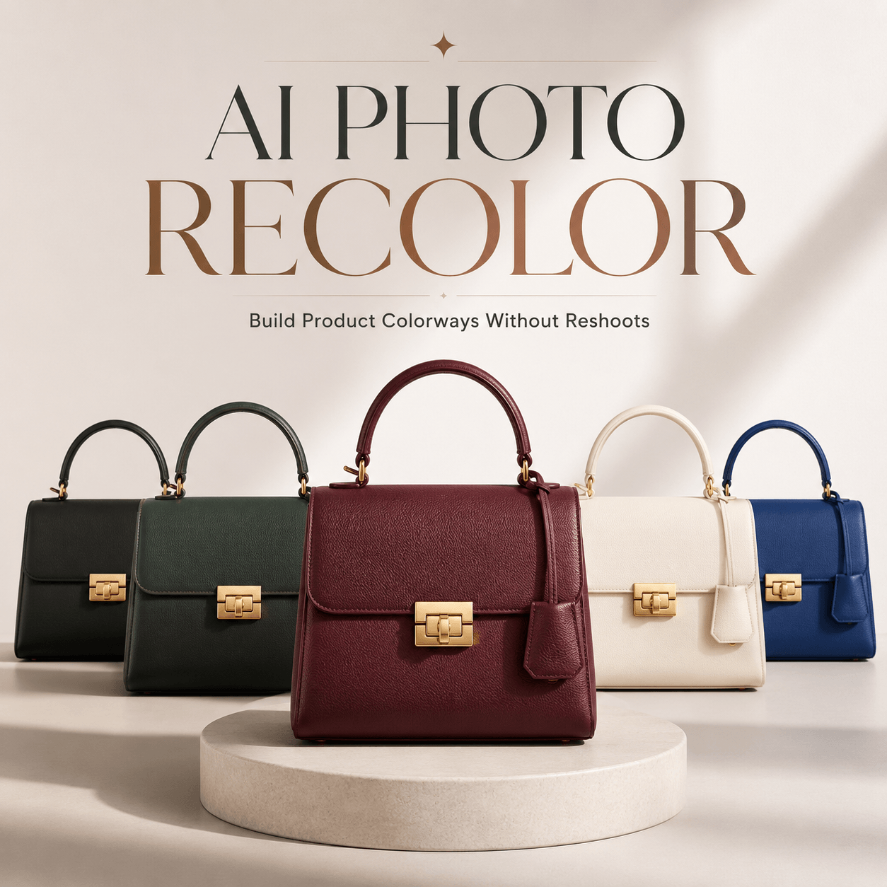
AI Product Color Testing is not only about asking whether a color looks good. A shade may feel elegant on a clean product page. However, the same shade may disappear inside a busy social feed. It may also look dull in a small mobile ad.
Therefore, a product color should not be judged in only one image. It should be tested in the places where customers will actually see it.
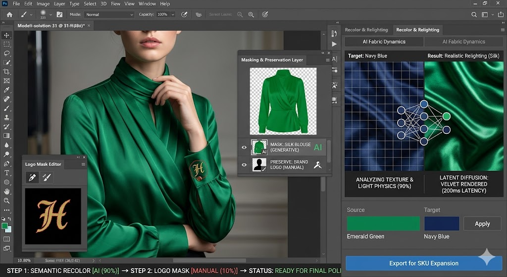
With AI recoloring, teams can place the same product in several controlled color directions. Then, they can compare how each option works across product pages, social posts, paid ads, campaign visuals, and mobile screens.
The goal is not to generate as many colors as possible. Instead, the goal is to find the colors that still work when the context changes.
🎨 Why AI Product Color Testing Should Happen in Context
A color never appears alone.
It sits beside a background, logo, headline, model, product label, button, or surrounding image. As a result, the same shade can create a very different impression in each setting.
For example, a soft beige bag may look refined on a white product page. However, it may lose definition inside a warm hotel campaign. Meanwhile, a bright orange version may look too strong in a catalog but perform well in a fast social feed.
Therefore, context should be part of the color decision from the beginning.
A Good Color Can Still Be Wrong for the Channel
A product team may approve a shade because it looks beautiful in a large studio image.
Still, customers may first see that product as a small thumbnail.
On a product page, shoppers have time to study the material and details. In contrast, a social media user may look at the image for less than a second before scrolling.
Therefore, the color needs to do a different job in each channel.
A product page color should feel accurate. A social color should stay visible. An ad color should support the message. Meanwhile, a campaign color should fit the wider visual story.
Why Color Names Are Not Enough for Product Decisions
Words such as “sage green,” “midnight blue,” and “soft coral” sound clear. However, they can describe many different shades.
One sage green may look calm and modern. Another may appear gray or muddy. Likewise, one coral may feel fresh, while another looks too orange.
Therefore, teams should not approve colors from names alone. They need to see the color on the actual product.
More importantly, they need to see it under the same light, camera angle, material texture, and background.
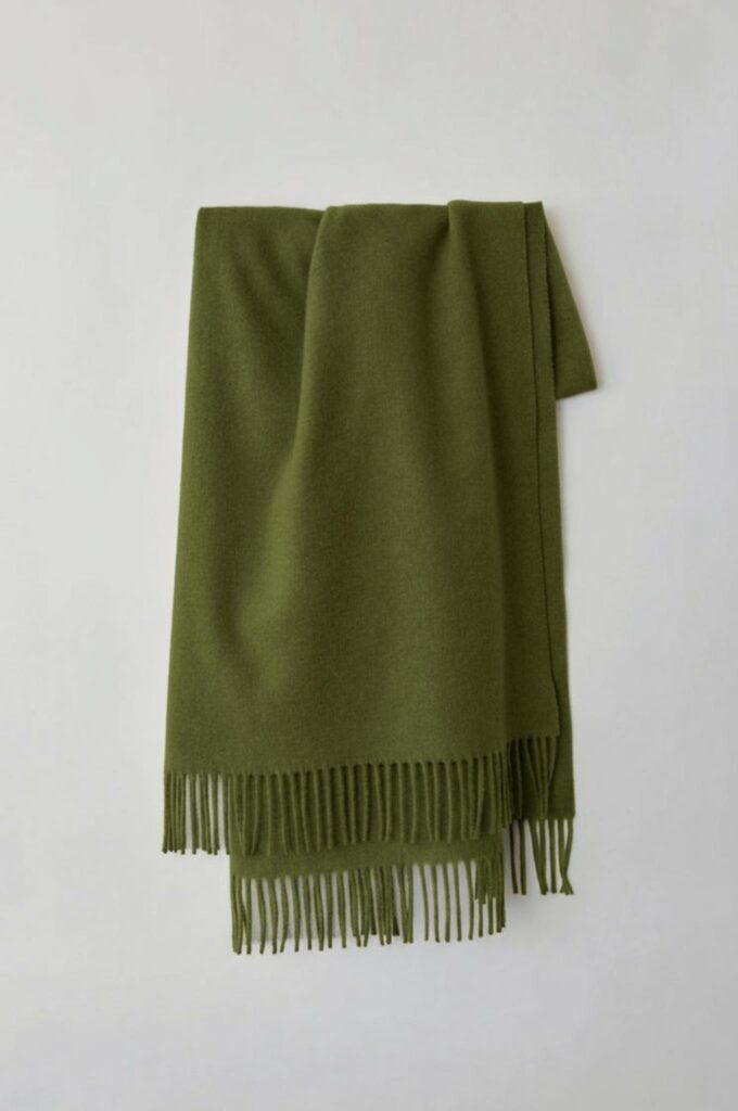
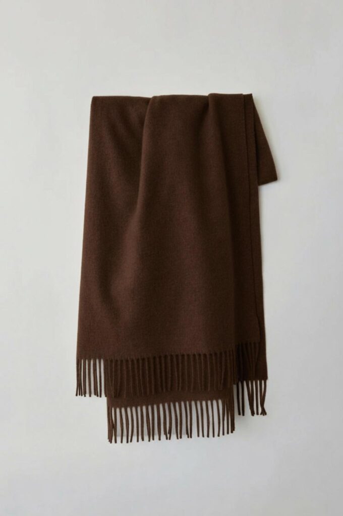
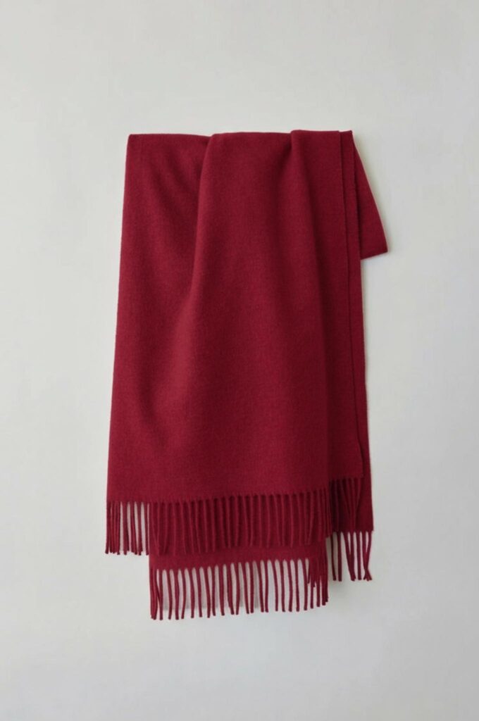
How AI Product Color Testing Reduces Early Guesswork
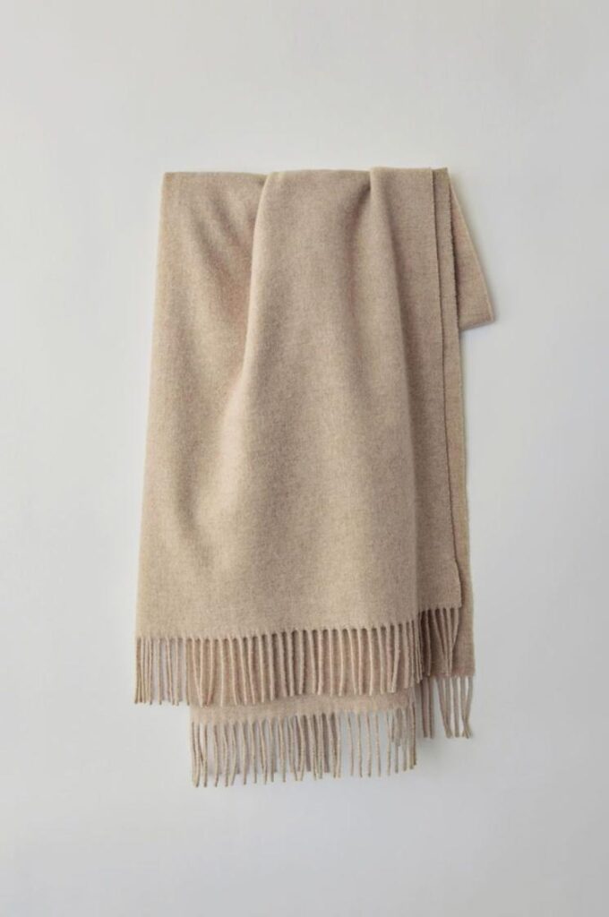
Traditional color discussions often depend on swatches, mood boards, or written descriptions.
Those materials are useful. However, they do not always show how a color will behave on a finished product.
With AI Product Color Testing, one reliable product image can become a controlled visual test. The product shape stays familiar. Meanwhile, the selected color changes.
As a result, teams can discuss something more specific than personal taste.
Instead of saying, “I do not like this green,” they can say, “This green loses contrast in the mobile thumbnail.”
That is a much more useful decision.
👀 How AI Product Color Testing Changes Across Sales Channels
Customers do not experience a product in one fixed setting. Therefore, a strong color choice must survive several visual environments.
AI Product Color Testing for Product Pages
On a product page, the color should help customers understand what they may receive.
The background is often simple. In addition, the image may be large enough to show texture, highlights, and small details.
Therefore, subtle shades can work well here.
A muted brown leather bag may still feel rich because shoppers can see the grain and hardware. Likewise, a pale blue shirt may remain clear against a clean white background.
Still, accuracy matters more than drama. The image should not make the product look brighter, deeper, or more saturated than it really is.
AI Product Color Testing for Social Feeds
Social media creates a different challenge.
The product competes with faces, text, video, and many other images. Therefore, a color that works in a catalog may not create enough contrast in a feed.
A stronger color does not always mean a neon color. Instead, it means a shade that remains easy to recognize at a small size.
For example, dusty pink and light beige may look too similar in a thumbnail. However, dusty pink and deep navy create a clearer visual difference.
AI Product Color Testing for Paid Ads
An ad usually has one main message.
It may promote a new launch, seasonal offer, limited edition, or product benefit. Therefore, the product color should support that message.
A bright yellow bottle may suit a summer launch. In contrast, a dark burgundy version may fit a premium holiday campaign.
However, the color should not fight with the headline or call-to-action area. If both the product and graphic text demand attention, the ad may feel crowded.
AI Product Color Testing for Campaign Images
Campaign photography often uses stronger backgrounds, styling, and lighting.
Therefore, the product color needs to fit the mood of the scene.
For example, a soft blue product may work beautifully in a clean coastal setting. However, it may feel cold inside a rich brown hotel interior.
Meanwhile, a deep green shade may look premium in the hotel scene but disappear inside a forest background.
The best campaign color supports the story while keeping the product easy to see.
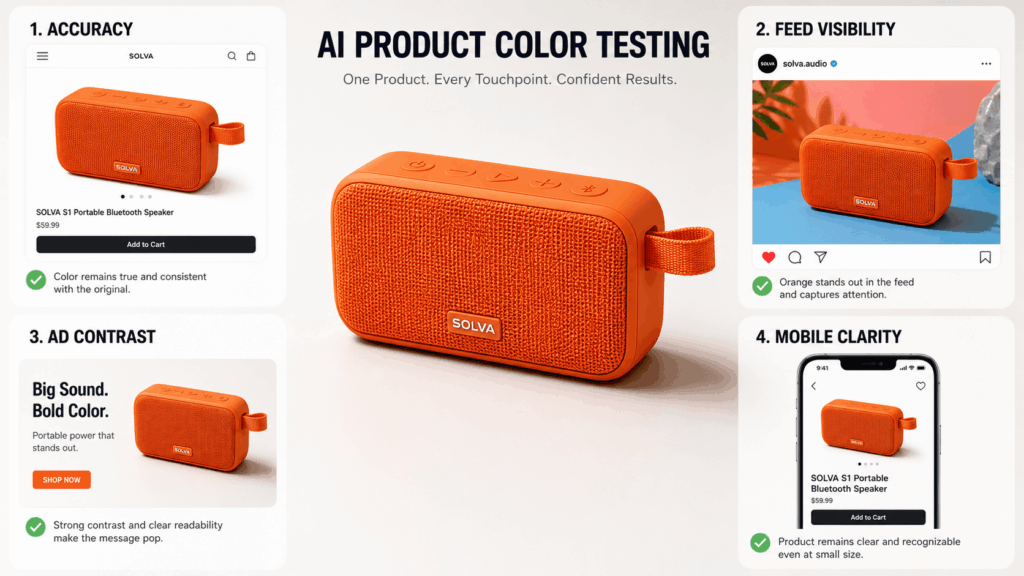
🧩 A Four-Context AI Product Color Testing Method
A useful color test does not need dozens of images.
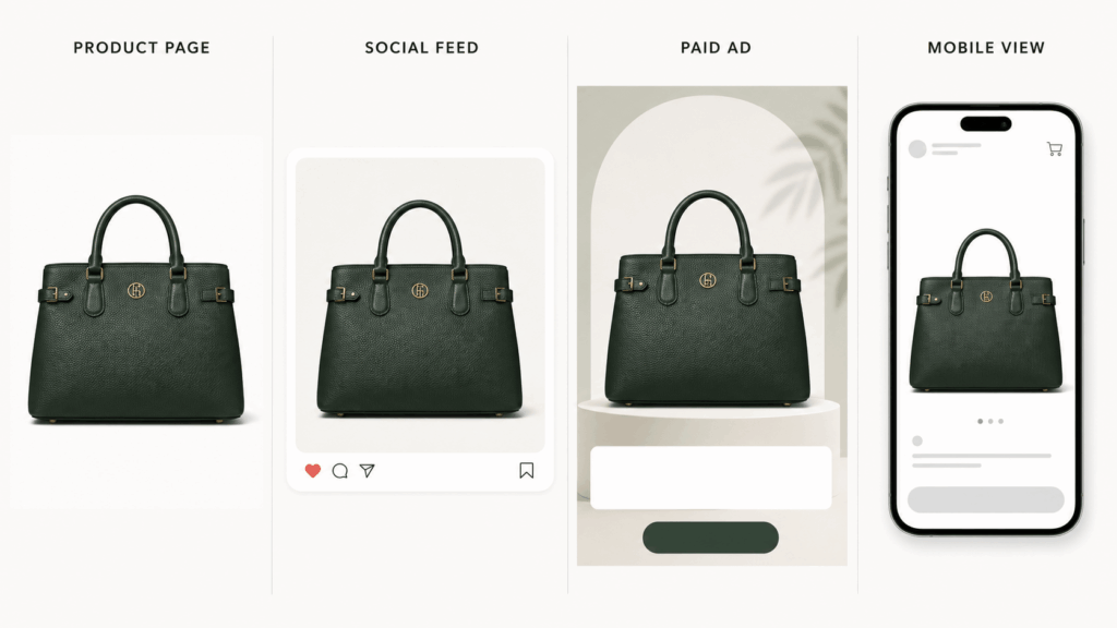
Instead, test every color in four clear contexts:
- Product page
- Social feed
- Paid ad
- Mobile thumbnail
This method reveals whether a shade is flexible or only works in one controlled setting.
Product Page Test
Begin with a clean product image.
Use the same background, crop, light, and camera angle for every version. Then, compare the colors side by side.
Ask:
- Does the material still look real?
- Are the edges easy to see?
- Does the product stand apart from the background?
- Are important details still visible?
- Does the shade look believable?
The product page test is your accuracy test. Therefore, do not add dramatic props or strong campaign lighting yet.
AI Product Color Testing for Social Feeds
Next, place each color inside a simple social post.
You can use the same product image, but reduce it to a realistic feed size. In addition, add the type of background or headline your brand often uses.
Then, look at the post for only two seconds.
Which product do you notice first?
If a color needs a long explanation, it may not be strong enough for fast content. However, that does not mean it is a bad product color. It may simply need a different role.
For example, a soft neutral may work as a permanent catalog option. Meanwhile, a brighter shade may become the social campaign hero.
AI Product Color Testing for Paid Ads
Now test the colors inside an ad layout.
Keep the same headline, offer, product position, and button area. Only change the product color.
This controlled comparison matters. Otherwise, you may react to the layout rather than the shade.
Ask:
- Does the product remain the main focus?
- Does the color support the campaign message?
- Is there enough contrast around the product?
- Does the shade work with the brand palette?
- Can the headline still breathe?
The strongest ad color is not always the most attractive shade by itself. Instead, it is the shade that makes the whole message easier to understand.
Mobile Thumbnail Test
Finally, reduce every version to a small phone-sized thumbnail.
This step is easy to skip. However, it often reveals the biggest problems.
At a small size, similar shades can blend together. Fine texture may disappear. In addition, the product may lose contrast against the background.
Therefore, zoom out before making the final decision.
A color should not only look good in a presentation. It should still work in the real viewing environment.
📸 How to Build a Reliable Color Test Set
A fair test needs control. If every image uses a different crop, pose, or background, the comparison becomes weak.
Choose One Neutral Master Image
Begin with a clear product image that shows the full structure.
A good source image should include:
- Visible texture
- Clean edges
- Balanced lighting
- Natural shadows
- Accurate proportions
- A useful camera angle
- Minimal background distractions
A medium or light base color often works well because the material details remain visible.
However, the best source depends on the product. Glossy objects, sheer fabrics, metallic surfaces, and transparent items may need extra care.
Change One Variable at a Time
During AI Product Color Testing, the color should be the main variable.
Do not change the background, crop, styling, product angle, and lighting at the same time.
Otherwise, you will not know why one version feels stronger.
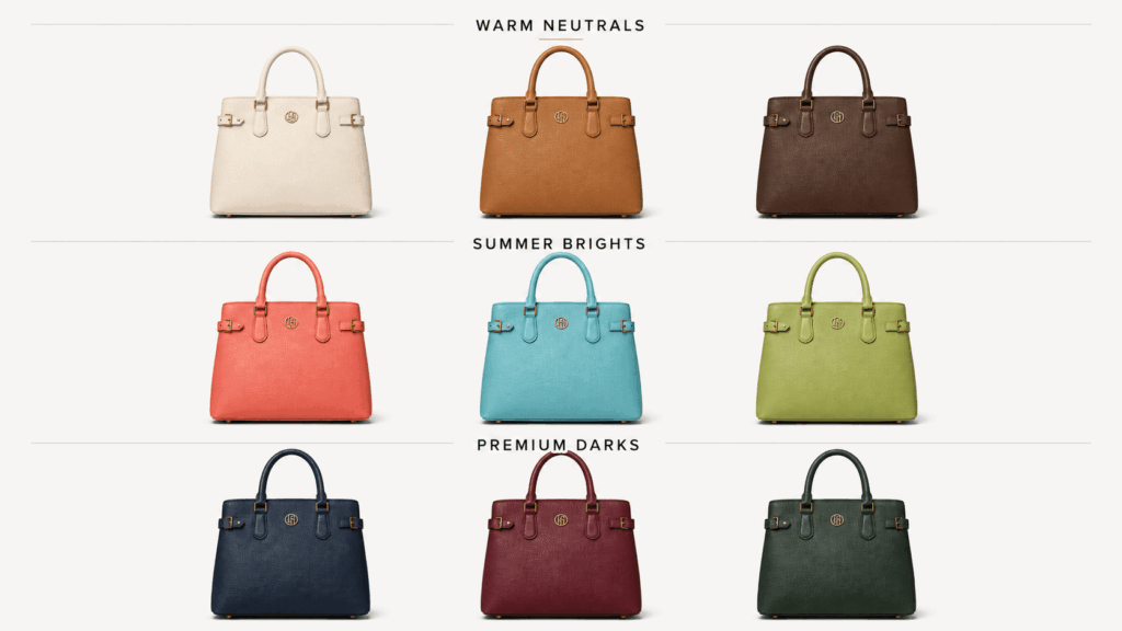
For example, keep the exact same handbag image and test four leather colors. After choosing the strongest colors, place those finalists into campaign settings.
This order makes the decision easier.
Use a Controlled Color Family
Random color generation can create a large but useless set.
Instead, begin with one clear palette direction.
For example:
Warm Neutrals
- Cream
- Camel
- Warm gray
- Chocolate brown
Summer Brights
- Coral
- Lemon yellow
- Aqua blue
- Fresh green
Premium Darks
- Black
- Deep navy
- Burgundy
- Forest green
A controlled family makes comparison more meaningful. In addition, it helps the final collection feel connected.
Keep the Prompt Specific
A weak instruction might say:
“Make the product green.”
A stronger instruction would say:
“Change only the leather body of the handbag to deep forest green. Keep the gold hardware, logo, stitching, handles, shadows, leather grain, shape, and background unchanged.”
The second version defines both the change and the protected details.
Therefore, it is easier to review.
Compare Versions at the Same Size
Every color option should use the same dimensions and crop.
In addition, arrange the versions in a simple row or grid. Do not make one option larger than the others.
A larger image may feel more important even when the color is not stronger.
Therefore, equal presentation creates a fairer decision.
🧵 AI Product Color Testing for Different Materials
Color does not behave the same way on every surface.
A shade that works on cotton may look very different on satin, leather, metal, or plastic. Therefore, material should always be part of the review.
Fabric Needs Texture
Fabric is not a flat block of color.
It contains folds, fibers, stitching, shadows, and highlights. Therefore, the new shade should move naturally through those details.
For example, a satin dress should keep its soft shine. Meanwhile, a knitted sweater should still show its visible fibers.
If the recolored fabric looks smooth and plastic, the test is not reliable.


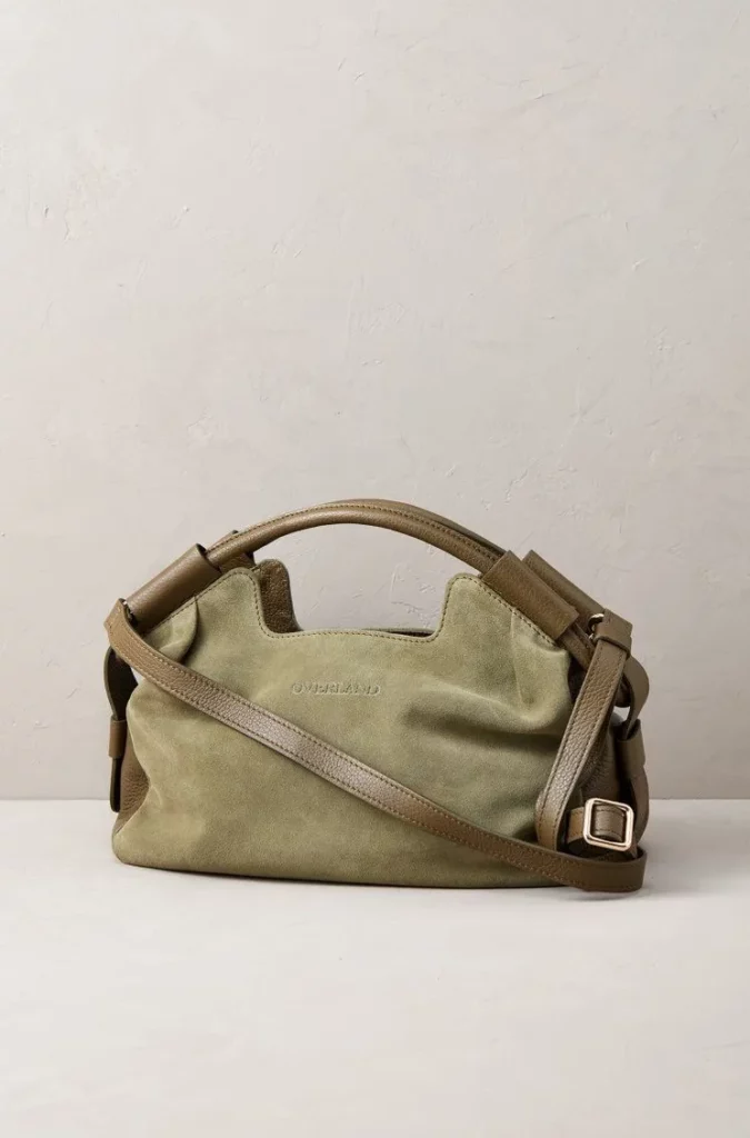
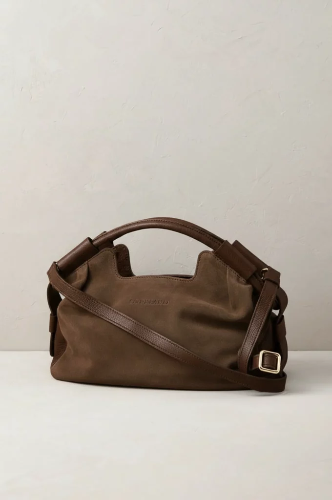
Leather Needs Depth
Leather often includes grain, polished highlights, worn edges, and darker folds.
Therefore, a successful recolor should preserve those details.
Deep colors can sometimes hide the grain. In contrast, very light colors may make the product look flat.
Check the handles, corners, seams, and hardware before approving a leather color.
Metal and Plastic Need Realistic Reflections
Glossy products reflect their environment.
Therefore, changing the main color without adjusting the reflections can create an artificial result.
For example, a red metal bottle may still contain highlights from the original blue version. Likewise, a glossy plastic device may lose its depth if the shade becomes too flat.
Review the reflections at full size. Then, check the product again as a small thumbnail.
Transparent Materials Need Extra Care
Transparent or semi-transparent products are harder to recolor.
The color may affect both the object and the background seen through it. Therefore, a quick shade change may not fully represent the real material.
Use these results for early concept discussion. However, confirm the final direction with a physical sample or accurate product render.
🧠 Turn Color Options Into Clear Decisions
A color test should end with a decision, not another folder full of images.
Therefore, create a simple scorecard for every final option.
Score Product Fit
First, ask whether the color suits the product itself.
Consider:
- Shape
- Material
- Hardware
- Construction
- Texture
- Product category
A bright shade may look exciting. However, it may weaken the material or make the product feel cheaper.
Meanwhile, a darker color may improve the sense of quality but hide small design features.
Score Brand Fit
Next, compare the shade with the brand’s existing visual system.
Does it feel connected to the current palette? Can it work beside the logo? Does it support the expected price level?
A color does not need to match every existing brand shade. Still, it should feel intentional.
For example, a bold new color can refresh a quiet brand. However, it should not make the product look like it belongs to another company.
Score Channel Fit
Then, review how the color performs across the four contexts.
You can use a simple rating:
- Strong
- Usable
- Weak
A color may be strong on the product page but weak on social media. Another may work well in ads but feel too bright for a full catalog.
This does not always mean you must reject one shade. Instead, it may help you assign a role.
Score Product Truth
Finally, ask whether the image still represents a believable product.
Check:
- Texture
- Folds
- Highlights
- Shadows
- Edges
- Logo
- Hardware
- Material finish
If the color looks attractive but the material feels false, the result should not move forward.
Product truth should always come before visual novelty.
🛍️ Different Colors Can Serve Different Jobs
Not every approved shade needs the same role.
In fact, a product range can become stronger when each color has a clear purpose.
The Catalog Color
This shade should feel reliable and easy to understand.
Neutral colors often work well because they fit many product pages and customer preferences.
However, the catalog color should still show enough contrast and material detail.
The Campaign Color
This is the shade that carries the seasonal story.
It may be brighter, deeper, or more unusual. Therefore, it can lead a launch campaign even if it is not the safest long-term option.
For example, coral may become the summer campaign hero. Meanwhile, black and cream remain the core catalog colors.
The Social Color
The social color needs to remain visible in a fast feed.
It may use stronger contrast or a clearer hue. However, it should still fit the brand.
This version can help create attention without changing the whole product range.
The Limited Color
A limited shade can support an event, collaboration, or regional campaign.
Still, it should be tested carefully. A color that feels exciting in a mood board may not suit the product material.
Therefore, use AI Product Color Testing to preview the complete idea before producing the physical version.
📷 When AI Product Color Testing Should Not Replace Photography
AI recoloring is useful when the product remains physically the same and only the color changes.
However, a new shoot or accurate product render may be necessary when:
- The material changes
- The finish changes
- The hardware changes
- The stitching changes
- The pattern changes
- The product construction changes
- The new shade affects transparency
- Exact color accuracy is essential
For example, a smooth black leather bag cannot become a tan suede version through color alone.
The silhouette may stay the same. However, the material response is completely different.
Therefore, use AI to narrow the options. Then, use physical samples to confirm the final product.
Final Thoughts
A product color is not ready simply because it looks attractive on a blank background.
It is ready when it still works on a product page, inside a social feed, within an ad, and on a small mobile screen.
That is the real value of AI Product Color Testing.
First, begin with one reliable image. Next, test a controlled color family. Then, place the strongest shades into realistic channel settings. Finally, score each option for product fit, brand fit, channel fit, and product truth.
As a result, color becomes more than a personal preference. It becomes a clear visual decision that the whole team can understand.
Go to WeShop AI For Exploration: