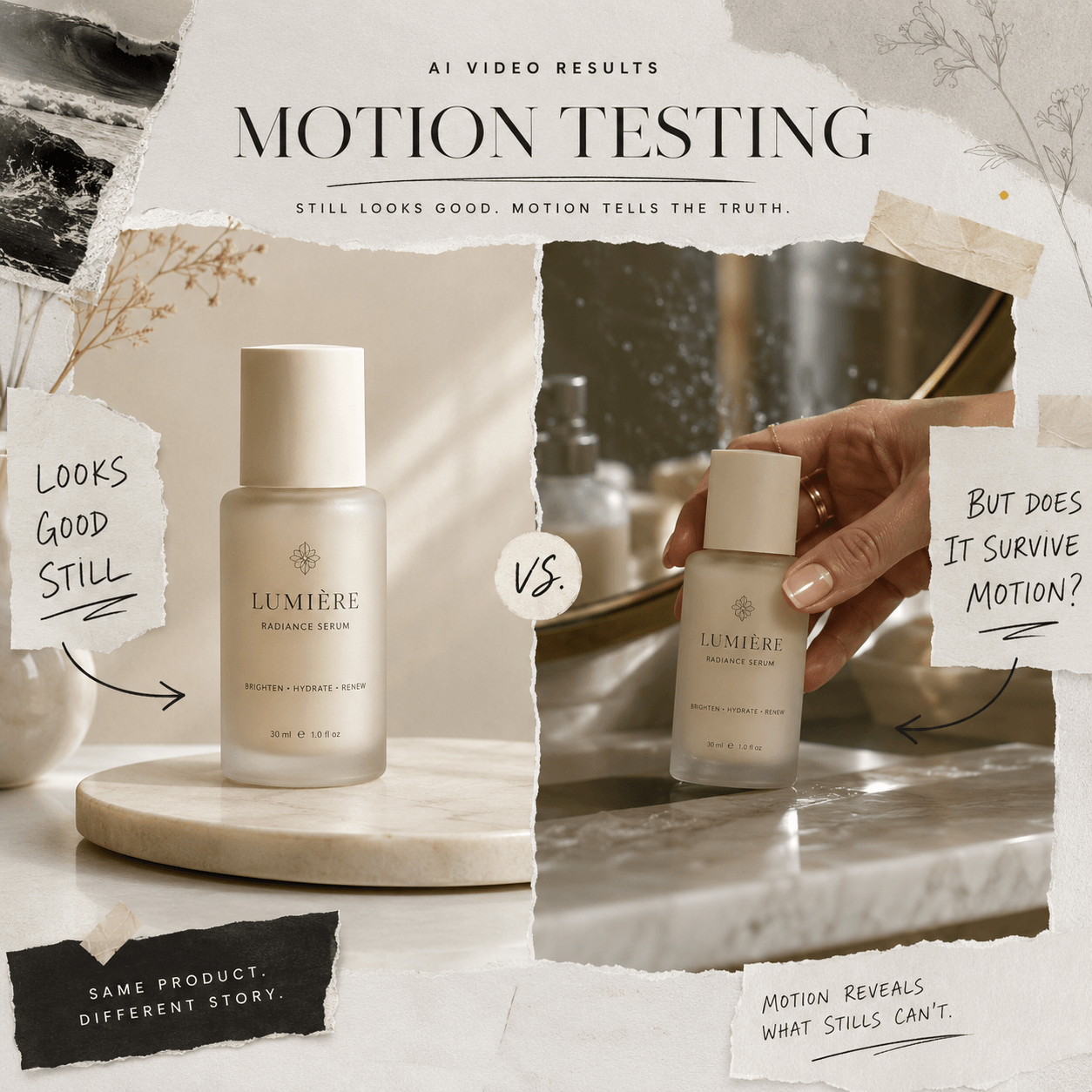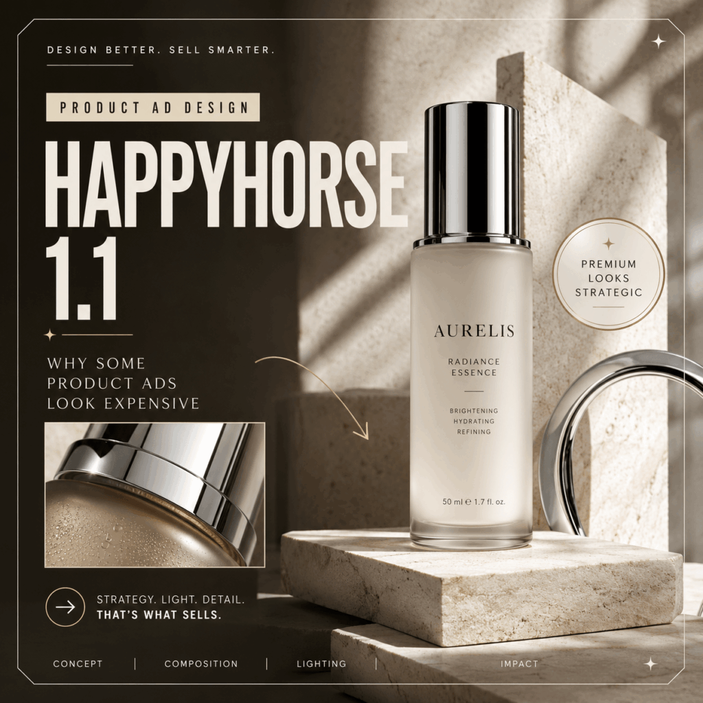
HappyHorse 1.1 can turn a product image or brief into a polished video concept. Yet good motion is only one part of a strong ad. Premium product ads also use scale, light, materials, space, and timing with care.
This matters because attractive content is now easier to produce. However, brands still need ideas that feel clear and memorable. So, instead of adding more effects, start with better design choices.
This guide explains seven choices that can make a product ad feel more valuable. Each lesson also works with the example videos shown on the HappyHorse 1.1 page.
HappyHorse 1.1 Is a Creative Tool, Not a Luxury Filter
A video can include glossy surfaces, dramatic light, and fast camera moves. Even so, it may still look like a template.
Premium design does not come from one expensive-looking effect. Instead, it comes from several choices that support the same idea.
First, the product needs a clear role. Next, the scene should support that role. Motion must also fit the product. Finally, the last frame needs a purpose.
Public creator discussions show a similar concern. Sellers want faster ways to produce content. At the same time, they still care about clean details and repeatable results.
For example, one Reddit discussion about AI product photography focused on the cost of traditional props and backgrounds. However, commenters also raised concerns about consistent layouts, stable product details, and an obvious “AI” appearance.
A faster workflow is useful. Still, the final ad must feel planned.
1. Give the Product One Clear Role
Every strong ad gives the product a job.
The product may be the hero. It could solve a problem. In other cases, it may represent comfort, status, speed, or play.
Choose one role before planning the scene. This makes every later decision easier.
For example, a perfume bottle can feel mysterious. A skincare bottle may feel calm and useful. By contrast, a sports product may stand for speed and progress.
Once the role is clear, the camera can support it. Light can build the right mood. Props can then remain simple.
HappyHorse 1.1 accepts prompts, first frames, and visual references. Therefore, creators can define the product role before describing the action or camera movement.
2. Use Scale to Guide the Eye
Size changes the way a product feels.
A large object can look bold or iconic. Meanwhile, a small object in a wide space can feel rare and refined.
Close shots work well when texture matters. Wider shots are better when the setting adds meaning. A centered hero frame also helps when fast recognition is important.
Avoid making every shot equally dramatic. When every detail asks for attention, the product loses focus.
Instead, choose one main scale for each moment. Then use a clear change in scale to create progress.
A close-up might introduce the material. After that, a wider frame can reveal the full design. This simple change creates a visual journey without adding unnecessary effects.
3. Match Motion to the Product Material
Different materials suggest different types of movement.
Glass works well with slow reflections and clean light changes. Liquid suits pouring, dripping, or soft waves. Metal often needs precise moves and sharper highlights. Fabric feels more natural with soft and steady motion.
Using the same floating spin for every item can feel generic. Therefore, study the product before choosing an effect.
Start by checking whether the product feels soft or solid. Next, consider its weight. Finally, look at whether the surface is matte or reflective.
These details should guide the movement.
A serum bottle may need one clean light sweep. Faster ingredient motion could fit a snack ad. Meanwhile, controlled mechanical action may suit a watch.
The effect should reveal something about the product. It should not distract from it.
HappyHorse 1.1 lets creators describe close-ups, push-ins, product rotations, tracking shots, slow reveals, and other camera directions.
4. Build One Visual World Around the Product
An expensive-looking ad rarely uses a random background.
The surface, light, props, and colors should belong to the same world. Together, they need to support the product idea.
For example, a future-facing product does not need a crowded neon city. One chrome surface and one sharp light may be enough.
Likewise, natural skincare does not need a forest of leaves. Warm stone, soft daylight, and one organic detail can create a clearer result.
Restraint makes the product easier to remember. It also reduces the visual clutter that often makes generated content feel artificial.
A simple formula can help:
Product Character + Surface + Light + One Supporting Detail
A precise product could use chrome, cool light, and a geometric shadow.
Meanwhile, a calm product could use cream stone, morning light, and a soft towel.
The scene should feel designed for the product. It should not look borrowed from another campaign.
5. Reveal the Product Instead of Simply Displaying It
A basic product video places the item in the center from start to finish.
A stronger ad creates a small reveal. This gives the viewer a reason to continue watching.
The product could move from shadow into light. It may appear through liquid, smoke, or fabric. Another option is to show one detail before revealing the full package.
However, do not hide the product for too long. Feed-based ads move fast.
Reddit’s official advertising guidance recommends showing the brand within the first three seconds. It also advises advertisers to keep content polished while making it feel natural to the platform.
For that reason, reveal the idea early. Then save the clearest product shot for the payoff.
A good reveal creates curiosity. It should not cause confusion.
6. Create One Memorable Product Moment
A short product ad does not need five large effects.
Usually, one strong moment is enough. It could be a cap click, a splash, a package opening, or a sharp change in light.
That moment should fit the product.
A clean mechanical move may suit a technology item. A soft sensory action could work for fragrance. Meanwhile, a playful transformation may fit snacks or younger audiences.
Judge the moment by its purpose, not only by its beauty.
Does it make the product easier to understand? Will the viewer remember it after the clip ends?
When the answer is no, the effect may be impressive but unnecessary.
Strong ads often remove more than they add. As a result, the main moment becomes easier to notice.
7. Plan the Final Frame First
Many product videos begin well but end without a clear choice.
The camera may stop during a movement. Sometimes the product leaves the frame. In other cases, the clip simply cuts too soon.
A strong final frame completes the ad.
The frame can show the full product. It may also leave space for a headline. A smooth loop or clear call to action is another option.
Plan this shot before adding extra movement.
Keep enough distance when the package must remain readable. Move the product to one side when the ad needs text space. For a loop, connect the final composition with the opening shot.
The last frame is not empty time. It is where attention becomes product memory.
HappyHorse 1.1 allows users to describe the closing shot, camera direction, pacing, format, and final reveal in the creative brief.
What Product Sellers Want From Video Ads
Public seller discussions often focus on practical value.
In a Shopify Community discussion, users noted that problem-solving demos can work well because they place products in a clear, real-world context. The same discussion also suggested that portrait formats suit many social feeds. Meanwhile, landscape remains useful for softer showcases and some ads.
Reddit offers similar advice. Ads should show the product clearly and explain why someone should buy it. The platform also recommends a visible call to action and captions for viewers who watch without sound.
Together, these points lead to one useful rule:
A product ad should look good. However, it must also be clear, believable, and ready for its intended channel.
That standard is higher than simply making a product image move.
How HappyHorse 1.1 Fits the Product Ad Workflow
HappyHorse 1.1 supports text-to-video, image-to-video, and reference-guided creation. Users can guide camera movement, pacing, visual style, product details, audio, and the final shot.
The tool page presents HappyHorse 1.1 for several common uses:
- Social ad concepts
- Product launch clips
- Brand content tests
- Ecommerce videos
- UGC-style product demos
- Campaign variants
However, generation should not be the first step.
Define the Product Role
Choose one main idea. It could be calm, speed, precision, comfort, or play.
Pick One Design Principle
Focus on scale, material, setting, reveal, or one key action.
Select a Clear Source Image
Use a product image with readable packaging. Clean lighting also helps. In addition, leave enough space for movement.
Describe the Ending
Decide what the viewer should see during the final second.
Review the Result as an Ad
Check the product, setting, motion, and final frame. Do not judge visual quality alone.
HappyHorse 1.1 Product Ad Checklist
Before publishing a clip, check these points:
- Is the product easy to recognize?
- Does the motion suit its material?
- Does the setting support the product?
- Is the main idea clear?
- Is there one memorable moment?
- Does the final frame feel complete?
- Does the format suit the platform?
- Are the package, logo, and claims correct?
Several negative answers usually point to a weak concept.
In that case, do not add another effect. Simplify the idea instead.
HappyHorse 1.1 FAQ
Can HappyHorse 1.1 Create Product Ads?
Yes. HappyHorse 1.1 can create short video concepts from prompts, first frames, product images, and visual references.
Its tool page lists social ads, product launches, ecommerce visuals, UGC-style demos, and campaign tests as common use cases.
Do Product Ads Need Complex Motion?
No. A simple camera push, light change, or product reveal may be enough.
Movement should support the message. Therefore, add complexity only when it improves the idea.
What Makes a Product Ad Look Premium?
Clear hierarchy often matters more than complex effects.
Controlled light, suitable motion, simple props, and a strong final frame can make an ad feel more refined. Luxury surfaces alone cannot create a premium result.
Can HappyHorse 1.1 Videos Be Used for Commercial Work?
Commercial use depends on the current plan, output license, uploaded references, music rights, and brand permissions.
Use original or approved materials. Also, review the latest tool terms before publishing client work or paid ads.
Final Thought: Make the Product the Reason
HappyHorse 1.1 can speed up product video planning. It can also help teams explore new campaign ideas.
Still, speed should not replace judgment.
Use scale to guide attention. Match movement to the material. Build one clear visual world. Then end with a frame worth remembering.
A premium product ad does not need to shout.
Every detail simply needs a reason.
Go to WeShop AI For Exploration: