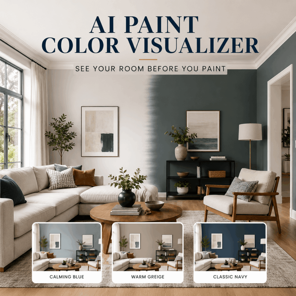
AI Paint Color Visualizer lets you preview new paint colors directly in a photo of your own room, kitchen, furniture, or home exterior. Instead of trying to imagine how a tiny paint swatch might look across an entire wall, you can see different color directions in the space where they will actually appear.
Choosing paint often sounds simple. You find a shade you like, buy a sample, and start planning the makeover. However, the result can feel completely different once that color covers a large surface.
A warm white may suddenly look yellow. A soft gray may feel cold and flat. Meanwhile, a stylish dark green may make a small room look heavier than expected.
Therefore, previewing your ideas before buying several gallons of paint can save time, reduce uncertainty, and help you make a more confident decision.
What Can AI Paint Color Visualizer Do?
AI Paint Color Visualizer applies new colors to paintable surfaces in an uploaded photo. It can help you test walls, ceilings, cabinets, doors, trim, siding, shutters, fences, garage doors, and selected furniture surfaces.
At the same time, it aims to keep the rest of the scene recognizable. Your flooring, windows, furniture, decorations, room layout, and architectural details can remain in place while you explore a new paint direction.
As a result, you are not looking at a random sample room with a fashionable color. Instead, you are checking how that color may work with your own sofa, flooring, lighting, windows, and existing decor.
You can use AI Paint Color Visualizer to:
- Preview bedroom and living room wall colors
- Test a single accent wall
- Compare kitchen cabinet colors
- Explore ceiling, door, and trim combinations
- Preview exterior siding and stucco colors
- Test shutters, fences, and garage doors
- Create several color options for a client
- Build a shortlist before buying physical samples
In addition, you can compare subtle neutrals, bold colors, dark accents, warm earth tones, and custom color ideas without manually masking every surface in editing software.
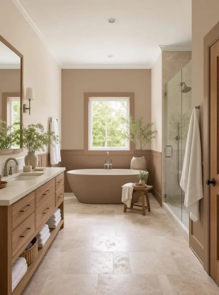
Why Paint Swatches Often Look Different at Home
A paint swatch shows you a color, but it does not show the full relationship between that color and your space.
Several details can change how the final paint appears. Therefore, a color that looks perfect in a store, catalog, or online photo may feel completely different in your own room.
Natural Light Changes Throughout the Day
A sunny room can make colors appear warmer and brighter. However, a north-facing room or a space with limited daylight may make the same shade look cooler, darker, or grayer.
The result may also change from morning to evening. For example, a cream wall might look clean in daylight but noticeably yellow under warm lamps at night.
Therefore, checking a color in only one lighting condition can be misleading.
Floors and Furniture Affect Wall Color
Walls do not exist in isolation.
Wood flooring, rugs, sofas, curtains, cabinets, and artwork can all influence how you see a color. A cool white may work beautifully next to gray stone flooring. Nevertheless, the same white might feel disconnected from warm oak furniture.
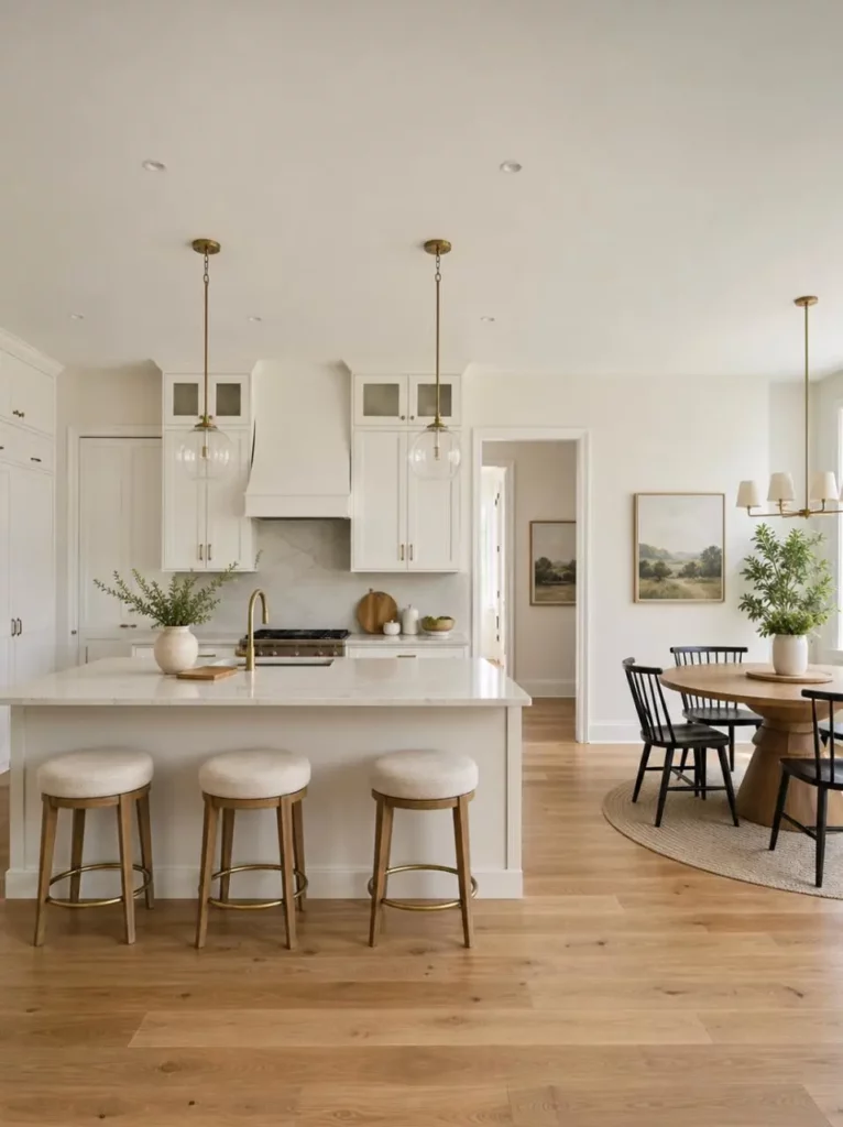
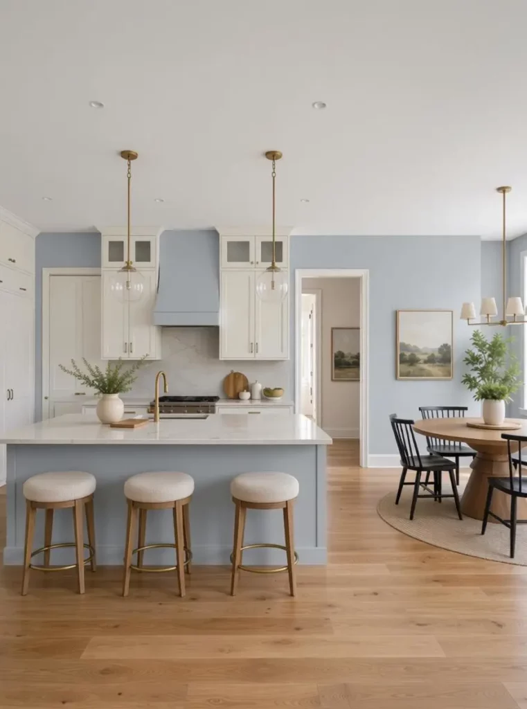
AI Paint Color Visualizer gives you more context because your existing items stay visible while the selected surface changes. Consequently, it becomes easier to judge whether a new wall color supports the rest of the room or competes with it.
Large Surfaces Make Undertones More Noticeable
A color may look balanced on a small card but much stronger across an entire room.
For instance, a slight pink, green, blue, or yellow undertone may be difficult to notice on a swatch. Once the color covers a large wall, however, that undertone can become one of the most visible parts of the space.
A deep blue may also feel calm on a small sample but dramatic when applied to four walls. Similarly, a pale beige may appear neutral on a screen yet look warmer beside wooden floors.
Consequently, it is useful to preview broad color families before focusing on one exact shade.
How AI Paint Color Visualizer Improves Color Decisions
AI Paint Color Visualizer is most valuable when it becomes part of a clear decision-making process rather than a tool for creating random color variations.
The goal is not to generate as many options as possible. Instead, it should help you compare ideas, reject weak choices, and keep only the colors that genuinely suit the space.
Compare Color Families First
Instead of testing twenty unrelated colors, begin with a few clear directions:
- Warm white
- Cool white
- Cream or beige
- Sage or muted green
- Gray-blue
- Terracotta
- Dark accent color
Once you find the family that works best with your room, you can compare lighter, darker, warmer, or cooler versions within that group.
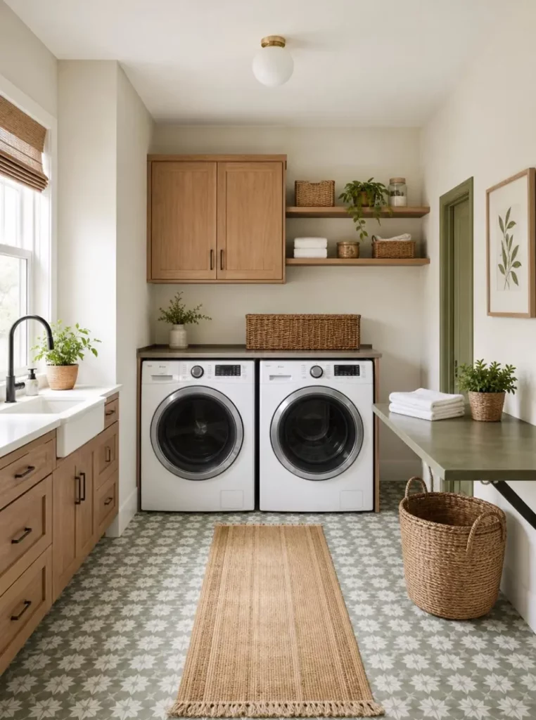
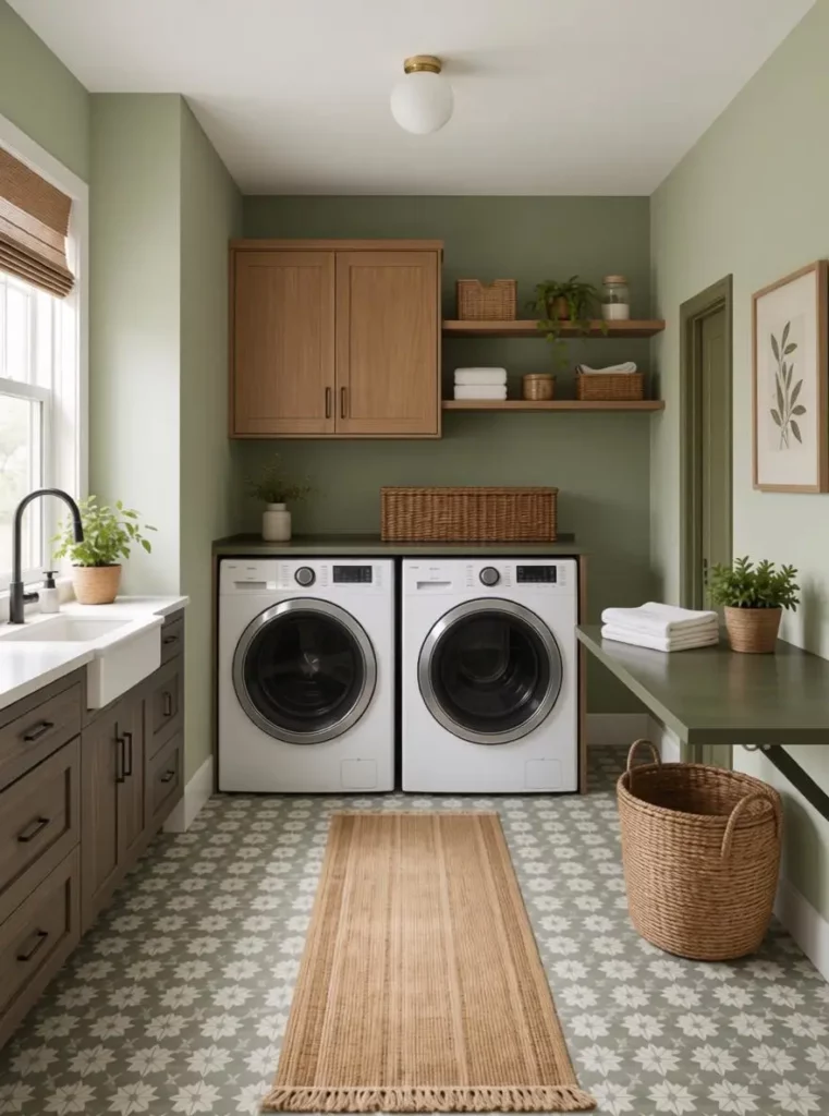
For example, you might discover that green works well with the flooring, but only softer sage tones feel balanced. Alternatively, you may find that warm neutrals suit the furniture better than cool gray shades.
This approach creates a manageable shortlist. In contrast, generating too many random options often makes the decision more confusing.
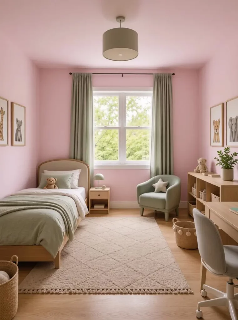
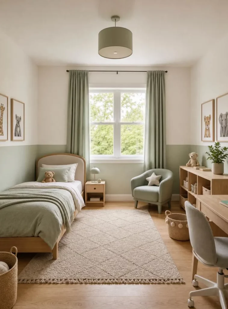
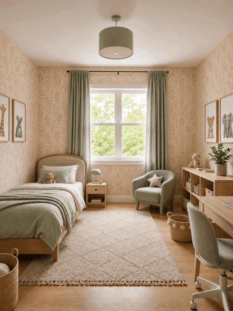
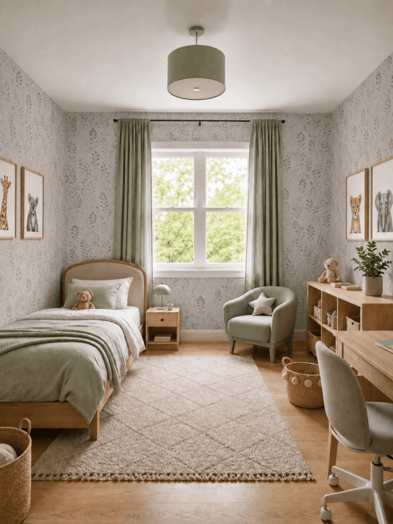
Compare Before and After
A before-and-after view helps you notice more than the color itself.
You can compare:
- Overall brightness
- Visual contrast
- Room size perception
- Color undertones
- Furniture coordination
- The strength of an accent wall
- The balance between walls and trim
For example, a darker wall may make light furniture stand out. On the other hand, it may reduce the sense of openness in a smaller room.
A warmer shade may make the space feel inviting. However, it may also bring out unwanted yellow tones in existing wood or lighting.
Therefore, the original photo should remain part of the review instead of being forgotten after the first edit.
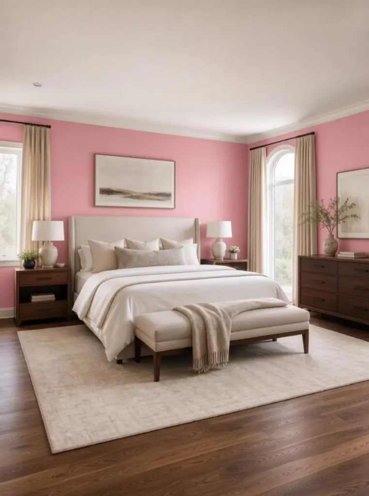
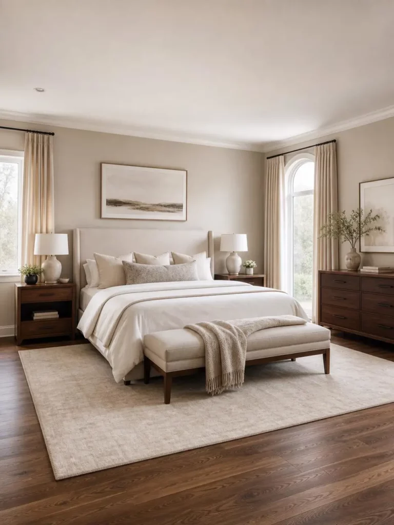
Narrow the Shortlist Before Buying Samples
AI Paint Color Visualizer should help reduce the number of physical samples you need to test.
Suppose you begin with eight possible colors. After previewing them in your room, you may discover that only two or three suit the flooring, natural light, and furniture.
You can then buy physical samples for those final options. This method is more efficient than purchasing every color that looked attractive on a website, inspiration board, or paint card.
In addition, it gives you a clearer reason for choosing each finalist. One may provide the best brightness, while another may create a stronger mood.
How to Use AI Paint Color Visualizer
A simple and controlled workflow usually produces more useful results.
Rather than changing every visible surface at once, focus on one decision and compare each result under similar conditions.
Step 1: Upload a Clear Photo
Choose a well-lit photo with the wall, cabinet, or exterior surface clearly visible.
Whenever possible, avoid:
- Heavy shadows
- Blurry images
- Very low resolution
- Extreme camera angles
- Large objects covering the target surface
- Strong colored lighting
A normal front-facing or slightly angled room photo is often easier to work with than an artistic wide-angle image.
Natural daylight is helpful because it shows the room more clearly. However, you should also choose a photo that represents how the space normally looks.
Step 2: Choose One Surface to Change
Decide what you are testing before generating variations.
For example, change the wall while keeping the flooring, furniture, curtains, and cabinets unchanged. Alternatively, test the cabinets while preserving the wall color and countertop.
This controlled approach makes each result easier to compare.
If you change the wall, floor, sofa, lighting, and decor at the same time, you are no longer testing paint. Instead, you are creating a completely different room.
Step 3: Create a Small Set of Directions
Begin with three or four distinct options rather than many nearly identical shades.
You might create:
- Safe Neutral
- Warm and Cozy
- Fresh Green
- Dark and Dramatic
These simple categories make the results easier to discuss with family members, clients, painters, or contractors.
They also prevent the review from becoming a long comparison between colors that look almost identical.
Step 4: Review the Whole Room
Do not focus only on whether the new color looks attractive.
Instead, check how it works with:
- The floor
- Large furniture
- Window light
- Existing wood tones
- Metal hardware
- Curtains and rugs
- Adjacent rooms
- Doors and trim
A beautiful color can still be the wrong choice if it fights with permanent elements in the space.
For example, a stylish cool gray may not suit a room filled with warm wooden furniture. Similarly, a dark green may look dramatic but make a small room feel closed in.
Step 5: Save the Best Options
Keep only the strongest two or three versions.
You can then share those previews with other decision-makers. As a result, discussions become more specific than simply saying, “I think green might work.”
Instead, everyone can compare the same room with a soft sage wall, a warmer olive tone, and a neutral alternative.
This is especially useful when several people need to approve the final choice.

Step 6: Confirm with Real Paint Samples
Finally, test the shortlisted colors on the actual surface.
Observe them during the morning, afternoon, and evening. Also, check how they look under the artificial lights normally used in the room.
AI Paint Color Visualizer can guide your decision. However, a real sample remains the best final check before a complete repaint.
The screen cannot perfectly reproduce every paint finish, wall texture, shadow, or lighting condition. Therefore, the digital result should help you choose finalists rather than replace the final physical test.
Best Projects for AI Paint Color Visualizer
AI Paint Color Visualizer can support more than a standard living room makeover.
It is useful anywhere a paint decision depends on surrounding materials, lighting, scale, or architectural details.
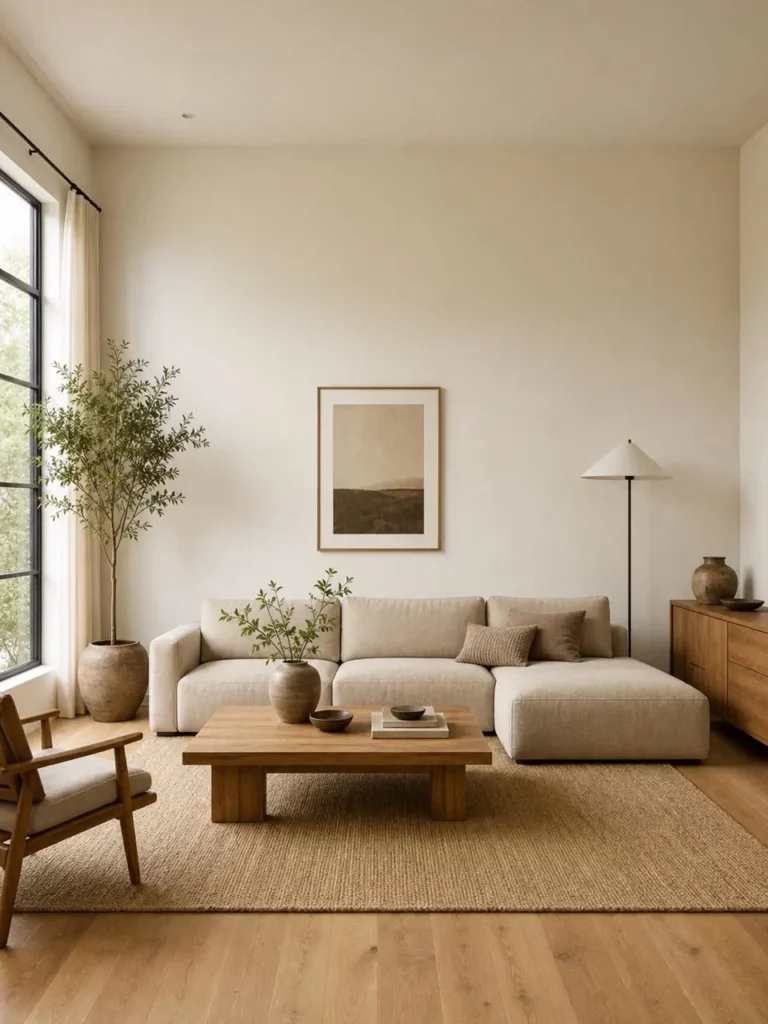
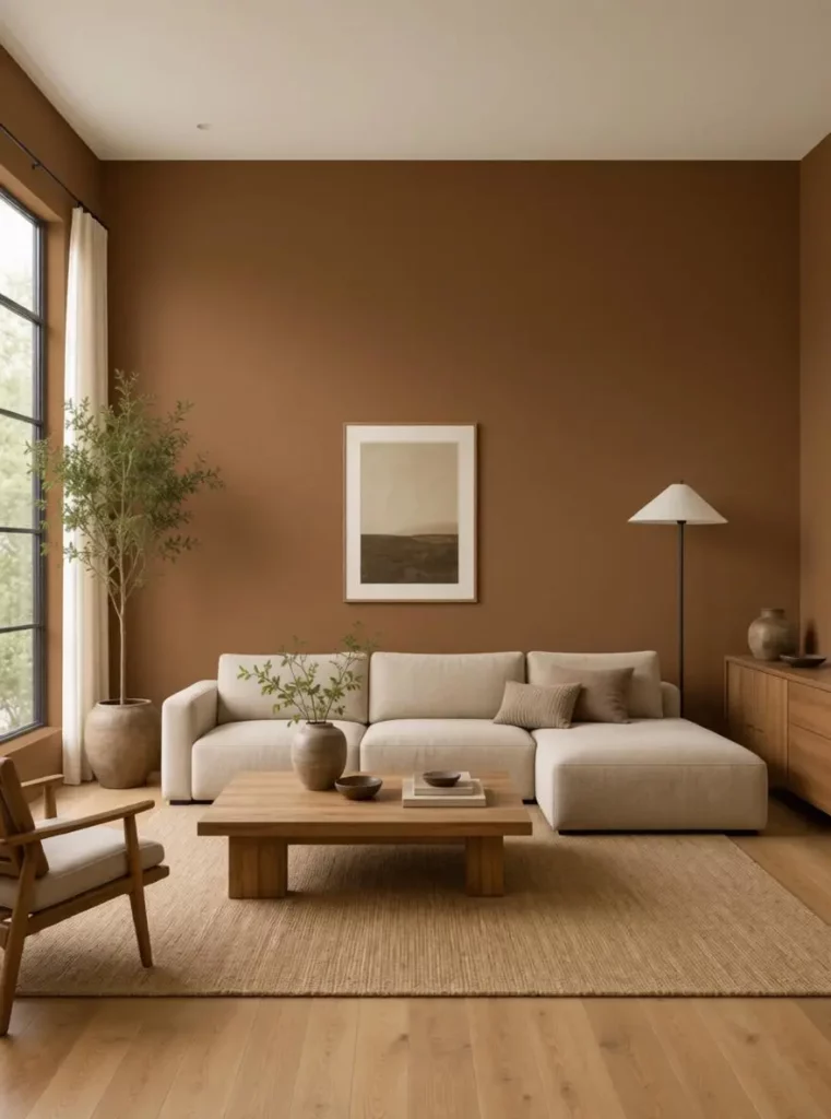
Living Room and Bedroom Walls
Living rooms contain many competing colors and materials. Therefore, a wall color must work with the sofa, flooring, rug, curtains, wood tones, and daylight.
A pale neutral may make the room brighter, while a darker shade can create stronger contrast. However, the best option depends on the size and existing style of the room.
Bedrooms may require a different approach. Soft neutrals, muted greens, calm blues, and deeper colors can create very different moods.
Using the same room photo for every variation makes those differences easier to judge.
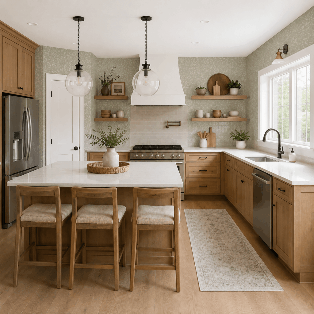
Kitchen Cabinet Repainting
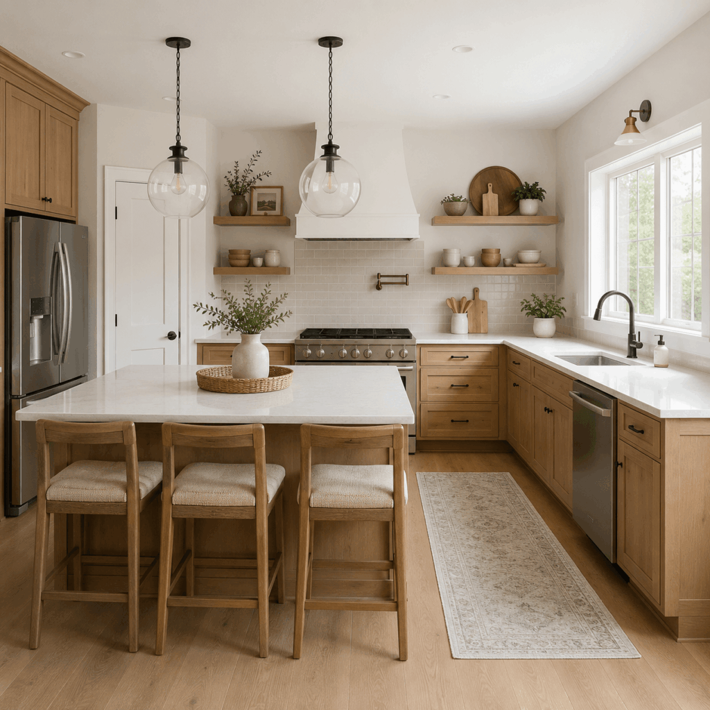
Repainting cabinets can refresh a kitchen without replacing the full cabinet system. Nevertheless, the new color still needs to coordinate with the countertop, backsplash, flooring, appliances, and hardware.
AI Paint Color Visualizer can help compare options such as:
- White
- Cream
- Sage green
- Forest green
- Navy
- Charcoal
- Two-tone combinations
For instance, dark lower cabinets may add contrast while lighter upper cabinets keep the kitchen feeling open.
Meanwhile, a soft green may work well with natural wood and brass hardware, but it may appear very different beside cool stone or stainless steel.
Previewing those combinations can help you avoid choosing a cabinet color in isolation.
Exterior House Paint
Exterior painting is expensive, highly visible, and difficult to reverse quickly.
In addition, the siding color must work with the roof, brick, driveway, landscaping, doors, shutters, and neighboring homes.
A visual preview can help compare:
- Siding colors
- Stucco colors
- Trim combinations
- Front door colors
- Shutters
- Garage doors
- Fences
It can also provide a clearer reference for conversations with family members, contractors, property managers, or HOA reviewers.
For example, a muted green exterior may work well with natural landscaping. However, a warm beige may coordinate better with the roof and stone details.
Viewing both ideas on the real building is more useful than comparing two isolated color swatches.
Doors, Trim, and Accent Areas
A full wall repaint is not always necessary.
Sometimes, a smaller color change can make a noticeable difference. Doors, trim, shutters, fences, and accent walls can introduce contrast without changing the entire space.
AI Paint Color Visualizer allows you to test whether these smaller areas should blend in or stand out.
For instance, dark trim may create a modern graphic look. In contrast, matching the trim to the wall can make a room feel softer and more continuous.
A Smarter Client Approval Tool
Professional users can turn paint previews into client-ready presentation materials.
An interior designer may receive a bedroom photo and prepare three controlled directions. A painter may show how a wall or exterior could look before the customer approves the work. Meanwhile, a real estate team may compare low-cost color updates before preparing a property for sale or rent.
Instead of presenting only paint names and small color chips, professionals can show the proposed color inside the client’s real space.
This can help clients:
- Understand the design direction
- Compare alternatives more quickly
- Give clearer feedback
- Approve a shortlist
- Discuss changes before work begins
AI Paint Color Visualizer can also support mood boards, renovation proposals, consultation decks, and social media content.
For example, a designer could present three options labeled Soft Neutral, Natural Green, and Bold Contrast. Because the furniture and room layout remain consistent, the client can focus on the paint decision rather than unrelated design changes.
Common Mistakes When Previewing Paint Colors
Even a useful visualizer can produce confusing results if the testing process is not controlled.
Testing Too Many Colors at Once
More choices do not always create a better decision.
If you generate twenty unrelated colors, it becomes difficult to remember why one worked better than another.
Instead, begin with a small number of distinct directions. Then, refine the strongest color family.
Ignoring the Existing Room
A wall color should not be reviewed on its own.
If you only look at the painted area, you may overlook a conflict with the flooring, curtains, furniture, or lighting.
Always review the full image before keeping an option.
Changing Several Elements Together
If every version includes different furniture, lighting, flooring, or decor, you cannot tell which improvement came from the paint.
Therefore, keep the rest of the scene as consistent as possible.
Choosing a Color Only Because It Is Trendy
A popular color may look attractive in editorial photos, but that does not mean it suits every home.
The best paint color should work with the specific room, permanent materials, lighting, and practical needs.
Trends can provide ideas. However, the room itself should guide the final decision.
What AI Paint Color Visualizer Cannot Guarantee
A digital preview is still an estimate.
The final painted surface can be affected by:
- Screen calibration
- Natural and artificial light
- Wall texture
- Existing wall color
- Primer
- Number of paint coats
- Matte, eggshell, satin, or gloss finish
- Reflections from surrounding surfaces
For this reason, the preview should not be treated as a perfect color match.
Instead, use AI Paint Color Visualizer to reject unsuitable ideas, compare broad directions, and choose the strongest candidates. After that, confirm the final shade with a physical sample.
For example, a digital image may show a muted olive wall, but the real paint could look warmer or darker depending on the lighting and surface finish.
The tool helps you make a better shortlist. It does not remove the need for final testing.
A Better Way to Choose Paint
Choosing a paint color should not begin and end with a small swatch.
A better process is simple:
- Upload a photo of your real space.
- Preview a few controlled color directions.
- Compare the results with your existing furniture and lighting.
- Keep the strongest two or three options.
- Confirm the final choice with physical paint samples.
AI Paint Color Visualizer makes the uncertain part of painting easier to see. It allows you to explore wall, cabinet, trim, and exterior ideas without immediately committing to materials or labor.
Most importantly, it changes the question from “Do I like this color?” to “Does this color actually work in this room?”
That is a much more useful question to answer before the first can of paint is opened.
Go to WeShop AI For Exploration: