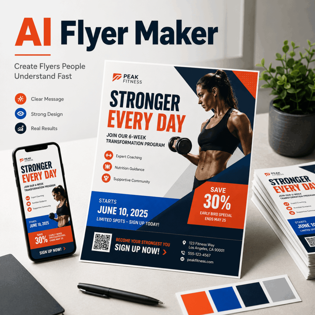
An AI Flyer Maker can help you create a polished promotional flyer in minutes. However, speed is not the only goal. A flyer must also tell customers what is happening, why they should care, and what they should do next.
Many flyers look attractive but still fail to generate visits, registrations, or sales. Usually, the problem is not the color palette or product photography. Instead, too many messages compete for attention.
The business name, discount, date, address, QR code, product details, and social media handles may all appear at the same size. As a result, customers cannot find the main offer quickly enough.
With an AI Flyer Maker, small businesses and marketing teams can turn a short description into a structured flyer, edit the text, apply brand elements, and prepare the design for digital or printed use.
Still, the tool works best when you give it a clear message. Before choosing fonts or images, decide what someone should understand within the first three seconds.
Why Attractive Flyers Still Get Ignored
Customers rarely read a flyer from the top-left corner to the bottom-right corner. Instead, they scan it.
First, they notice the largest headline or image. Next, they look for a price, discount, date, or event name. Finally, they decide whether the offer deserves more attention.
If the main benefit is difficult to find, the flyer has already lost its chance.
Common problems include:
- Using the business name as the largest headline
- Making the discount smaller than decorative text
- Hiding the event date near the bottom
- Adding several competing calls to action
- Placing text over a detailed background
- Including information that belongs on a landing page
A flyer does not need to explain everything. Instead, it should create enough interest for the customer to take one clear next step.
Therefore, start with one question:
What should someone remember after seeing this flyer for three seconds?
The answer might be “20% off this Saturday,” “free beginner class,” or “live music tonight.” That message should control the rest of the design.

How AI Flyer Maker Clarifies a Weekend Promotion
Imagine that a local café wants to promote a weekend buy-one-get-one-free offer.
The owner has plenty of information to share. There is a business story, a list of participating drinks, opening hours, an address, membership details, social media accounts, and several conditions.
However, placing all of that information on one flyer would weaken the promotion.
Lead With the Main Flyer Offer
The strongest headline would be:
BUY ONE, GET ONE FREE
This message immediately tells customers what they can receive.
By contrast, placing the café name at the top may look professional, but it does not explain the value of the promotion. The logo can still appear on the flyer. It simply does not need to become the first visual priority.
Add Urgency Close to the Offer
A limited promotion needs a clear time frame.
For example:
THIS WEEKEND ONLY
The date should sit close to the offer. Otherwise, customers may notice the discount but miss when it is available.
Urgency does not require flashing graphics or several exclamation marks. A short, visible deadline is usually enough.
Choose One Main Action
The final information layer should tell customers what to do.
Possible calls to action include:
- Visit Us This Saturday
- Reserve Your Spot
- Scan to Order
- Shop the Weekend Sale
- Get Tickets Now
Choose only one primary action. Contact information, social media handles, and addresses can remain in the supporting area, but they should not compete with the CTA.
An AI Flyer Maker can use this information to create several structured directions. You can then compare which version gives the offer, deadline, and CTA the strongest hierarchy.
A Simple AI Flyer Maker Workflow
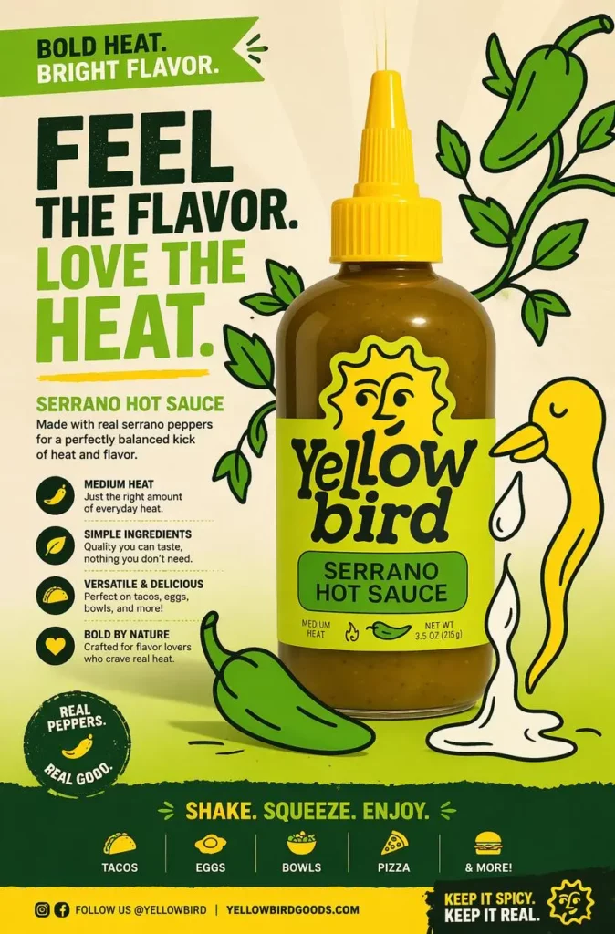
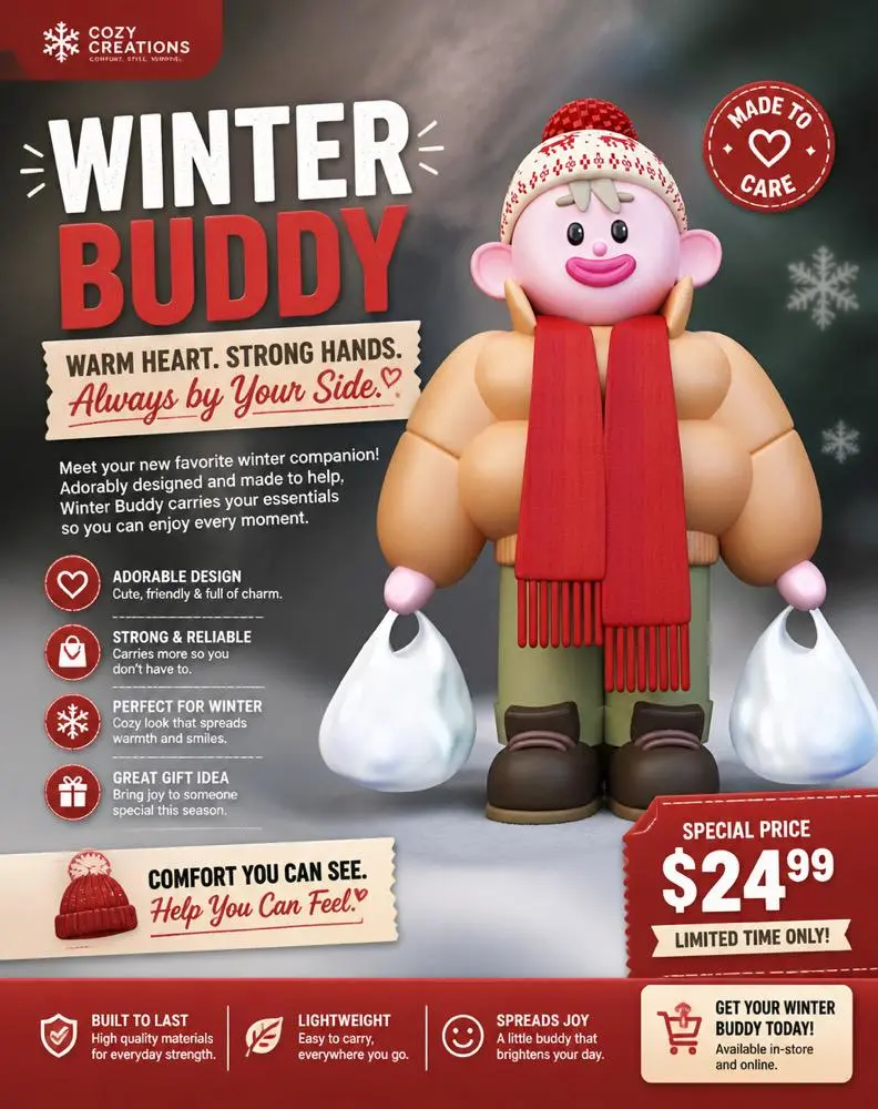
Using an AI Flyer Maker does not mean accepting the first generated result. Instead, treat the first version as a structured starting point.
1. Write a One-Sentence Flyer Brief
Summarize the entire promotion in one sentence.
For example:
A weekend coffee promotion offering buy-one-get-one-free drinks to local customers.
This sentence forces you to identify the event, offer, audience, and time frame.
2. Prepare the Essential Flyer Details
Before generating the design, collect only the details that must appear:
- Main offer
- Event name
- Date and time
- Location
- One CTA
- Logo or business name
Optional information can be added later. Starting with fewer details makes it easier to create a clear hierarchy.
3. Generate Several Flyer Designs
Do not spend too much time fixing the first layout.
Instead, generate several versions with different visual priorities. One design might use a large offer headline. Another may feature the product more prominently. A third could emphasize the event atmosphere.
Comparing different structures is often faster than endlessly adjusting one weak concept.
4. Replace Generic Flyer Copy
Generated text may provide a useful placeholder, but every sentence should still be reviewed.
Remove vague phrases such as:
- An Amazing Experience
- Something Special Is Coming
- Don’t Miss Out
- The Best Event Ever
These statements sound exciting, but they provide little information.
Replace them with specific details:
- Free Outdoor Yoga This Sunday
- 30% Off All Summer Shoes
- Live Jazz From 7 PM
- New Menu Launch This Weekend
Specific language makes the flyer easier to understand.
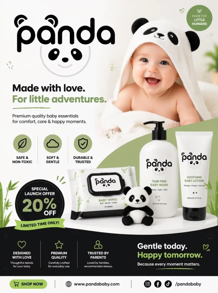
5. Add Branding to Your Flyer
Add the correct logo, brand colors, and visual style. However, do not allow branding to overpower the offer.
The flyer should look connected to the business while still communicating the promotion clearly. Therefore, keep the logo visible but secondary, especially when the offer is the main reason someone will stop and look.
Use AI Flyer Maker Across Print and Social Media
A local event rarely appears in only one place.
For example, a fitness studio promoting a free beginner class may need:
- A printed flyer for the reception area
- A square post for Instagram
- A vertical version for Stories
- A digital image for community groups
- A horizontal version for email
Rebuilding each design from scratch can lead to inconsistent fonts, colors, wording, and dates.
Instead, create one core message:
FREE BEGINNER CLASS
SATURDAY AT 10 AM
LIMITED SPOTS
RESERVE YOUR PLACE
Then adapt that message for each channel.
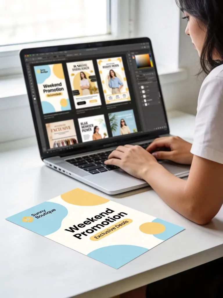
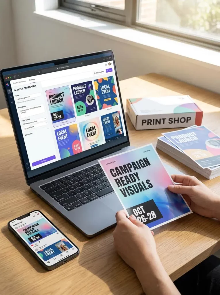
On a printed flyer, the address may need more space. Meanwhile, an Instagram Story may need a shorter CTA and larger type. An email graphic can use a wider composition with fewer supporting details.
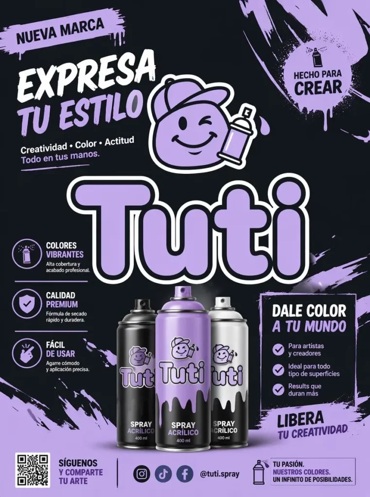
The AI Flyer Maker allows users to adjust designs for different flyer sizes and prepare promotional materials for social media, websites, email campaigns, and printed use.
Although the layout changes, the offer and visual identity should remain consistent. Consequently, customers can recognize the same campaign wherever they encounter it.
Write Better AI Flyer Maker Prompts
A vague prompt usually produces a vague flyer.
For instance, entering “coffee shop flyer” does not explain the promotion, target customer, deadline, or visual priority.
A stronger prompt should include five elements.
Define the Flyer Type
Explain whether you are creating a sale flyer, product launch, class announcement, party invitation, concert poster, or local business promotion.
State the Main Flyer Offer
Include the most important message exactly as it should appear.
For example:
- Buy One, Get One Free
- 20% Off This Saturday
- Free Entry Before 8 PM
- New Collection Launch
Identify the Target Audience
Mention who should respond to the flyer.
The audience might include local families, college students, new gym members, skincare shoppers, home buyers, or small business owners.
Choose a Flyer Design Style
Choose one clear style, such as:
- Bold and energetic
- Clean and editorial
- Friendly and colorful
- Premium and minimal
- Retro and playful
Avoid combining too many conflicting directions. A “minimal, luxurious, playful, vintage, futuristic” flyer is unlikely to feel visually focused.
Add the Required Flyer Details
List the date, time, location, offer, price, and CTA that must appear.
A complete prompt might read:
Create a clean promotional flyer for a local skincare pop-up targeting young shoppers. Highlight “20% Off This Saturday,” include the event time and location, and use a fresh editorial style with one clear RSVP call to action.
Another example could be:
Create a bold flyer for a weekend café promotion. Feature “Buy One, Get One Free” as the main headline, add “This Weekend Only,” use warm café photography, and include one clear visit-us CTA.
These prompts provide enough structure for the AI Flyer Maker to create a useful first design without turning the brief into a long paragraph.
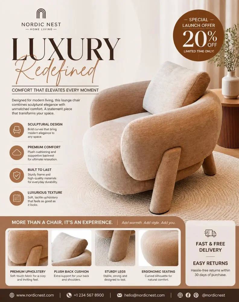
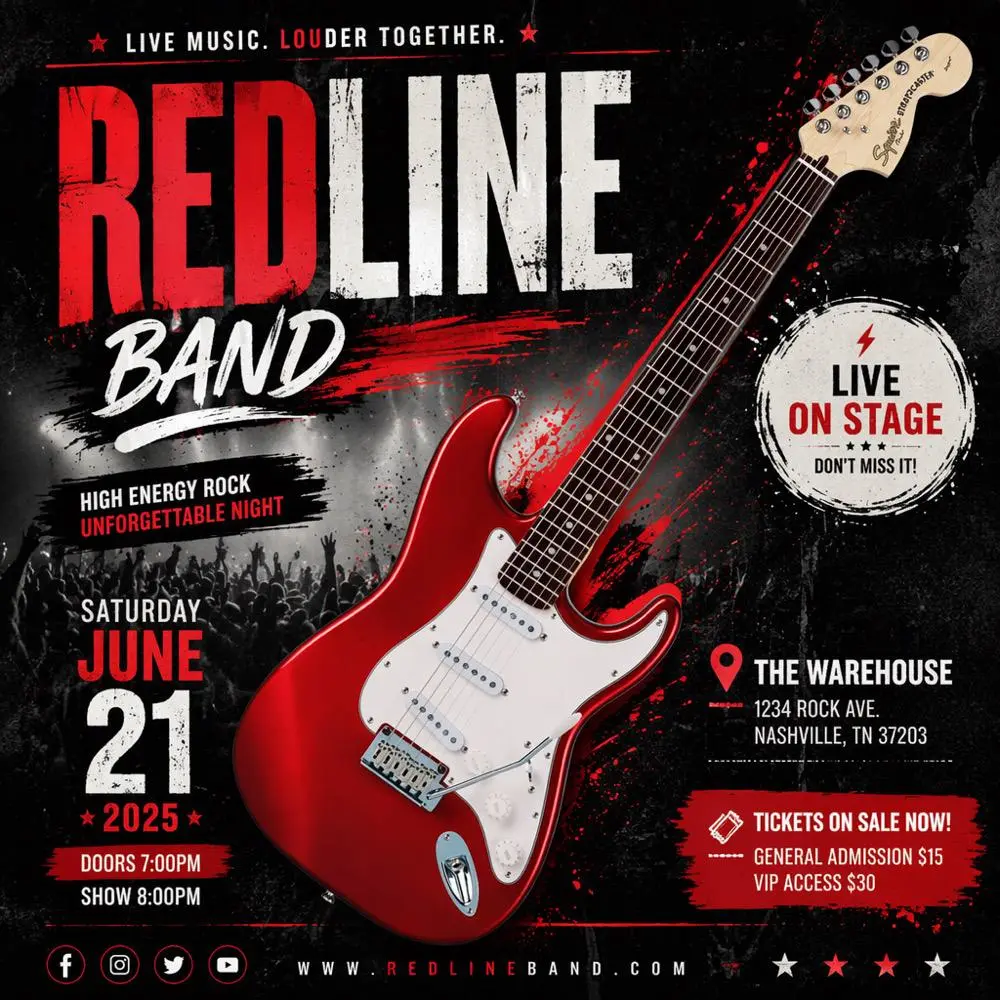
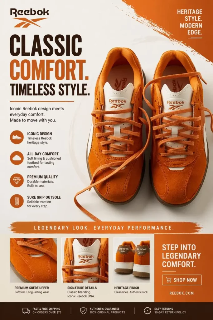
Run the Three-Second Flyer Test
Before publishing, reduce the flyer to a smaller size or hold your phone farther away.
Look at the design for only three seconds. Then answer three questions.
What Flyer Element Did You Notice First?
The answer should usually be the offer, event, product, or main benefit.
If you notice a decorative shape, background pattern, or oversized logo first, the hierarchy may need adjustment.
Can You Find the Flyer Date?
Customers should not need to search for essential timing information.
The date does not have to be as large as the headline. Nevertheless, it should remain visible and separate from fine print.
Is the Flyer CTA Clear?
A clear flyer creates a clear next action.
If customers are being asked to scan a QR code, visit a store, follow an account, send an email, call a number, and visit a website, the design is asking for too much.
Choose one main CTA and treat everything else as supporting information.
Common Flyer Design Mistakes to Fix
Even a strong generated layout still needs a final review.
Too Much Flyer Copy
Move long descriptions, terms, FAQs, and brand stories to a landing page or social caption.
Weak Text and Background Contrast
Make sure important text remains readable against the background. If necessary, simplify the image, add spacing, or place the text in a solid area.
Too Many Competing Flyer Headlines
Only one message should dominate. Secondary information should become smaller and quieter.
Unclear Event Dates
Avoid writing only “Saturday” when the flyer may continue circulating for several weeks. Include the full date when confusion is possible.
Contact Details That Are Too Small
Supporting information can be smaller, but it still needs to remain readable in the final output size.
Inconsistent Flyer Versions
Check every version before publishing. A printed flyer and social post should not contain different dates, prices, or offer conditions.
FAQ About AI Flyer Maker
What Is an AI Flyer Maker?
An AI Flyer Maker is a design tool that turns a written prompt or business description into a structured promotional flyer. It can help organize headlines, images, supporting information, and calls to action.
Do You Need Flyer Design Skills?
No advanced design experience is required. However, you still need to review the message, spelling, visual hierarchy, and campaign details before publishing.
Can AI Flyer Maker Create Event Flyers?
Yes. The same workflow can be used for product promotions, local sales, product launches, parties, classes, concerts, community events, and other announcements.
Can One Flyer Work Across Every Channel?
The core message can remain the same, but the layout should be adapted for each channel. Printed materials, square posts, vertical Stories, and horizontal email graphics have different space and readability requirements.
What Should an AI Flyer Maker Prompt Include?
Include the promotion type, main offer, audience, visual style, essential details, and one call to action. Specific prompts usually produce more usable results than broad descriptions.
Create Clearer Flyers, Not More Decoration
A successful flyer does not need to communicate every detail about a business or event.
Instead, it needs to help customers understand one offer quickly.
The AI Flyer Maker can reduce the time required to build layouts, test visual directions, apply branding, and prepare campaign assets. However, the strongest results still begin with a focused message.
Lead with the benefit. Keep the deadline visible. Use one CTA. Then remove anything that distracts from those three elements.
Customers may only give your flyer three seconds. Fortunately, three seconds can be enough when the message is clear.
Go to WeShop AI For Exploration: