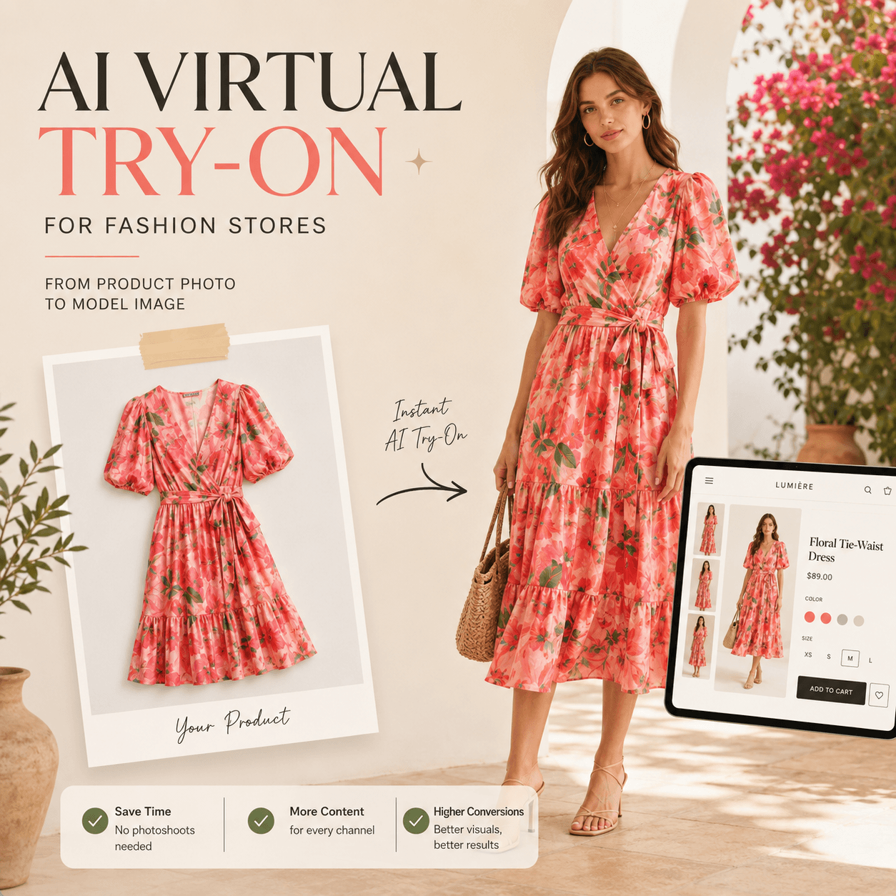
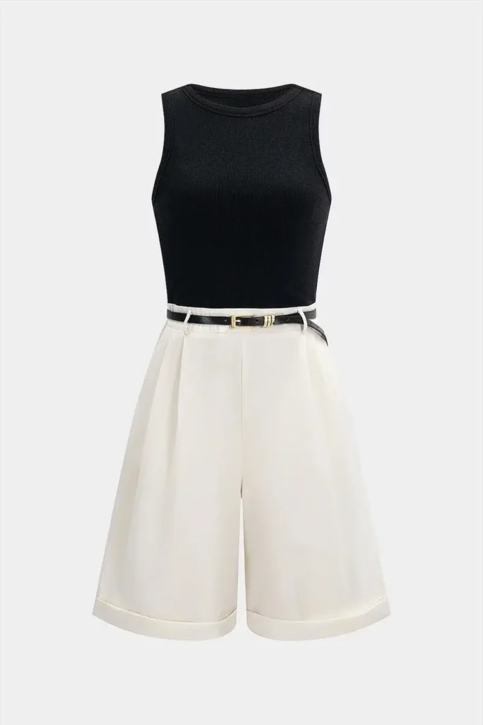
You have 20 new products ready to launch, but every item has only one flat-lay photo. The collection is scheduled, the product pages are waiting, and another photoshoot is not in the budget. In this situation, AI Virtual Try-On can help turn one clothing image into a more complete Shopify product gallery.
A flat lay can show the color, shape, and basic design of a garment. However, it cannot fully show where the hem falls, how the sleeves sit, or what the item looks like when worn. Therefore, one photo often leaves shoppers with several unanswered questions.
Still, the goal is not to generate five random model images. Each image should have a clear purpose. In this guide, you will learn how to plan five useful product visuals, keep color variants consistent, and review every result before publishing.
Why One Flat Lay Is Not Enough for a Shopify Product Page
A product image should do more than prove that an item exists. It should also help shoppers imagine how the item may look in real life.
For example, a dress may appear straight and simple when placed flat. Once it is worn, however, the waist may look more fitted, the skirt may have more volume, and the straps may sit differently than expected.
As a result, shoppers usually need both a clean product image and an on-model view.
A complete gallery should answer several questions:
- What does the full garment look like?
- How does it sit on the body?
- What is the side shape?
- Which details should the shopper notice?
- How could the item work in a real outfit?
When the gallery answers these questions in order, the buying process feels easier. In contrast, five nearly identical flat lays add more images without adding useful information.
Five Images to Create With AI Virtual Try-On
A strong Shopify gallery does not need dozens of images. Instead, it needs a small set of visuals that each complete a different task.
The following five-image formula works especially well for dresses, tops, jackets, knitwear, and other fashion products.
1. Start With a Clean Hero Image
The first image should make the product easy to understand. Therefore, use a simple pose, a clear front view, and a background that does not compete with the garment.
Although campaign images can be expressive, the hero image should remain direct. Keep the full garment visible, preserve its main color, and avoid accessories that cover important details.
The shopper should understand the item within a few seconds. Therefore, avoid extreme crops, dramatic poses, or heavy shadows in the first gallery position.
2. Add a Front On-Model Image
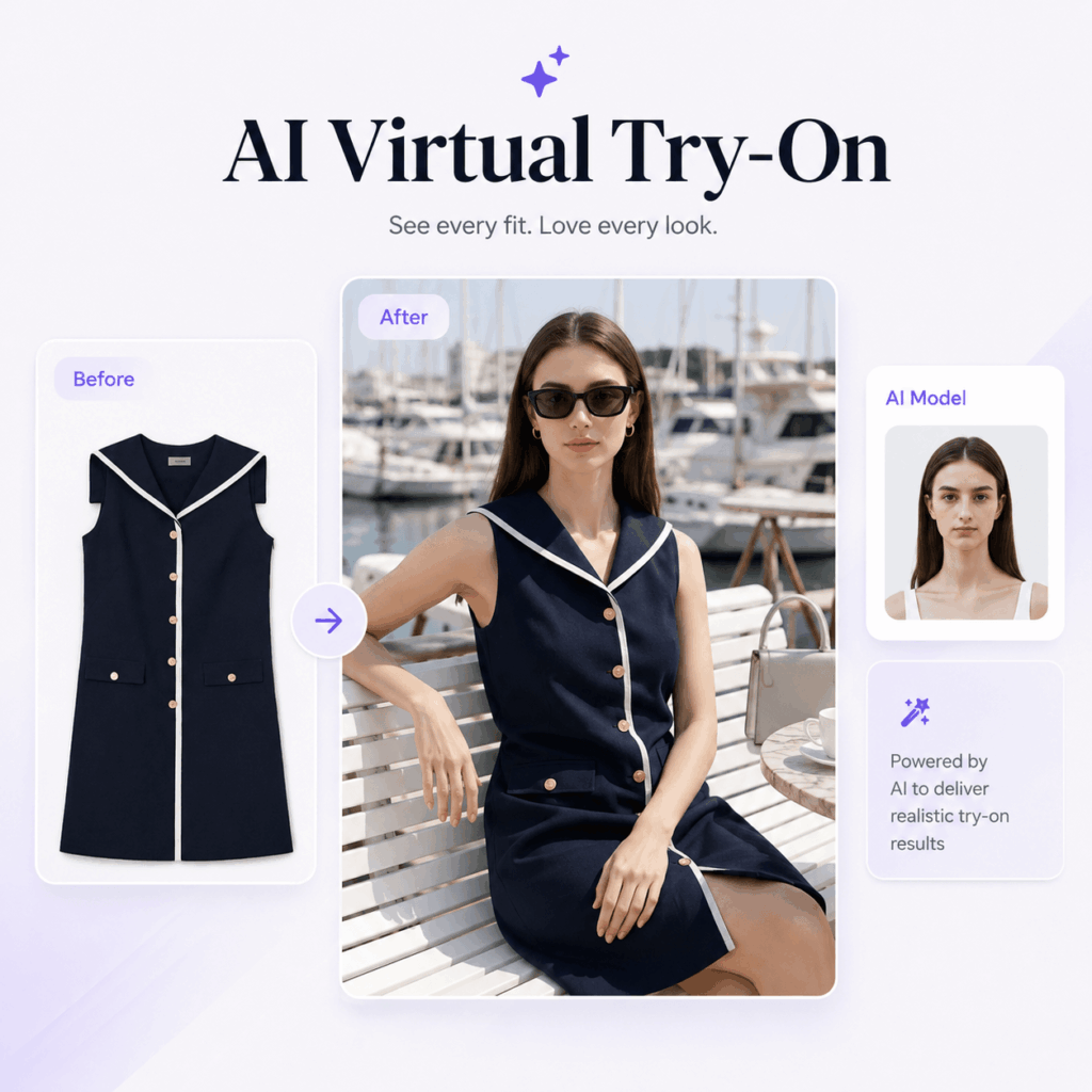
Next, create a full-body or three-quarter-body view that shows how the item looks when worn.
This image helps shoppers understand:
- Garment length
- Sleeve shape
- Waist position
- Overall silhouette
- Body-to-garment proportion
For example, a cropped jacket should clearly show where it ends at the waist. Similarly, a long shirt should not be hidden by folded arms or a large bag.
Whenever possible, keep the model’s arms slightly away from the body. As a result, the sleeves, waist, and side seams remain easy to see.
3. Create One Lifestyle Image
After the garment is clearly presented, you can add mood and context.
Place the item in a setting that matches the brand, such as:
- A bright studio
- A clean city street
- A quiet café
- A relaxed holiday location
- A modern office
However, the setting should support the product rather than overpower it.
For example, a minimal knitwear brand may benefit from soft daylight and a neutral interior. In contrast, a streetwear label may use stronger light, movement, and an urban background.
A lifestyle image can also suggest where the item might be worn. Therefore, it should feel believable rather than purely decorative.
5. Finish With a Detail or Fit Image
Finally, show the feature that may influence the buying decision.
This could include:
- Collar shape
- Buttons
- Stitching
- Print placement
- Fabric texture
- Cuffs
- Pockets
- Hem details
If the source image does not contain enough detail, do not allow the generated image to invent it. Instead, use a real close-up product photo when possible.
The detail image should increase trust. It should not simply fill the final gallery position.
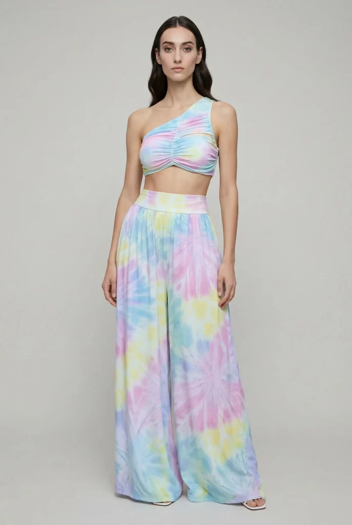
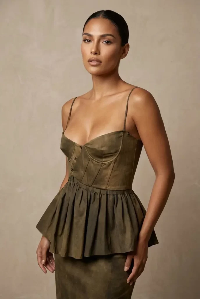
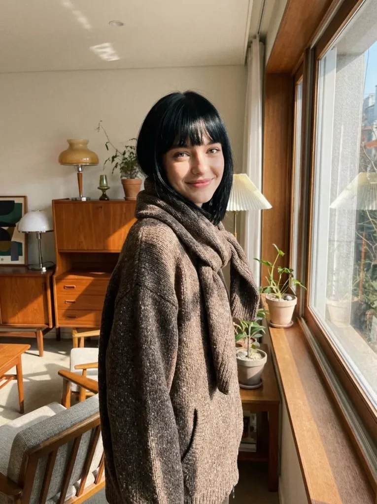
How to Use AI Virtual Try-On From a Flat Lay
Once the gallery plan is clear, the image creation process becomes easier. Instead of trying to generate an entire campaign at once, create one useful product image first, then expand the gallery step by step.
Step 1: Prepare a Clean Clothing Photo
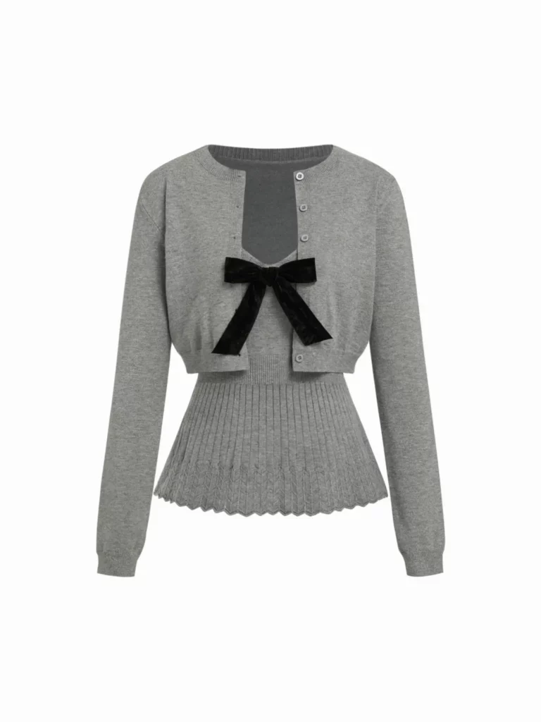
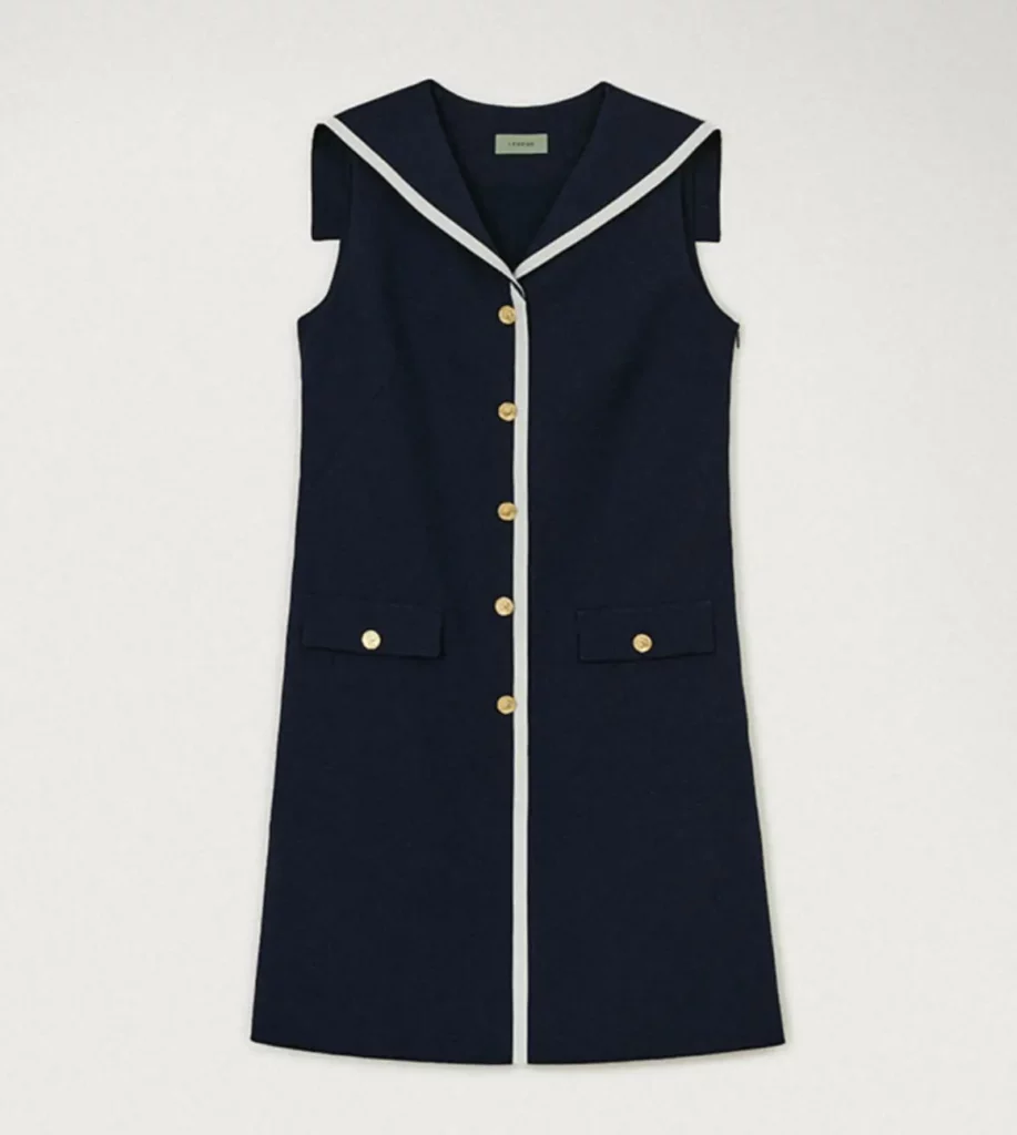
First, check the source image. The garment should be fully visible, evenly lit, and easy to separate from the background.
Before uploading it, remove distracting objects and smooth only the folds that hide the garment’s real construction.
Also, make sure the following details are clear:
- Logos
- Prints
- Buttons
- Seams
- Neckline
- Garment edges
Use this simple checklist:
- Show the complete garment.
- Use a front-facing image.
- Avoid props covering the item.
- Keep the color accurate.
- Upload the clearest file available.
A clean white or neutral background is often easier to work with. However, perfect studio photography is not always necessary. The garment simply needs to be clear and easy to recognize.
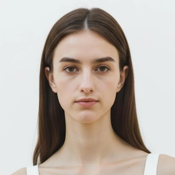
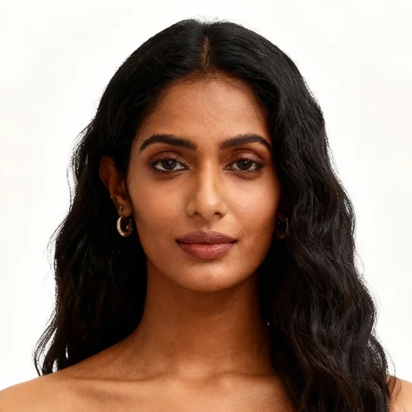
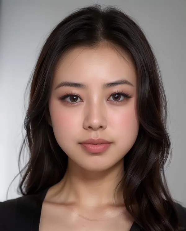
Step 2: Choose One Model Direction
Next, define the model before changing the background, pose, or styling.
Decide on:
- General age range
- Overall appearance
- Body type
- Pose
- Brand mood
- Lighting direction
However, avoid turning this step into a long casting brief. One clear direction is better than ten conflicting ideas.
For example:
Confident adult fashion model, relaxed front pose, clean studio lighting, minimal ecommerce style.
Once the first image works, keep the same model direction throughout the product gallery. As a result, the final images will feel like one photoshoot rather than several unrelated experiments.
You can create more varied model images for campaigns later. For the product page, however, consistency should come first.
Step 3: Generate One Image for One Purpose
Start with the hero image. Then, move to the front fit view, side angle, detail shot, and lifestyle scene.
Importantly, change only one major element at a time.
If you change the model, pose, background, lighting, and styling together, it becomes harder to understand why the result changed. Instead, preserve the successful parts and adjust only what the next image needs.
For example, keep the same model and lighting when moving from a front pose to a three-quarter pose.
This controlled approach makes the results easier to compare. Moreover, it reduces the chance that each image shows a slightly different version of the garment.
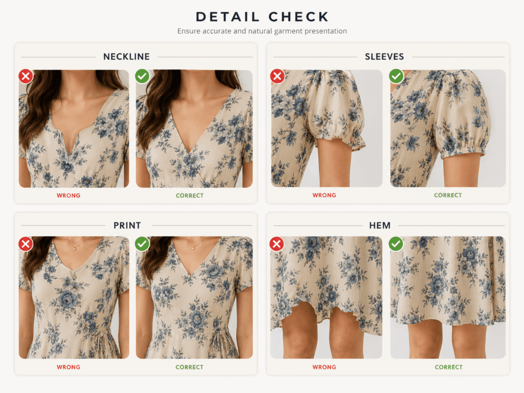
Step 4: Check the Garment, Not Just the Model
A realistic face can distract you from product errors. Therefore, zoom in and inspect the clothing before approving any result.
Check these areas carefully:
- Neckline shape
- Sleeve length and width
- Buttons and closures
- Print or logo placement
- Waist and hem position
- Pockets and seams
- Fabric folds
- Product color
For example, a missing button may seem like a minor issue in a social media post. On a product page, however, it changes the item being sold.
Likewise, a distorted print can create the wrong expectation. If an important feature is incorrect, revise the image rather than hoping shoppers will not notice.
How AI Virtual Try-On Keeps Color Variants Consistent
Color variants often create a hidden visual problem.
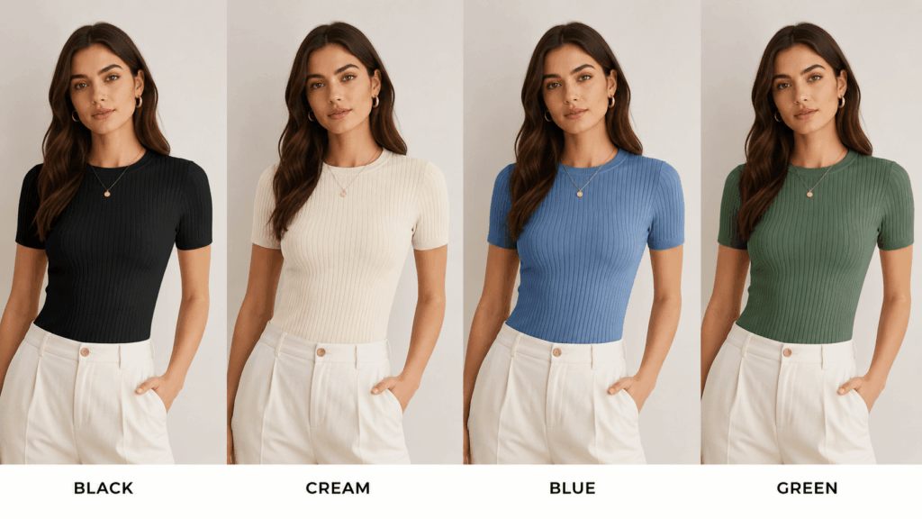
A store may show the black version on one model, the cream version in another setting, and the blue version with a completely different crop. Although every image may look attractive on its own, the full product page can feel disorganized.
In addition, shoppers may struggle to compare the available options.
Instead, treat every color as part of the same visual system. Keep the following elements as stable as possible:
- Model
- Camera angle
- Pose
- Crop
- Lighting
- Background
Then, use the correct source photo for each color variant.
This approach makes comparison easier. It also prevents shoppers from wondering whether a change in shape comes from the garment, the model, or the pose.
Consistency matters most in the first two gallery positions. Therefore, use the same hero composition and front fit view for every color.
After that, lifestyle images can become slightly more varied when the campaign needs additional visual range.
Where to Place Each Image in the Shopify Gallery
Image order affects how quickly a shopper understands the product. Therefore, arrange the gallery like a short visual explanation.
A practical order is:
- Clean hero image
- Front on-model image
- Side or three-quarter view
- Detail image
- Lifestyle image
First, the shopper recognizes the item. Next, they understand how it looks when worn. Then, they inspect its shape and important details. Finally, the lifestyle image adds mood and styling inspiration.
However, this order can change when one product feature is especially important.
For example, a reversible jacket may need an alternate view earlier. Likewise, a dress with a detailed back should show that feature before the lifestyle image.
The rule is simple: every gallery position should answer the shopper’s next likely question.
What AI Virtual Try-On Should Not Replace
AI-assisted images can expand a Shopify product gallery. However, they should not replace accurate product information.
First, generated images do not replace a size chart. They can communicate style and general proportion, but they should not promise an exact fit for every body.
Therefore, keep measurements, fit notes, and model sizing information clear.
Second, generated visuals should not replace truthful fabric details. If a material is matte in real life, do not publish an image that makes it appear highly glossy.
Likewise, do not allow an image to add:
- Extra pockets
- New seams
- Different buttons
- Missing prints
- Decorative trims
- Altered garment lengths
A beautiful image is not useful when it presents a different product.
Finally, review every image as a product claim. Ask whether the shopper will receive the garment shown. If the answer is uncertain, revise the image or use a real product photograph instead.
This honest approach makes generated fashion content more useful. More importantly, it protects the connection between attractive visuals and the real product.
Build a Better Product Gallery With AI Virtual Try-On
A single flat lay does not have to remain a single product image.
With a clear plan, it can become:
- A clean hero image
- A front fit view
- A useful side angle
- A detail-focused image
- A lifestyle scene
However, the goal is not to create more images simply for volume. The goal is to remove uncertainty.
Each image should explain one part of the garment. At the same time, the full gallery should feel consistent from beginning to end.
Start with one item. Choose one model direction. Then, create and inspect each image separately.
Once the system works, apply it to new colors, new arrivals, and future collections.
That is when AI Virtual Try-On becomes more than a way to generate attractive model images. It becomes a practical visual workflow for launching Shopify fashion products with the assets you already have.
Go to WeShop AI For Exploration: