In 2026, e-commerce sellers are facing a new crisis: Visual Fragmentation. The era of “one-size-fits-all” photography is officially dead. As you look for a 2026 E-commerce Image Guide, you’ll find that simply meeting Product Image Specifications 2026 isn’t enough anymore.
Today, every platform is fighting a “Ratio War”—with Instagram pivoting to 3:4, TikTok demanding 9:16 immersion, and Amazon shifting toward AI-native semantic indexing. If you are still uploading the same square photo to every channel, your brand looks “broken” to the algorithms.
This guide is designed to help you sync your visual strategy across 4 global giants without losing your mind or your budget.
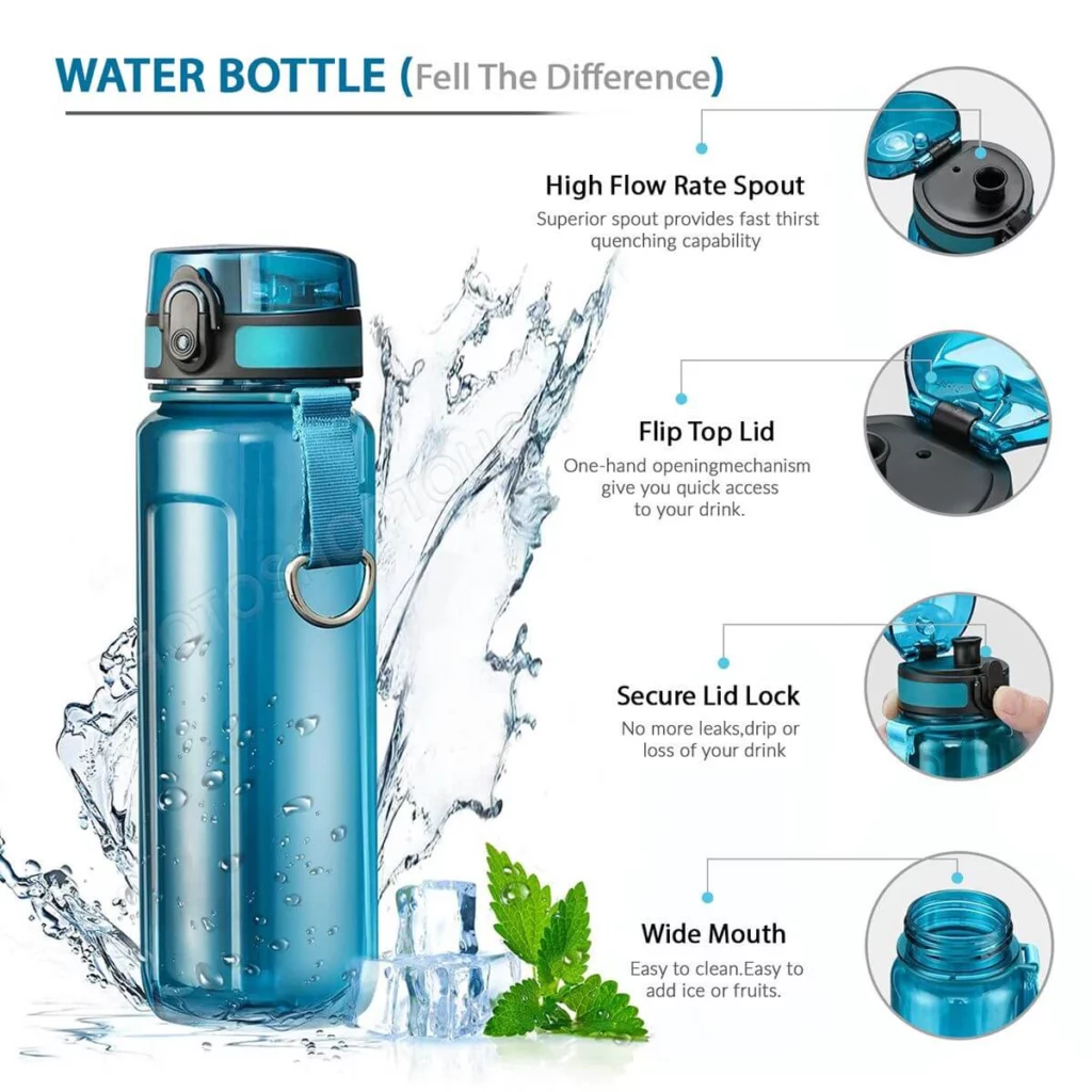
1. Amazon: The “White Background” Discipline
Amazon is the most traditional but also the most strict platform. They don’t care about “vibes”; they care about clarity and accuracy. If your main image doesn’t follow their rules, your listing will simply be removed.
Technical Requirements
In 2026, Amazon’s mobile app usage is at an all-time high. This means your images need to be sharp enough for “Retina” displays but optimized enough for mobile data.
- The 1600px Rule: To enable the “Zoom” feature, your image must be at least 1000 pixels. However, for 2026 standards, 1600 pixels on the longest side is the professional choice.
- Pure White is Mandatory: Your Main Image (the first one) must have a pure white background (RGB: 255, 255, 255).
- The 85% Rule: The product should occupy at least 85% of the total image area. Don’t leave too much empty space!
Amazon Image Specs Table
| Image Type | Recommended Size | Ratio | Key Rule |
| Main Image | 1600 x 1600 px | 1:1 | No text, logos, or watermarks. |
| Infographic | 1600 x 1600 px | 1:1 | Use simple fonts to explain dimensions. |
| Lifestyle | 2000 x 2000 px | 1:1 | Show the product in use (e.g., in a kitchen). |

2. Shopify: Speed, Branding, and Flexibility
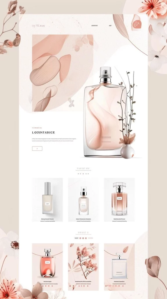
Shopify is your personal brand space. Unlike Amazon, you can use any background you want. However, because Shopify is a website you host, you have to worry about Page Speed.
The WebP Revolution
By 2026, JPEG is officially “old school.” To make your Shopify store load instantly, you should save all your product images as WebP. This format keeps the image looking crisp but makes the file size much smaller.
Shopify Design Tips
- Keep it Consistent: If your first product image is a square (1:1), make sure all of them are. If you mix 1:1 and 4:3 ratios, your collection page will look messy and unprofessional.
- Center your Subject: Shopify themes often crop images differently on desktop and mobile. If you keep your product in the center 60% of the image, it will never get cut off.
Shopify Image Specs Table
| Image Type | Recommended Size | Ratio | File Format |
| Product Image | 2048 x 2048 px | 1:1 or 3:4 | WebP (Highly Recommended) |
| Collection Image | 1024 x 1024 px | 1:1 | Keep the background clean. |
| Hero/Slider | 2880 x 1200 px | 21:9 (Wide) | High impact, low file size (< 500kb). |

3. TikTok Shop: The “Mobile-First” Lifestyle
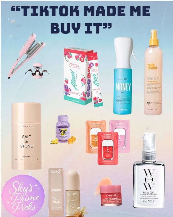
TikTok Shop is the fastest-growing platform in 2026. Here, the rules are very different. People aren’t “searching” for products; they are “discovering” them while scrolling. Your images need to look like they belong in a social feed, not a catalog.
Understanding the “Safe Zone”
TikTok’s user interface has a lot of overlays—the “Buy” button, the product title, and the shopping cart icon. If you put your product’s most important feature in the bottom right corner, nobody will see it.
TikTok Shop Image Specs Table
| Image Type | Recommended Size | Ratio | Strategy |
| Main Image | 1200 x 1200 px | 1:1 | “Bright & Clean” works best. |
| Detail Images | 1080 x 1350 px | 4:5 | Vertical photos cover more screen. |
| Product Video | 1080 x 1920 px | 9:16 | 15-second “unboxing” or “demo.” |

4. Instagram: The High-End Look
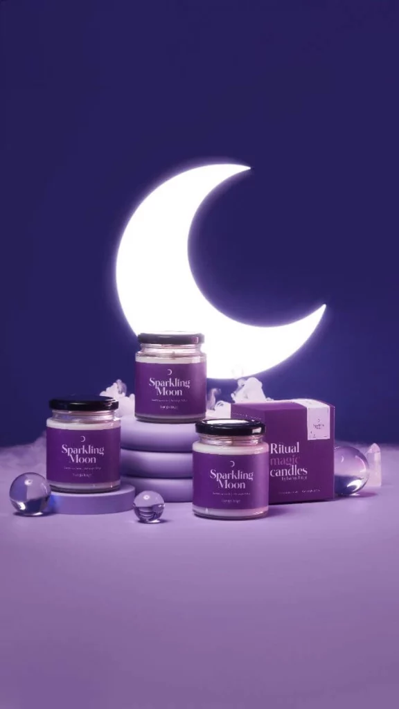
Instagram is where people go to see “beautiful” things. If Amazon is the supermarket, Instagram is the luxury boutique. Your images here need to be high-contrast, perfectly lit, and aesthetic.
Vertical is King
In the past, everyone used square (1:1) photos. In 2026, the 4:5 ratio is the winner. Why? Because a 4:5 image is taller. It takes up more space on the user’s phone screen, which means they spend more time looking at your product and less time looking at the next post.
Instagram Image Specs Table
| Image Type | Recommended Size | Ratio | Best For |
| Standard Feed Post | 1080 x 1350 px | 4:5 | Daily product updates. |
| Stories/Reels | 1080 x 1920 px | 9:16 | Flash sales and limited offers. |
| Carousel | 1080 x 1350 px | 4:5 | Showing different colors of one item. |

Common Mistakes to Avoid in 2026
After analyzing thousands of successful (and failed) listings, we’ve identified three major mistakes sellers make when designing their product images:
- Too Much Text: Platforms like Amazon and Instagram are using AI to “read” your images. If your image is covered in “FREE SHIPPING” or “50% OFF” text, the algorithm might flag it as low quality. Keep text for the description, not the photo.
- Poor Lighting: Dark, grainy photos are the #1 reason for a high bounce rate. Even if you are using a smartphone, ensure you have bright, natural light.
- Ignoring Mobile Users: Always check your images on a phone! A 2000px image might look great on your 27-inch monitor, but if the font in your infographic is too small to read on an iPhone, it’s useless.
Solving the Visual Fragmentation: Leveraging E-commerceAI Tools
In the face of 2026’s “Ratio War,” manual content creation has become a bottleneck. The demand for platform-specific assets—3:4 for Instagram, 1:1 for Amazon, and 9:16 for TikTok—has fueled a surge in Algorithm-Native AI tools designed to understand marketplace nuances.
When navigating this new tech stack, sellers generally choose between several specialized AI solutions:
- Modelia: The Fashion-Centric SpecialistModelia is the go-to for high-end apparel brands. It excels in virtual model consistency, allowing labels to maintain a “brand face” across an entire collection. Its focus is on the technicalities of fashion—fabric draping and editorial posing—making it ideal for digital lookbooks and high-street aesthetics.
- WeShop AI: The Multi-Channel Workflow Engine For merchants selling across categories like home decor, electronics, or beauty, WeShop AI solves the Visual Fragmentation problem through versatility. It acts as a “Visual Translation Layer,” allowing you to take one product shot and instantly generate a compliant white background for Amazon, a high-energy lifestyle shot for TikTok, and a grid-ready 3:4 image for Instagram.
- Flair.ai & Pebblely: The Product Staging Experts Tools like Flair.ai and Pebblely focus on “drag-and-drop” scene staging. These platforms excel at placing products (like skincare or beverages) into beautifully rendered environments with realistic lighting. They are perfect for creating atmospheric hero banners for Shopify or high-impact social media posts without a physical studio.
The right choice depends on your niche. If you are fashion-only, Modelia is a logical fit. However, if you are a multi-channel seller struggling to sync different ratios and backgrounds across global platforms, the cross-category flexibility of WeShop AI or Flair offers the most efficient path to scaling your 2026 visual strategy.
Final Reference: Official Platform Links
If you want to dive even deeper into the technical whitepapers for each platform, here are the official 2026 resource links:
- Amazon:Seller Central Image Standards
- Shopify:Best Practices for Product Images
- TikTok Shop:Seller Academy Visual Guide
- Instagram:Meta Business Creative Center
Conclusion
In 2026, your product photography is no longer just a “picture”—it is data for an algorithm. By understanding the shift from 1:1 squares to the 3:4 “Ratio War,” and by adopting modern formats like AVIF, you give your store a massive SEO advantage.
The goal isn’t just to have “pretty” pictures; it’s to have Algorithm-Native visuals. Whether you use specialized tools like Modelia for your fashion line or leverage the multi-channel versatility of WeShop AI, the key is to stop treating every platform the same.
Sync your ratios, respect the safe zones, and let AI handle the fragmentation while you focus on scaling your business.
Ready to win the Ratio War? Start by auditing your current Instagram grid—if you see 1:1 squares, it’s time for an upgrade.


