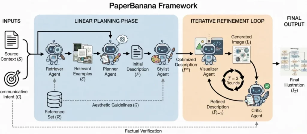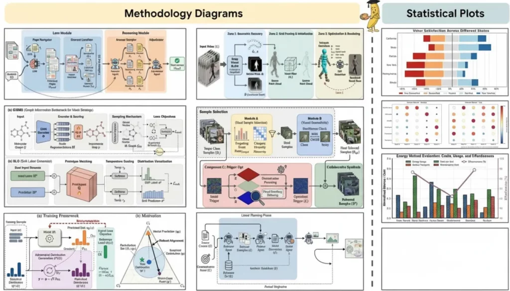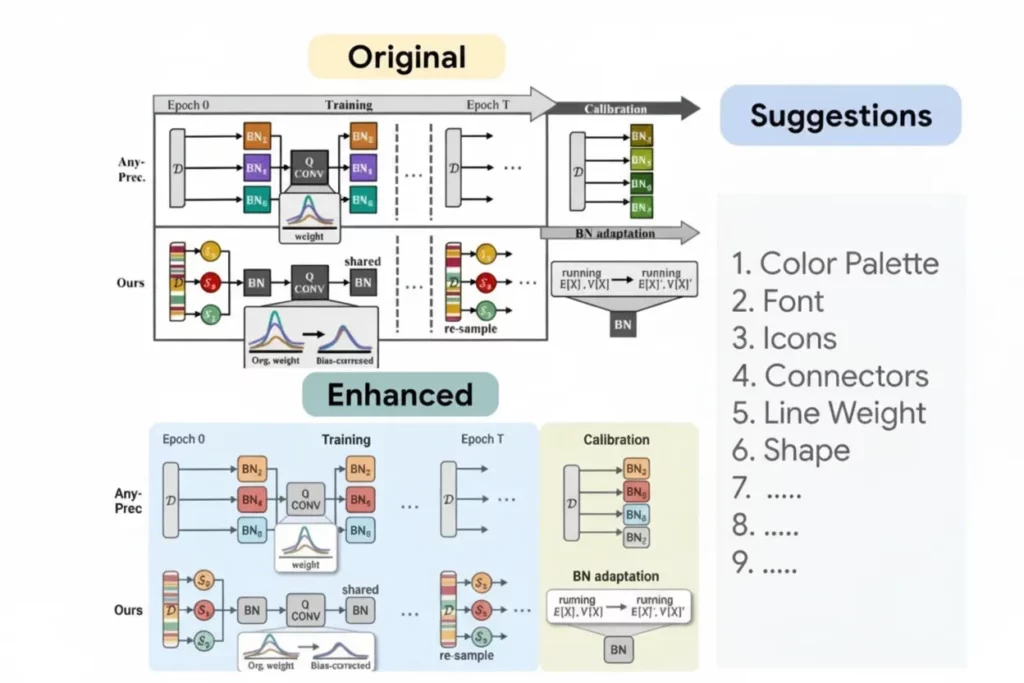
Every researcher knows the “Figure 1” headache. You spend months collecting data, only to spend weeks fighting with software to make it look professional. Google recently launched a tool that changes this entire process. It is called Paper Banana. This isn’t just another plotting library. It is an AI-driven platform built specifically for the scientific community. It bridges the gap between raw data and the high-standard visuals required by journals like Nature or Science.
The buzz started on academic Twitter and Reddit. Ph.D. students and seasoned professors are sharing their results. They are all saying the same thing. Making beautiful, accurate charts has never been this easy.
The Struggle with Traditional Scientific Plotting
Before we look at why the tool is famous, let’s talk about the problem. Most researchers use three main methods for their figures. Some use Python libraries like Matplotlib. Others use expensive software like GraphPad Prism. A few even try to draw everything in Adobe Illustrator.
Matplotlib is powerful but frustrating. You have to write fifty lines of code just to change a font. One tiny error can break your entire plot. Prism is easier, but it costs a lot of money. It also lacks the flexibility many modern datasets require. Illustrator creates beautiful results, but it is not built for data. If your data changes, you have to start over.
This creates a massive bottleneck. Scientists should focus on science, not graphic design. This is exactly where the new Google tool steps in.
How Paper Banana Solves the “Ugly Chart” Problem
The magic of Paper Banana lies in its default settings. Most software gives you “standard” colors that look like they are from 1995. This tool uses Google’s design expertise to offer “Journal-Ready” presets immediately.
When you upload your data, the tool analyzes the structure. It suggests the best way to visualize that specific information. It doesn’t just give you a bar chart. It looks at your variables and suggests a violin plot or a heat map. It understands the “visual logic” of a scientific paper.
The colors are color-blind friendly. The fonts match the requirements of major publishing houses. You don’t have to look up the margin rules for Cell or The Lancet. The tool already knows them.

Key Features of Paper Banana
AI-Assisted Annotation
Adding labels to a complex graph is usually a nightmare. Labels often overlap or hide important data points. Paper Banana uses a “smart placement” algorithm. It moves text and arrows automatically to ensure everything stays readable. If you move a data point, the label follows it. This saves hours of manual clicking.
The “Paper Banana” LaTeX Integration
For many scientists, LaTeX is the gold standard for writing. Integrating plots into a LaTeX document is often difficult. This tool exports clean, vector-based files. It also generates the specific code snippets you need for your .tex file. You can even use LaTeX syntax directly inside your figure labels. This ensures your math formulas look perfect.
One-Click Journal Styling
This is perhaps the most loved feature. There is a dropdown menu with names of hundreds of journals. If you select “Nature Communications,” the tool adjusts everything. It changes the DPI, the font size, and the line weights. This ensures your submission won’t be rejected for “poor figure quality.”

Why the Name “Paper Banana”?
The name sounds a bit silly for a serious scientific tool. However, it is memorable. In the tech world, quirky names often hide very powerful technology. Some say it refers to the “banana for scale” internet meme. It represents the idea of making complex data easy to measure and understand. Whatever the reason, the name is sticking. It stands out in a sea of boring software names like “DataPlotPro” or “SciGraph.”
Collaborative Research in the Cloud
Research is rarely done alone. Most papers have multiple authors spread across different universities. Traditionally, you would email versions of a figure back and forth. This leads to “Figure_Final_v2_REAL_Final.png” files.
Paper Banana lives in the Google Cloud. This means you can share a link with your co-authors. They can leave comments directly on a specific data point. They can even adjust the colors or fix a typo in the legend. It works just like a Google Doc but for scientific visualization. This transparency speeds up the review process significantly.
Comparing Paper Banana to Matplotlib and Seaborn
Many researchers wonder if they should switch from coding. Coding offers total control, but it is slow. Here is how the new tool stacks up:
- Speed: You can create a complex figure in five minutes. In Matplotlib, this might take two hours.
- Consistency: If your lab uses this tool, every figure in your group will have a unified look.
- Ease of Use: You don’t need to know a single line of Python.
- Aesthetics: The default outputs are much more modern.
Of course, if you are doing highly custom, non-standard simulations, code is still king. But for 90% of scientific figures, this tool is more efficient.
Breaking Down the “Paper Banana” Workflow
Using the tool is very straightforward. You don’t need a heavy installation. It runs in your browser.
- Import: You can drag and drop a CSV file or connect a Google Sheet.
- Select: Choose your plot type. The AI will suggest three “best fits” for your data.
- Refine: Use the sidebar to tweak the “Journal Style.”
- Annotate: Click on any point to add a note or an arrow.
- Export: Download as a high-res PDF, SVG, or TIFF.
This simple flow is why the tool is going viral. It removes the friction from the creative process.

The Impact on Open Science
Google has a history of supporting open-source initiatives. There are rumors that Paper Banana will eventually offer a public library of figures. Imagine being able to see exactly how a famous researcher built their chart. You could “clone” their style and apply it to your own data. This would raise the visual standard of all scientific communication. It makes science more accessible to the public too. Clearer charts mean easier understanding for everyone.

Common Questions About the Tool
Is it free to use?
Currently, it is in a “Research Preview” phase. Many features are free for anyone with an academic email address. Google has not yet announced a long-term pricing model.
Can it handle large datasets?
Yes. Because it uses Google’s cloud infrastructure, it can process millions of data points. It does not slow down your local computer like some desktop apps do.
Is my data secure?
This is a big concern for researchers with unpublished data. Google uses the same security protocols they use for Google Drive. Your data is private unless you choose to share it.
The Future of Scientific Design
We are moving into an era where AI helps us communicate better. We already have AI for writing and AI for coding. Now, we have AI for scientific visualization. Paper Banana is the leader in this new category. It treats data visualization as a craft, not just a chore.
In a few years, we might look back at manual plotting and laugh. We will wonder why we ever spent hours adjusting x-axis ticks. The focus will return to the discovery itself.

Final Thoughts: Should You Try It?
If you have a submission deadline coming up, give it a try. The learning curve is almost non-existent. You will likely find that it replaces several other tools in your workflow.
The academic community is often slow to adopt new technology. But when a tool saves this much time, it spreads fast. Paper Banana is not just a trend. It is a significant upgrade for the scientific world. It helps you tell the story of your data with clarity and beauty.
Stop fighting with your old software. Try this new approach and see how it changes your research life. Your reviewers will thank you. Your co-authors will thank you. And most importantly, you will save your own sanity during the final stages of writing.


