







GPT Image 2.5: Turn One Product Photo Into 3 Ad Assets
See how GPT Image 2.5 Sunburst turned one serum packshot into a PDP hero, lifestyle image, and social ad while preserving core product details.
GPT Image 2.5: Turn One Product Photo Into 3 Ad Assets
One approved product photo rarely covers an entire ecommerce campaign. A product detail page needs a clean hero, brand content needs a believable lifestyle setting, and a social ad needs stronger hierarchy and readable copy. Rebuilding each asset by hand takes time—and every new composition creates another chance for the product shape, label, or brand colors to drift.
We tested a faster GPT Image 2.5 ecommerce workflow: provide one reference packshot, then create a PDP hero, a lifestyle image, and a vertical social ad from the same product. The goal was not simply to generate three attractive pictures. We wanted to see whether the product would remain recognizable when its setting, lighting, composition, and purpose changed.
All three outputs kept the exact words “LUMERA” and “BOTANICAL SERUM,” along with the bottle shape, dark-green label, ivory dropper, and restrained sage palette.
The product was still re-rendered rather than pixel-locked, so small structural and reflection changes require human review before packaging-critical use.
What we tested
We ran this first-party test on October 12, 2026 through the WeShop gpt-image v1.0 agent.
| Setting | Test value |
|---|---|
| Model | gpt-image-2.5-sunburst |
| Aspect ratio | 4:5 |
| Image size | 2K; delivered at 1712 × 2144 |
| Quality | High |
| Images per run | 1 |
| Reference images | 1 |
We chose Sunburst because this job prioritized reference fidelity and detailed creative control over minimum latency. OpenAI positions GPT Image 2.5 Sunburst for demanding quality and precision, while Flare is the faster starting point for everyday generation. If speed matters more, test Flare with the same reference, prompts, dimensions, and acceptance criteria before switching.
Input: establish a product reference you can inspect
To avoid brand-rights issues, we created a fictional skincare product called LUMERA. The reference uses a front-facing frosted-glass serum bottle, an ivory dropper, a dark-green rectangular label, and two lines of copy that can be checked across every result.
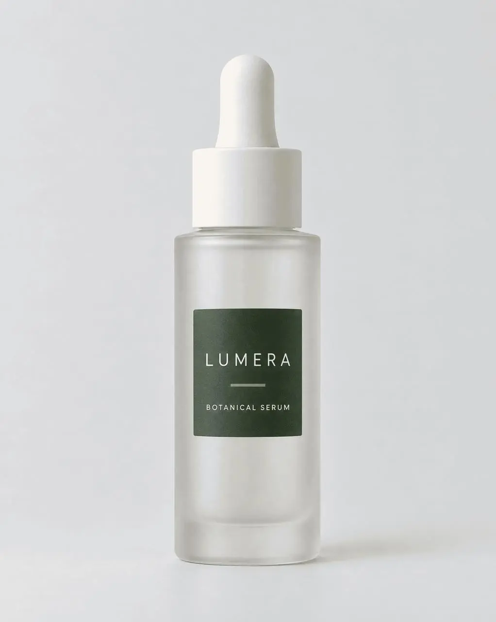
Before generating variations, we defined five product invariants:
- a tall cylindrical frosted-glass bottle;
- an ivory dropper with the same basic proportions;
- a dark-green rectangular label in the same front position;
- readable, correctly spelled
LUMERAandBOTANICAL SERUM; - no added products, badges, claims, logos, or unapproved copy.
This checklist matters more than a vague instruction to “keep the product consistent.” Every invariant gives the team something visible to accept or reject.
Asset 1: create a clean PDP hero
The first deliverable was designed for a product detail page or landing-page hero. We replaced the neutral source background with a pale stone pedestal, soft sage atmosphere, and restrained botanical shadows while keeping the front-facing product presentation.
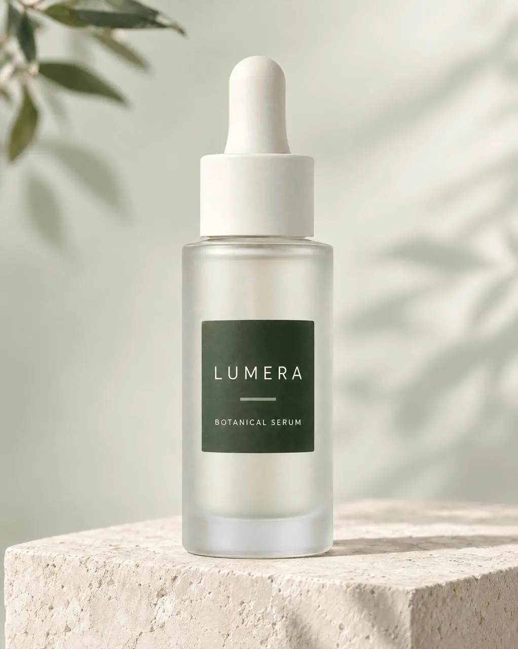
Both product lines remained readable. The model also respected the negative-space and “no extra copy” constraints, producing a clean commercial image instead of over-designing the frame.
Asset 2: move the product into a lifestyle setting
The second asset placed the same serum in a warm travertine bathroom with an ivory towel and restrained eucalyptus styling. The prompt kept the product large and unobstructed—a practical ecommerce requirement that is easy to lose when asking only for a “lifestyle image.”
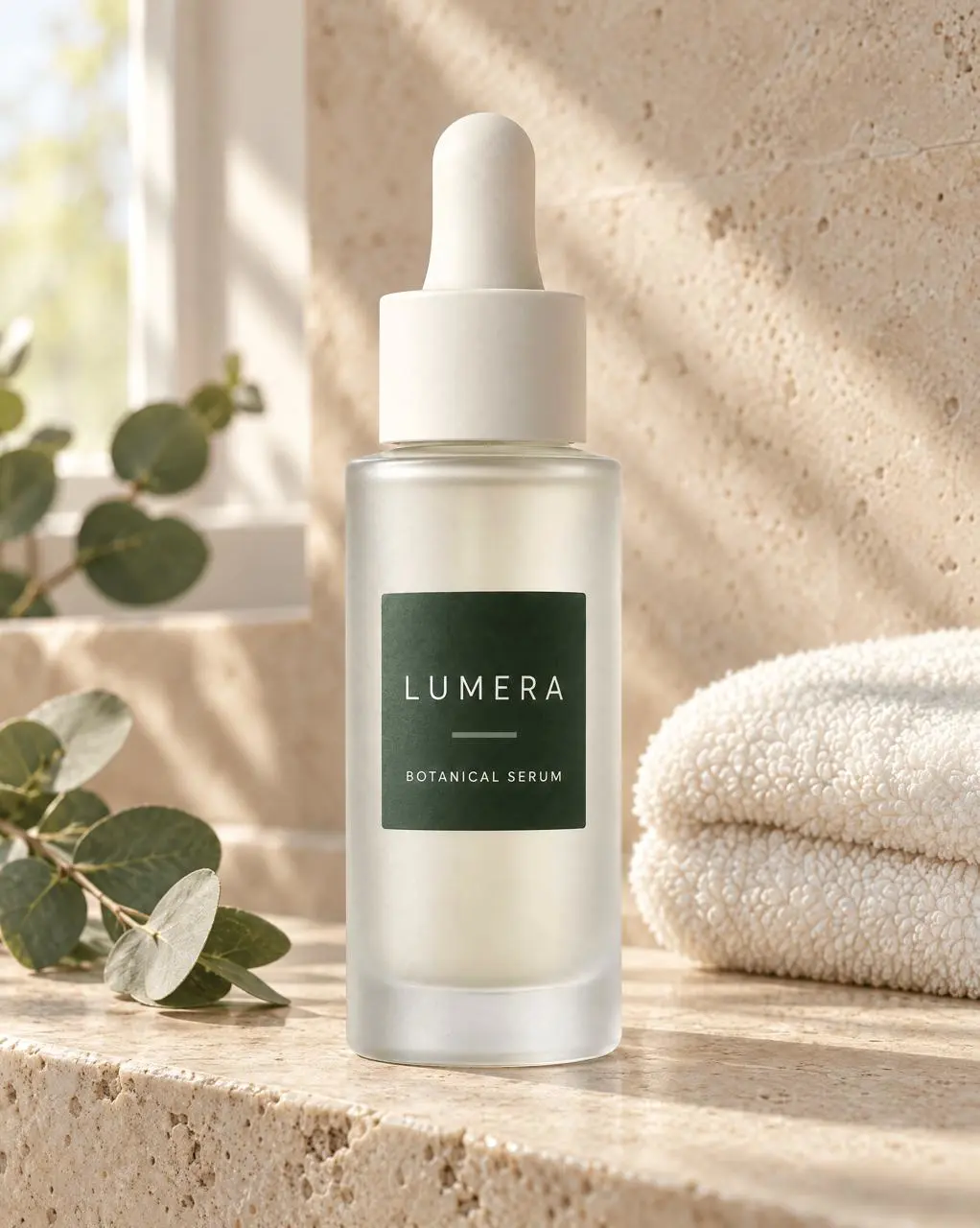
The scene feels coherent because the product, props, and environment share one believable light direction. More importantly, the bottle still dominates the frame and both label lines remain correct.
Asset 3: add one exact social-ad headline
The third deliverable introduced a stronger advertising layout and one approved headline: CALM IN EVERY DROP. This tests three constraints at once—product preservation, structured composition, and readable text.
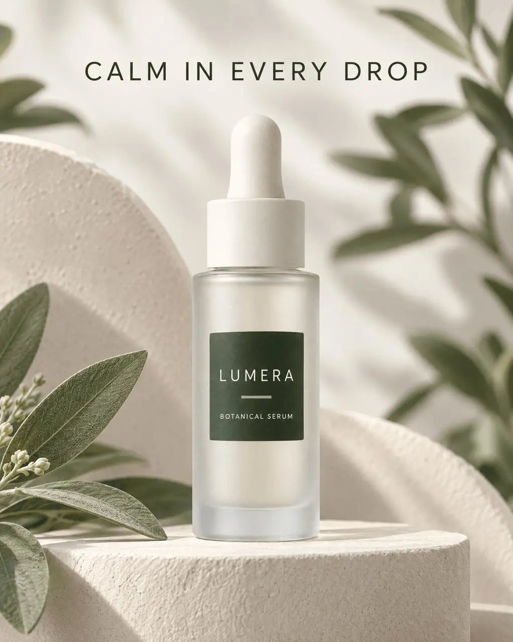
The model spelled the headline correctly and did not add supporting copy. That is a successful single test, not proof that every campaign line will render perfectly. Keep text QA in the workflow, especially for longer copy, legal language, ingredients, prices, or multilingual assets. For a dedicated localization stress test, see our GPT Image 2.5 product-localization workflow.
You can try it directly using the tool on the right.
Consistency check across all three assets
| QA checkpoint | PDP hero | Lifestyle image | Social ad |
|---|---|---|---|
LUMERA spelling | Correct | Correct | Correct |
BOTANICAL SERUM spelling | Correct | Correct | Correct |
| Dark-green rectangular label | Preserved | Preserved | Preserved |
| Ivory dropper | Preserved | Preserved | Preserved |
| Front-facing bottle identity | Highly consistent | Highly consistent | Highly consistent |
| Unrequested text | None | None | None |
| Intended role | PDP hero | Brand lifestyle content | Vertical ad |
The three images read as one campaign family, but they are not pixel-identical composites. Glass reflections change, the small gap between the bottle shoulder and cap shifts, and minor proportions are reinterpreted. That makes this workflow useful for campaign concepts, social content, internal review, and rapid creative expansion—not a substitute for locked packaging artwork or regulated product imagery.
A reusable product-to-campaign workflow
1. Start with a clean reference
Use a sharp, unobstructed product photo with enough resolution to inspect the label and structural details. A prompt cannot recover packaging information that is not visible in the source.
2. Name the invariants
List the exact shape, material, cap or hardware, label geometry, brand colors, copy, viewing angle, and placement that must remain stable. Avoid relying on “keep it consistent” as the only instruction.
3. Generate one channel asset at a time
Create separate prompts for the PDP hero, lifestyle scene, and ad layout. Each image should have one delivery job, one composition, and one QA pass.
4. State the prohibited additions
Explicitly block extra products, badges, claims, logos, watermarks, and copy. Otherwise, the model may try to make the scene feel more like a complete advertisement by inventing content.
5. Re-run product QA on every output
Check brand spelling, product subtitle, label placement, silhouette, colors, cap structure, obstruction, and added text. A correct first output does not guarantee the next one will be correct.
Reusable prompt template
When the asset needs a headline, add a separate line:
Add one headline reading exactly “[APPROVED HEADLINE].” Show it once. Add no other marketing copy.
Verdict: useful for campaign expansion, with product QA built in
In this test, GPT Image 2.5 Sunburst turned one clear packshot into three distinct ecommerce assets while preserving the product name, subtitle, label, core color system, and recognizable bottle design. The workflow is most useful when a team needs more campaign directions without arranging a new photoshoot for every channel.
The production rule is simple: define visible product invariants, change one delivery context at a time, and inspect every result independently. Use generated visuals for ideation and campaign production where small re-rendering differences are acceptable. Keep original product cutouts, approved typography, and manual compositing in the final pipeline when packaging geometry or regulated copy must remain exact.
Create your own product campaign variations with the WeShop GPT Image 2.5 tool. For model selection, read our GPT Image 2.5 overview and Flare vs Sunburst comparison.