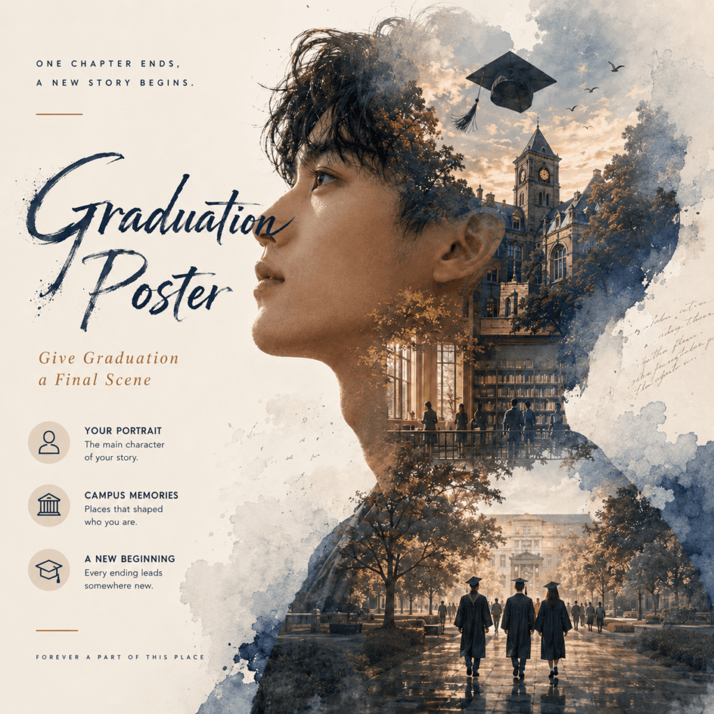
An AI Graduation Poster should not look like a school portrait with extra effects. It should feel like the final frame of a film you spent years living.
The main character is already there. So are the locations, symbols, and memories. The challenge is not adding more decoration. Instead, it is deciding what belongs in the final scene.
A campus path can become the setting. A side-profile portrait can become the frame. Books, lecture halls, trees, and graduation caps can appear inside the silhouette like scenes from a closing montage.
The result is not simply a photo of graduation day.
It is a poster for the story that came before it.
The Brief: One Life Chapter, One Frame
Most graduation photos record a moment.
Someone adjusts the cap. The graduate holds a diploma. A parent takes several versions of the same picture. Then everyone moves aside for the next person.
These photos matter. However, they often capture only the ceremony.
They do not show the early train to campus. The familiar library seat is missing. A single photo cannot capture the classroom where confidence slowly replaced confusion. It may also fail to explain why one ordinary building now feels important. Nor can they explain why one ordinary building now feels important.
An AI Graduation Poster works differently.
It compresses time. Several years can exist inside one frame. A single portrait can hold architecture, movement, weather, color, and emotion.
That is why the poster should begin with a story, not a visual effect.
Before opening WeShop AI, finish this sentence:
“These years felt like…”
Perhaps they felt quiet and uncertain. Maybe they were fast, bright, and chaotic. They could also feel lonely at first, then warm by the end.
That answer should control the poster.
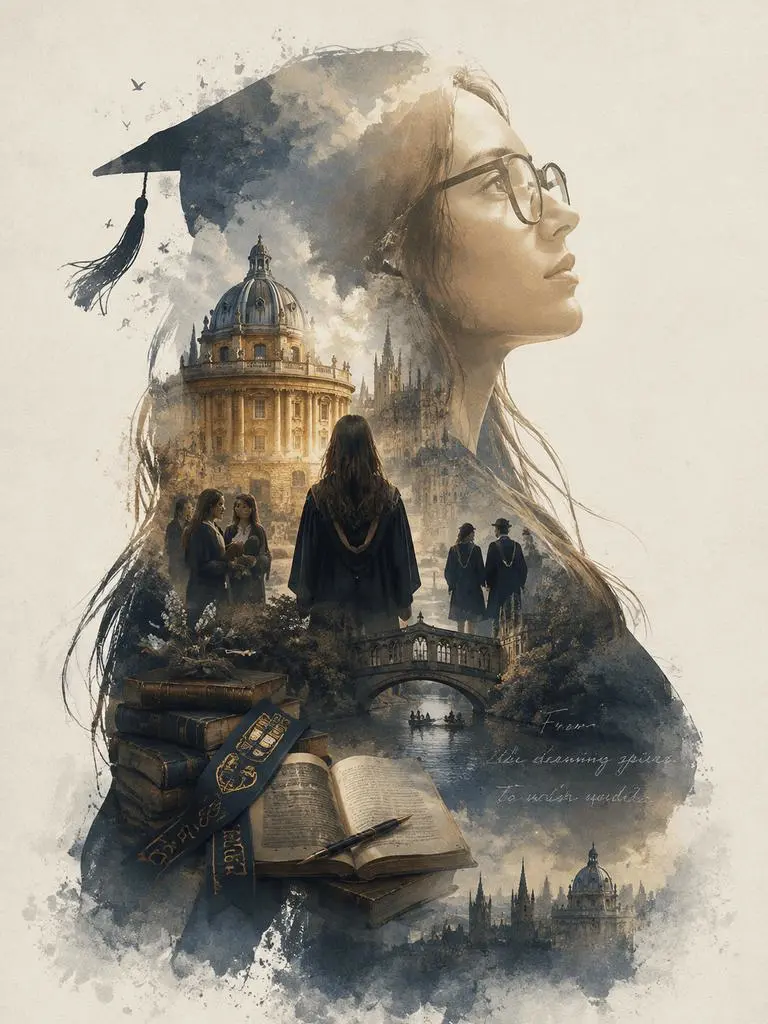
Why an AI Graduation Poster Needs a Story
A weak poster collects graduation symbols.
It includes a cap, diploma, campus gate, flying books, clouds, sparkles, and several people walking in different directions. Every object is relevant. Yet the image may still feel empty.
That happens because symbols are not automatically a story.
A story needs hierarchy.
The viewer should first notice the graduate’s profile. Next, the eye should move into the campus scene. Finally, smaller details should reward a closer look.
This order creates a sense of discovery.
The silhouette says, “This is one person’s experience.” The internal scene says, “This is the world they are leaving.” Small objects then suggest what happened there.
Therefore, do not ask GPT Image 2 to include every possible memory. Select the ones that support the same emotional direction.
A library, rainy walkway, and quiet lecture room belong to one story.
A stadium, crowded celebration, and bright campus lawn belong to another.
Both can work. Mixing them without a clear idea usually cannot.
Cast the Right Portrait for an AI Graduation Poster
The portrait is not just source material. It is the entire poster frame.
A clear side profile gives GPT Image 2 a strong outer shape. The forehead, nose, lips, chin, jawline, and hairstyle form a recognizable visual boundary. The campus scenes can then grow inside that boundary.
The Profile Is the Poster Frame
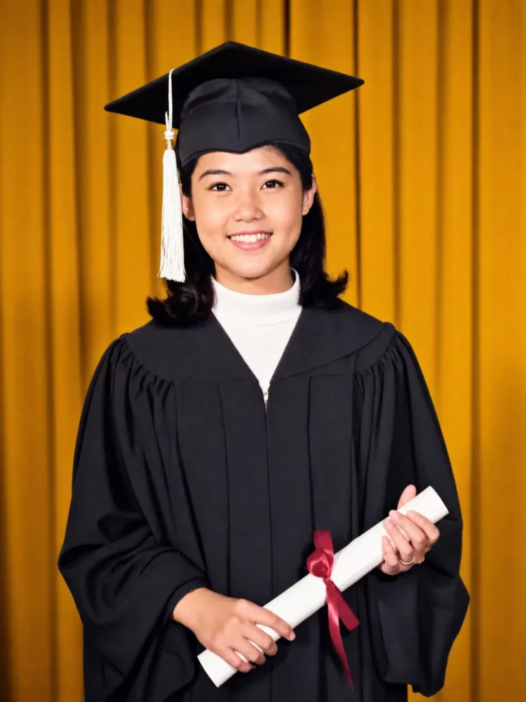
Choose a photo in which the side of the face is easy to read.
The subject should be large enough in the image. Hair should not hide the nose or chin. In addition, the background should be simple.
A plain wall often works better than a busy campus snapshot.
This may sound less exciting. Yet a clean source portrait gives the final composition more freedom. GPT Image 2 does not need the original background to provide the atmosphere. The prompt and campus references can do that work later.
A head-and-shoulders portrait is usually enough. A half-body image may also work when the silhouette needs more vertical movement.
Identity Comes Before Beauty
The poster should still resemble the graduate.
That sounds obvious. However, dramatic lighting, artistic textures, and cinematic styling can sometimes pull the face away from the original identity.
Therefore, the brief should protect the profile.
Ask the model to preserve the natural forehead shape, nose bridge, lips, chin, jawline, and hairstyle outline. Avoid requesting a sharper face, smaller jaw, or different nose unless that change is intentional.
A beautiful stranger is not a successful graduation poster.
A recognizable person inside an elevated visual world is.

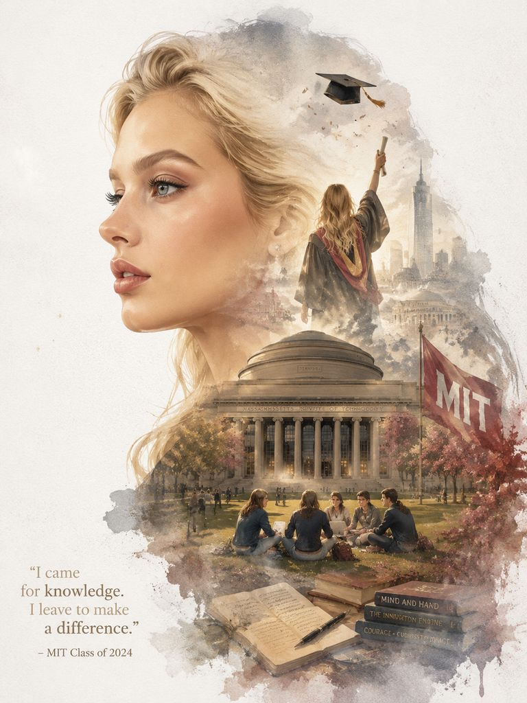
Build the AI Graduation Poster From the Inside Out
Once the profile is clear, treat the silhouette like a small world.
Do not fill it randomly. Instead, imagine that the viewer is entering the poster from one point and moving through a sequence of memories.
The lower part can hold the most grounded scene. A campus path, school gate, or group of students works well there.
The middle can contain the main landmark. This might be a library, auditorium, clock tower, or graduation venue.
The upper part can become lighter. Trees, clouds, birds, soft mist, or a distant cap can create space and movement.
This structure gives the poster depth. It also prevents the internal scene from looking like several separate photos pasted together.
Campus Architecture Is the Setting
A university name can guide the overall direction. However, it may not produce an exact building.
When a landmark matters, use a clear reference image.
The strongest reference has a recognizable roof, facade, window pattern, tower, column structure, or surrounding landscape. GPT Image 2 can then adapt those features into the artistic composition.
Still, the landmark should not appear like a property listing.
It is part of the memory, not the subject of an architectural report. Let mist, watercolor edges, light, and partial framing help it blend into the portrait.
Small Objects Carry the Memory
Large buildings establish the location. Small details make it personal.
A stack of books can suggest final exams. A bicycle may recall the daily route to class. Trees can mark a familiar season. A path can represent leaving, returning, or moving forward.
Even a few distant students can add life.
However, each object should earn its place.
Ask what it contributes. Ask what each object contributes. It may explain the setting, add emotion, or guide the viewer’s eye. If it does none of these, remove it.
When the answer is no, remove it.
The AI Graduation Poster Needs Editing, Not More
The first generation may look impressive. That does not mean it is finished.
Cinematic images often hide small problems behind atmosphere. A distorted building may sit inside the silhouette. Books may merge together. A graduation cap may have an unusual shape. The facial outline may also lose accuracy near the hair or jaw.
Therefore, review the poster at full size.
Do not only ask whether it feels emotional. Check whether its structure still works.
Keep the Double Exposure Organic
The interior scene should grow through the silhouette.
Visible rectangles, hard photo edges, or isolated image panels can make the result look like a scrapbook. Likewise, a building placed directly on top of the face may feel forced.
Look for soft transitions.
Architecture can fade into clouds. Trees can dissolve into watercolor texture. A path can lead naturally toward the lower edge of the silhouette.
The components should feel connected even when they represent different memories.
When the result looks pasted together, simplify the scene. Fewer elements often produce a stronger double exposure.
Protect the Negative Space
A poster does not need detail in every corner.
Empty space creates scale. It lets the profile remain visible. It also gives the image somewhere to breathe.
More importantly, negative space can hold accurate information later.
Names, degrees, graduation years, university names, and dates should be correct. Although GPT Image 2 can attempt short text, important details still require careful review.
A safer option is to reserve a clean area near the bottom or side. Add the final typography after the main visual is complete.
This approach also gives you better control over font, alignment, and spelling.
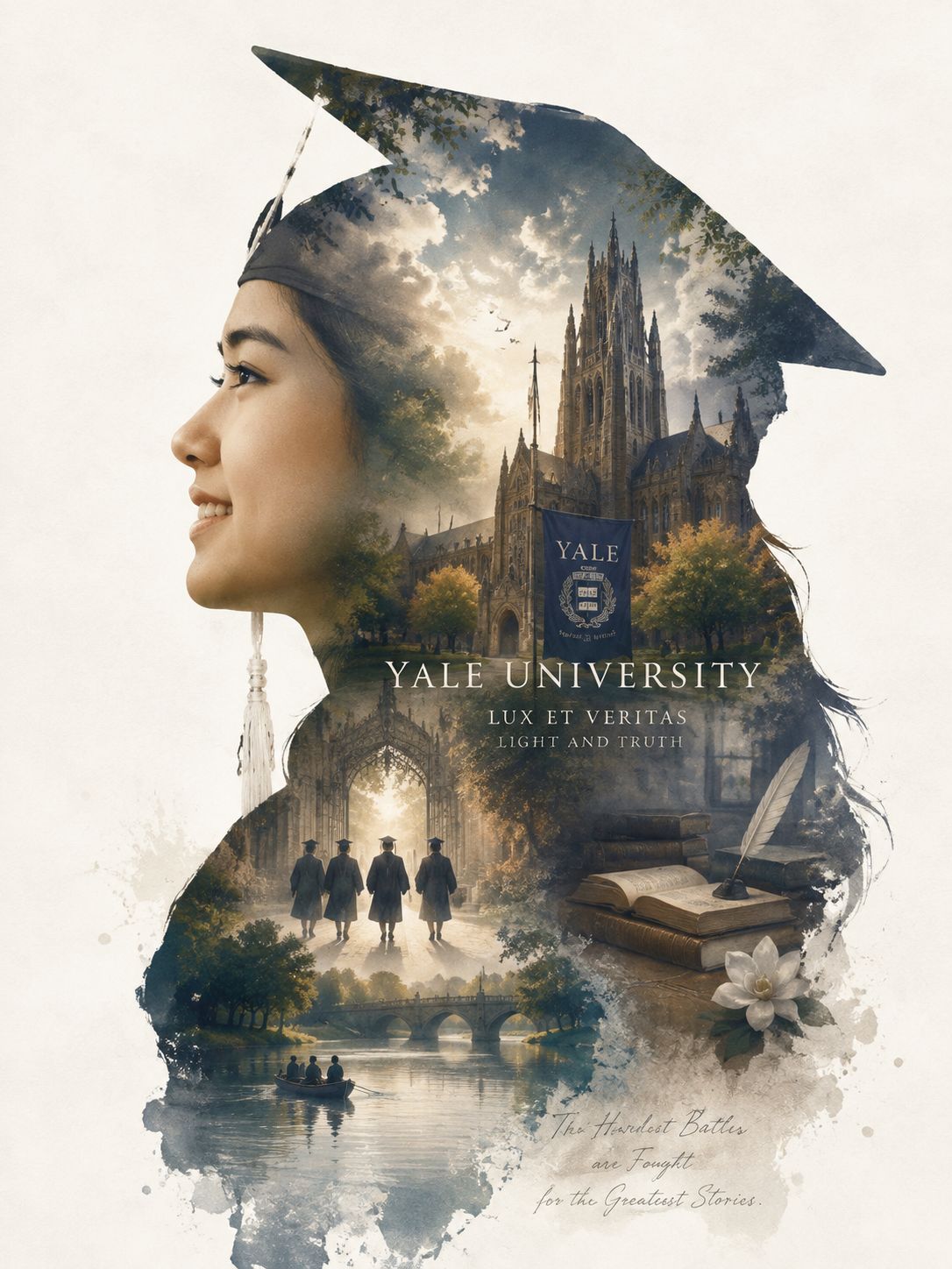
Use GPT Image 2 Like an Art Director
A strong AI Graduation Poster prompt does more than name objects.
It explains roles.
The portrait is the outer silhouette. The campus is the inner world. The landmark is the visual anchor. The watercolor texture connects the scenes. Negative space supports the layout.
The mood also needs direction.
Words such as “cinematic” or “epic” are helpful, but they are broad. Pair them with more precise emotional language.
For example:
Create a premium vertical AI Graduation Poster based on the uploaded side-profile portrait. Preserve the person’s natural identity and recognizable facial outline. Build an organic double-exposure campus story inside the silhouette. Include a university landmark, students walking, books, trees, soft mist, and subtle graduation symbols. Use restrained watercolor textures, gentle film grain, atmospheric depth, and clear negative space. The mood should feel reflective, hopeful, personal, and quietly grand. Avoid rectangular collage fragments, random fantasy objects, crowded decoration, and excessive text.
This is not a list of effects. It is a creative brief.
It tells GPT Image 2 what viewers should notice, how the elements should connect, and what the finished poster should feel like.
After generating several versions, compare the same criteria each time:
First, check whether the profile still looks right. Then ask whether the landmark belongs inside the scene. Next, see if the eye moves through the poster naturally. Finally, decide whether the empty space feels intentional.
Choose the result with the best balance. Do not automatically choose the one with the most detail.
Three Endings for One AI Graduation Poster
The same portrait can support very different conclusions.
The key is to choose one ending and commit to it.
The Quiet Ending
Use soft light, pale watercolor edges, distant architecture, and open sky.
Keep the campus almost empty. Add only one or two small human figures. Let the silhouette hold more negative space.
This version feels reflective. It suits a personal post, portfolio cover, or printed keepsake.
The message is simple: something important has ended, but the feeling remains.
The Grand Ending
Use stronger scale contrast.
Place a recognizable campus landmark deep inside the silhouette. Add dramatic clouds, a clear pathway, richer shadows, and a brighter point of light.
The scene can include a larger group of graduates. Still, the main portrait must remain dominant.
This version works well for announcements, graduation events, or celebratory social posts.
It feels like the closing image of a large story.
The Personal Ending
Build the poster around details that would not matter to anyone else.
Include the building where most classes took place. Add a path used every morning. Use the season, weather, or colors that belong to the real memory.
The result may appear less universally “epic.” However, it can feel more true.
That trade is usually worth making.
A graduation poster does not need to impress strangers first. It should be recognizable to the person who lived it.
An AI Graduation Poster Is a Trailer, Not the Memory
No poster can contain every exam, friendship, mistake, late night, or change in direction.
That is not its job.
An AI Graduation Poster selects a few images and turns them into one emotional promise. It says there was a person, a place, and a period of life worth remembering.
WeShop AI and GPT Image 2 can create the silhouette, compose the campus scenes, shape the atmosphere, and blend the visual layers. Yet the most important direction still comes from you.
Which building belongs inside the portrait?
Which season should fill the sky?
Should the ending feel peaceful, triumphant, or unfinished?
A standard graduation photo proves that the day happened.
A strong poster makes the years before it feel like a story.
Go to WeShop AI For Exploration: