









MiniMax H3 for Shopify Builds Four Short Product Ads
This real-world MiniMax H3 for Shopify test turns skincare, pet, automotive, and jewelry references into four short product ads. It compares creative transitions, product fidelity, physical consistency, typography, and the prompt corrections needed before publishing.
MiniMax H3 for Shopify Builds Four Short Product Ads
A serum bottle slips through a liquid portal, a golden retriever carries a chew toy from the kitchen to the yard, and an orange EV leaves a wet city street for the coast. These are not four versions of one reference. They are four separate MiniMax H3 for Shopify tests built around products that create very different problems for AI video.
The goal was simple: turn static ecommerce assets into ads under 15 seconds without losing the product along the way. The results also exposed where ambitious motion helps—and where it makes product details drift.
The strongest art direction, product movement, and final typography.
The lifestyle story works, but the small rope attachment drifts.
Strong location and angle changes; the opening splash is oversized.
The final run makes gemstone visibility follow the camera angle.
What This MiniMax H3 for Shopify Test Measures
The five source images cover three useful input patterns. The skincare, pet, and bracelet tests start from a product reference. The car test uses separate first and last frames to define both the opening city shot and the coastal destination. Each finished clip runs for roughly 8–12 seconds.
We judged every result against four commercial requirements: a fast opening hook, recognizable product design, purposeful scene changes, and a final frame that could work in a Shopify product page, campaign landing page, or paid social placement.
Describe product identity before motion. Then assign one action, one environment, and one camera instruction to each timed beat. Product constraints buried at the end are easier for the model to lose.
MiniMax H3 for Shopify Test 1 — A Skincare Ad Enters Another Dimension
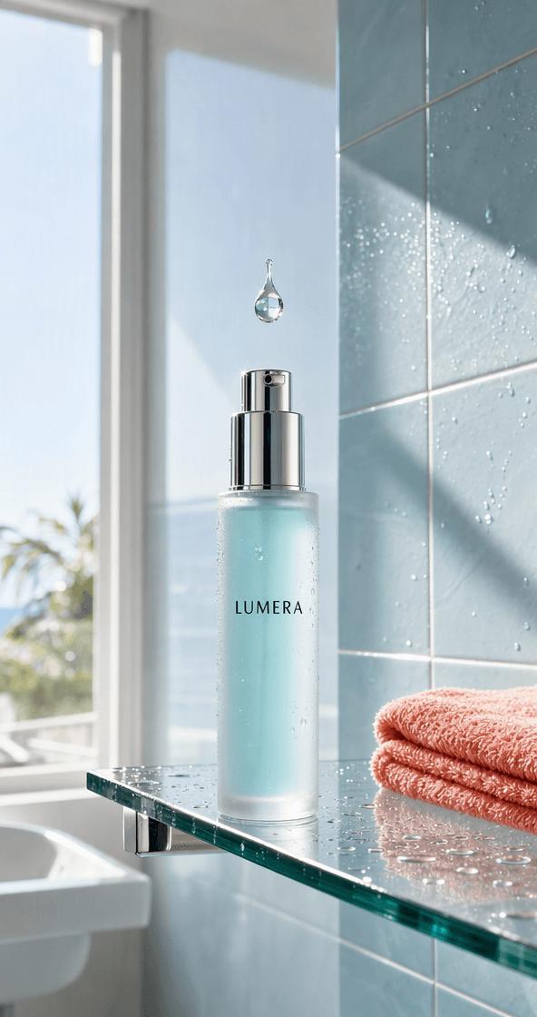
The LUMERA reference already supplies a strong color system: frosted aqua glass, blue tile, daylight, and a coral towel. The first attempt treated scene changes too literally. It moved the bottle through ordinary rooms and placed it upright inside a bag that was visibly too short. Its closing copy also fell back to plain black type.
The revised prompt removed the bag entirely. Instead, a serum bead becomes a portal into a bright hydration dimension made from transparent membranes, reflective liquid surfaces, and coral light trails. The bottle moves because a hand lifts it, a wave carries it, and a hand places it back beside a real city window.
Copy-ready prompt direction
Create a fast 10-second beauty commercial. Preserve the exact LUMERA bottle, pump, label, scale, and aqua glass. A hand lifts the bottle and presses the pump; one serum bead expands into a transparent portal. Enter a luminous hydration world of aqua water membranes, reflective surfaces, and coral light ribbons. Keep the bottle solid and recognizable as it moves forward, then return it unchanged to a real sunlit city window. Finish with “YOUR MORNING, REFRESHED.” Use oversized editorial display lettering in cobalt, coral, lilac, and sky blue, layered behind the bottle—never plain black text.Final skincare video: the real bathroom opens into a liquid visual world before returning to an editorial city-window end frame.
The portal is tied to the serum rather than added as an unrelated effect. The product participates in the movement.
The final words use oversized gradient display type behind the bottle, replacing the generic black headline.
Pause on the pump, label, bottle height, and hand contact before publishing the clip.
Test 2 — A Pet Toy Becomes a Complete Play Session
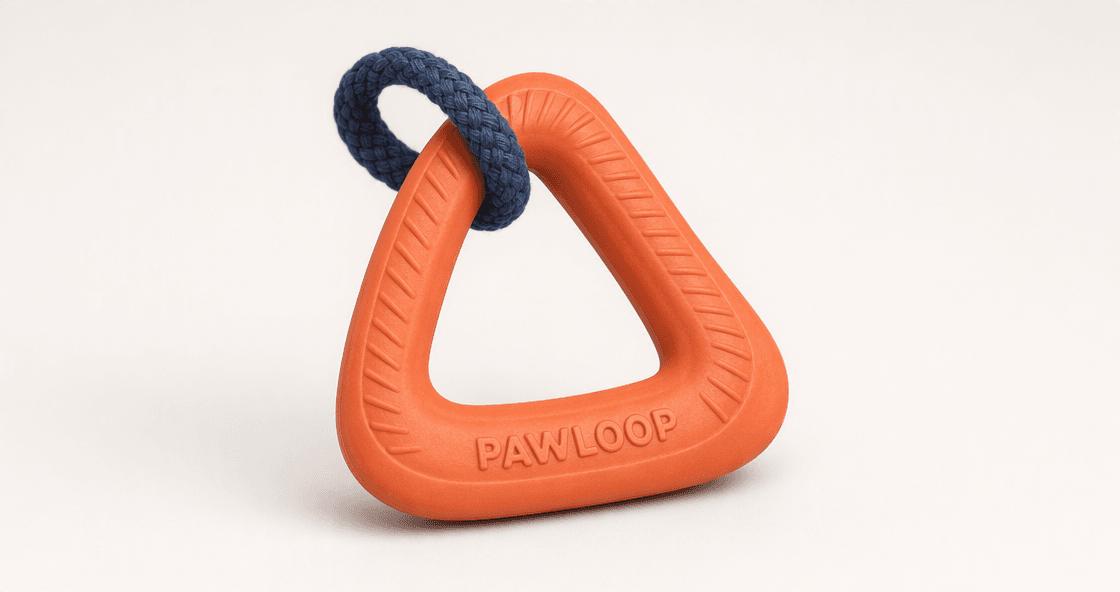
The PAWLOOP source is a clean studio packshot: a coral triangular rubber body with a navy rope loop. The video prompt gives it a real job. A golden retriever discovers the toy in a sunlit kitchen, carries it outside, and finishes on the living-room rug beneath the line “PLAY IT AGAIN.”
Copy-ready prompt direction
Create a 12-second bright lifestyle ad with one golden retriever and one exact PAWLOOP toy. Preserve the coral triangular rubber body, embossed word, and attached navy rope loop. Move from a lived-in kitchen to a sunny backyard and a soft living-room rug with quick hard cuts. The dog grips the coral edge rather than hiding the rope. End on a stable close-up with the complete toy visible and the exact words “PLAY IT AGAIN.”Final pet ad: a clear kitchen-to-yard-to-rug story gives the product a warm, everyday use case.
The orange triangular body remains recognizable, and the dog’s movement feels lively. However, the navy rope disappears during later action shots, while the embossed product text becomes less dependable. For the next run, specify that the dog holds the rubber edge and reserve the last half-second for an unobstructed product close-up.
Upload a first frame, add a last frame when the destination matters, and test one controlled motion idea before expanding the campaign.
Try MiniMax H3 on WeShop AI →MiniMax H3 for Shopify Test 3 — One Car, Two Locations
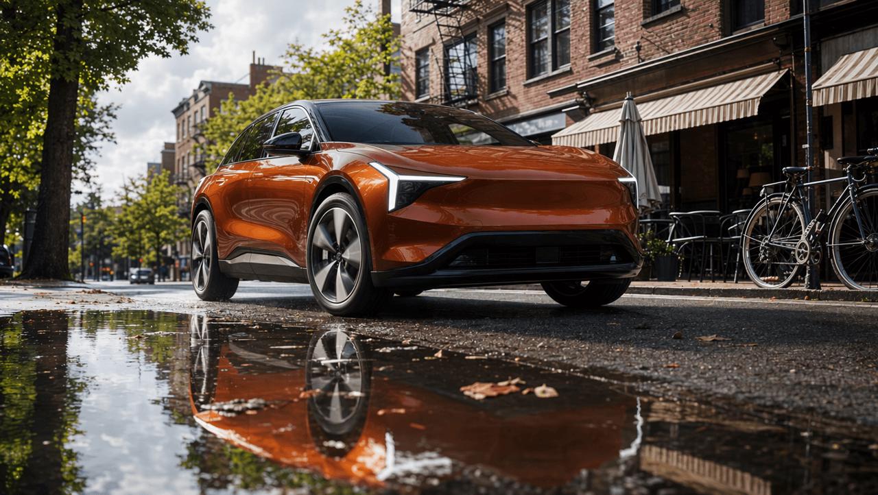
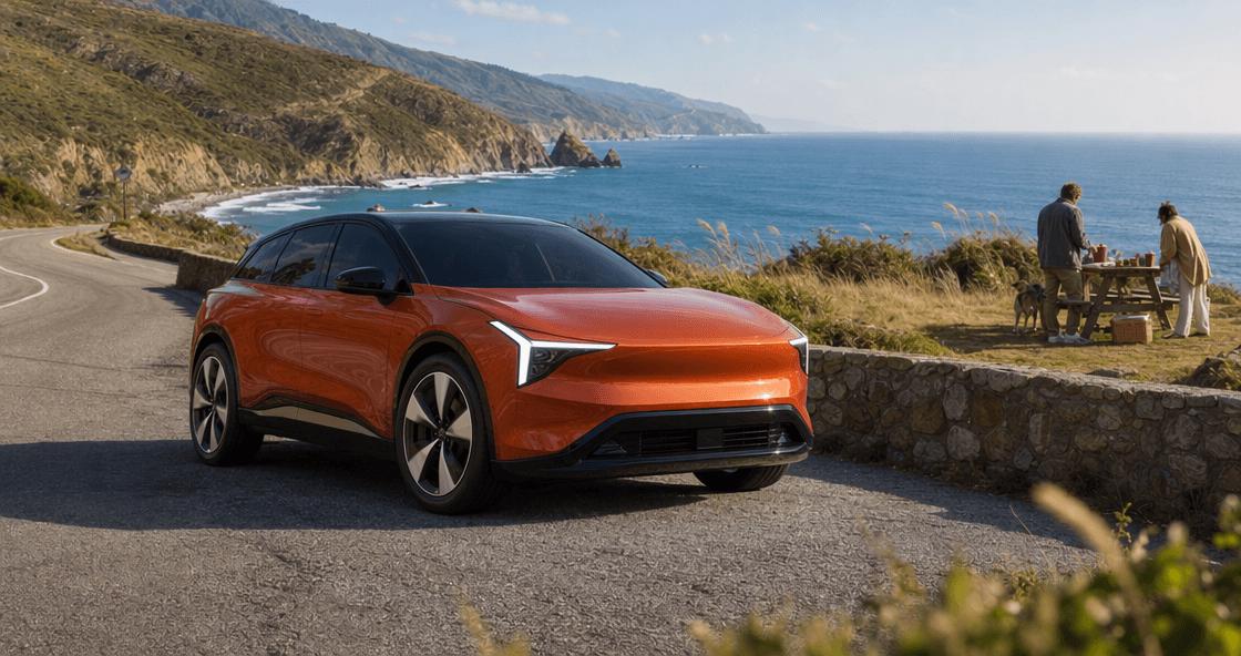
The automotive test uses the most controlled input pair. Its first frame puts the orange crossover beside a shallow puddle on a lived-in city street. Its last frame fixes the destination at a bright coastal overlook, with a picnic and dog adding everyday context rather than an empty showroom finish.
Copy-ready prompt direction
Create a fast 12-second commercial between the supplied first and last frames. Preserve the exact orange crossover, roof, lights, wheels, glass, and body proportions. Use hard cuts between low front, full side, elevated rear, and coastal approach angles. The front tire crosses only a thin film of water; spray stays below the wheel hub. Finish in the exact coastal composition with “MOVE WITH THE DAY.” in bold condensed custom automotive lettering and one short controlled light sweep.Final car video: front, side, rear, and coastal views create a much faster sense of progression than one continuous cinematic shot.
What MiniMax H3 for Shopify Got Right—and Wrong
The revised video does change camera position, moves naturally from neighborhood life to the coast, and lands on a bold condensed closing line. The first second is still the weak point: the tire throws a splash that is too large for the shallow puddle visible in the source frame.
That mismatch is not a reason to discard the entire concept. It is a prompt-level physics problem. Replace “drives through a puddle” with a measurable limit: “the tire crosses a 1–2 cm film of water; fine spray remains below the wheel hub.” Concrete scale beats dramatic adjectives.
Test 4 — Jewelry Reveals Why Visibility Is Not Position
The bracelet reference shows a continuous hammered silver cuff with one opening and one dark cat-eye stone fixed to a terminal. This is a harder consistency test than color alone because the stone should be visible only when the camera can see that terminal surface.
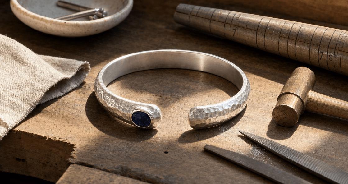
The first prompt said to “keep the gemstone visible.” That sounds protective, but it asks for the wrong thing. In the earlier wearing view, the model moved the stone onto the visible front surface instead of letting the terminal hide it naturally. The corrected prompt locks the stone to an object-relative position and allows real occlusion.
The final eight-second run shows hammered silver in the frontal wrist shots, reveals the black cat-eye only in a terminal macro, and hides it again in the overhead and closing views. The effective instruction was: “The cat-eye stone remains mounted on the flat end face of the same terminal. It is hidden in the frontal wrist view and visible only when the camera faces that terminal end.”
Corrected bracelet video: the cat-eye appears only in the terminal close-up, while the frontal wearing views retain a clean hammered-silver surface.
A Reusable MiniMax H3 for Shopify Prompt Structure
The four tests point to a shorter and more dependable workflow.
- Choose the input around the transition. Use one product image when the environment can evolve freely. Add a last frame when the campaign must reach a specific composition.
- Lock product topology first. Name connected parts, attachments, terminal features, logos, and details that may be hidden from some angles.
- Give every beat a purpose. A location change should demonstrate use, mood, portability, or product benefit. The skincare portal works because it grows from the serum itself.
- Control physical scale. Define shallow water, limited wrist rotation, or the exact part a dog should grip. “Dynamic” is not a measurable instruction.
- Design the final frame separately. State type hierarchy, color, placement, masking, and motion. “Premium font” alone often produces ordinary black text.
Before exporting a MiniMax H3 for Shopify ad, scrub the clip once for story and once for product identity. On the second pass, ignore whether the video feels exciting. Look only at labels, small attachments, wheel designs, jewelry settings, contact points, and the final words.
Four Products, Four Different Prompt Problems
The most useful result is not that every generation passed. It is that each product revealed a different control problem: creative transformation for skincare, attachment persistence for the pet toy, physical scale for the car, and viewpoint-dependent detail for the bracelet.
That is the practical value of testing MiniMax H3 for Shopify with several products instead of repeating one easy reference. Start with one strong product image, build a short motion idea around what the product actually does, and keep the first output as evidence for the next prompt—not as something that must automatically be published.
Create a short product ad with MiniMax H3
You can try it directly using the tool on the right.