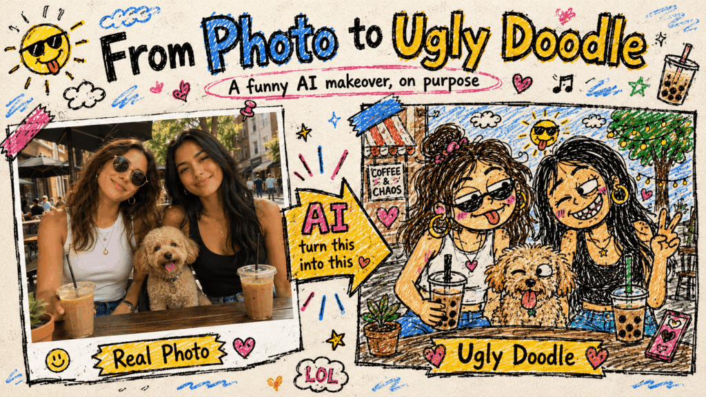
Most photo edits chase improvement. An ugly doodle does something more interesting: it preserves the memory while throwing away the polish. Straight lines wobble. Faces become a little too simple. Colors escape their outlines. Somehow, the result can feel more personal than the carefully edited original.
Still, “make it ugly” is not a complete creative direction. If the subject becomes unrecognizable, the joke disappears. If every line is smooth and balanced, the image becomes an ordinary illustration. The useful middle ground is controlled imperfection.
However, one distinction matters before we begin: ugly describes the drawing style, not the person or pet in the photo. The goal is to parody polished image-making while keeping the original subject readable and affectionate.
What Makes an Ugly Doodle Actually Work
A strong result creates tension between recognition and disorder. The original moment should read quickly before the rough drawing reveals its joke.
More specifically, three things usually carry that recognition:
- the number of people or pets and how they are positioned;
- one or two signature details, such as glasses, ears, a hairstyle, or a bright jacket;
- one background clue that explains where the moment happened.
Meanwhile, everything else can become simpler. Too much accuracy often weakens the style. The drawing needs a few clues arranged badly in a consistent way, not every object or strand of hair.se can become simpler. Too much accuracy often weakens the style. The drawing needs a few clues arranged badly in a consistent way, not every object or strand of hair.
Decide What the Drawing Must Remember
Choose Three Identity Anchors
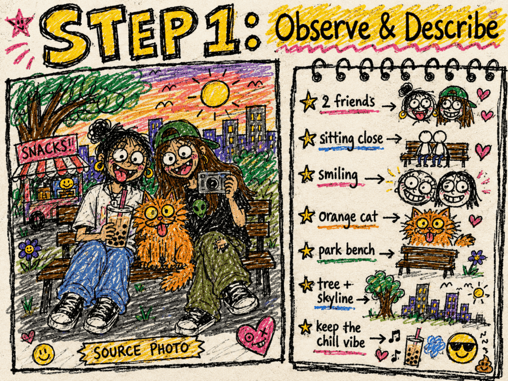
First, describe the photo as if you were reminding a friend of the moment. Do not create an inventory of everything in the frame. Instead, choose three anchors.
For example:
Two friends stand close together on a city street. One has round glasses, and the other is holding a yellow bag. Keep the street sign behind them.
As a result, that description protects the memory without copying every detail. For a pet photo, the anchors might be a tilted head, pointed ears, and a favorite sofa. For a group, use the people count, central pose, and one prop.
Therefore, this is the first quality test. If you cannot explain what must survive, the model cannot know which details are safe to distort.
Write an Ugly Doodle Prompt as Controlled Damagee Prompt
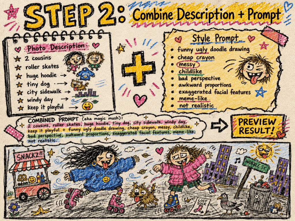
Build the Ugly Doodle Prompt in Three Layers
Instead of stacking a long list of words such as “messy,” “bad,” and “funny,” divide the instruction into three jobs:
Keep the subject count, pose, relationship, signature features, and one scene clue.
Break clean linework, perfect symmetry, realistic shading, and polished proportions.
Add one visual joke, such as oversized glasses, an awkward smile, a tiny scribbled cloud, or a deliberately flat color fill.
Together, those choices produce a more controlled copy-ready prompt:
Use the uploaded photo as the composition reference. Keep the number of subjects, their pose and relationship, [signature feature], and [one background clue]. Redraw the scene as an intentionally rough ugly doodle made with wobbly black marker and uneven crayon fill. Simplify small details, use awkward but readable proportions, and exaggerate one expression. Keep the subjects recognizable. Use one clear line for each limb and do not add extra people, pets, arms, or legs. Do not create polished vector art, anime, realistic painting, clean line art, smooth shading, or perfect symmetry.
However, notice what this prompt does not request: random damage everywhere. Extra limbs, missing faces, and unreadable clutter are not automatically funny. They are useful only when they support a visible joke.
Generate a Small Batch and Stop at Funny
Open GPT Image 2 in WeShop AI and add the original photo as the image reference. Then paste the prompt and replace the bracketed details with your own identity anchors.
Next, generate a small batch, but change only one variable between attempts. If the first result is too polished, push the line wobble and uneven coloring. When the subject becomes difficult to recognize, strengthen the identity anchors. For a crowded frame, remove background instructions instead of adding more negative words.
Ultimately, the winning version is rarely the most detailed one. It is the image that reads quickly, preserves the memory, and lands the joke without explanation.
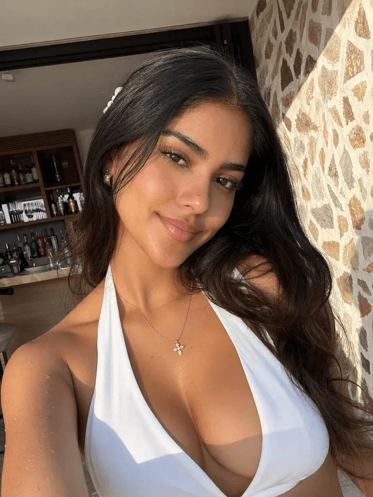
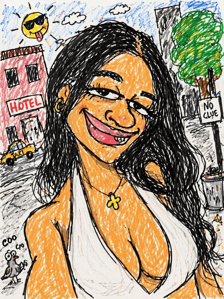
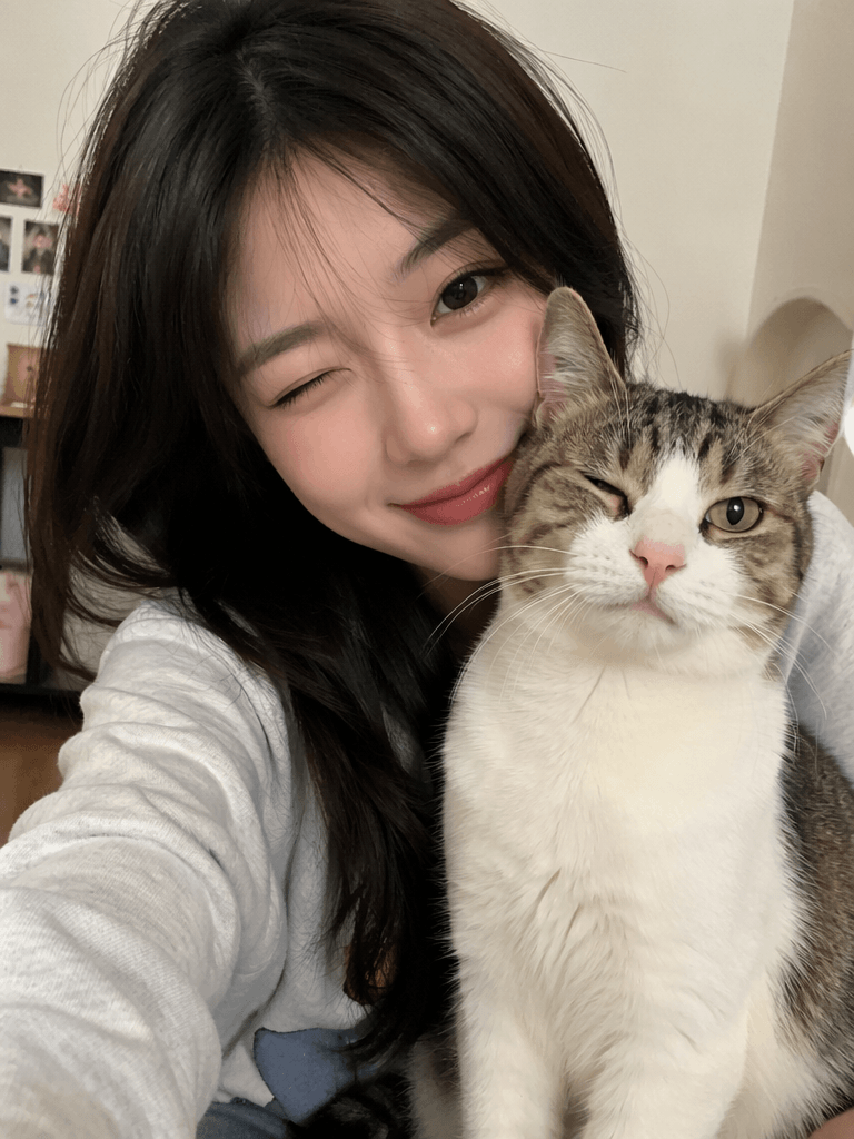
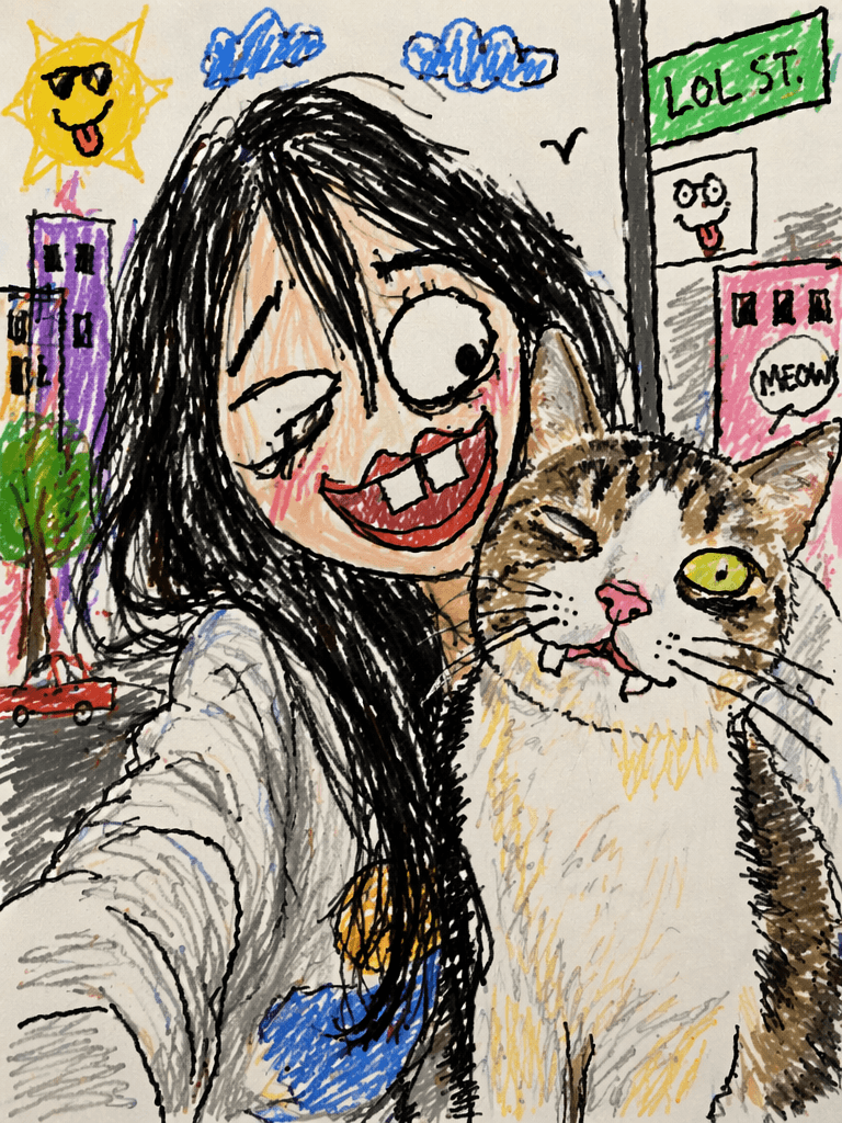
The Six-Image Test Separates Funny From Broken
Next, use the six examples above as a review board and ask the same questions each time.
Ugly Doodle Checkpoint One Keeps the Subject Alive
Can you identify the person or pet in two seconds? Look for the pose, silhouette, hair, ears, glasses, clothing color, or another signature feature. Exact facial similarity is not necessary, but the result still needs a visual link to the source.
Also check relationships. Two people standing together should not become two unrelated figures. A person holding a pet should not lose the contact between them. The pose often carries more memory than the facial details.
Ugly Doodle Checkpoint Two Gives the Mess a Pattern
Meanwhile, good mess has a shared visual rule. The same marker weight, uneven fill, and simplified shapes should appear across the whole image. By contrast, one realistic eye, one vector-clean hand, and one crayon background can make the result feel unfinished rather than intentionally rough.
In addition, the background should support the subject, not compete with it. One bent lamp, crooked window, or scribbled tree is usually enough. When every corner contains another joke, the image loses its focal point.
Fix the Result Without Making It Polished
Therefore, match each failure with a specific correction:
- Overly clean finish: ask for wobblier marker lines, flatter color, and fewer details.
- Random result: repeat the three identity anchors and remove secondary objects.
- Generic subject: name one distinctive feature instead of adding more style words.
- Busy frame: keep only one background clue and one exaggerated expression.
- Broken structure: request readable limbs, a clear face shape, and no extra subjects.
However, do not “fix” every crooked line. Those lines are the style. Correct only the errors that block recognition, composition, or the joke.
Where an Ugly Doodle Fits Best
In practice, this format works best where viewers understand an image quickly: reaction posts, birthday messages, group-chat stickers, creator carousels, profile images, and playful community content.
Meanwhile, brands can use the style for informal social replies, packaging inserts, launch easter eggs, or behind-the-scenes posts. However, it should not replace a clear product image when customers need accurate information. The doodle is the personality layer, not the product record.
Let Bad Drawing Carry the Memory
Ultimately, the charm of an ugly doodle is not that everything went wrong. It is that the right things stayed recognizable while the polish disappeared.
Choose three identity anchors. Break the clean finish. Add one joke. Then stop before the chaos erases the moment that made the photo worth using. That is how a deliberately bad drawing becomes a genuinely good edit.
Go to WeShop AI For Exploration: