






Turn a Perfume Packshot Into Three Halloween Product Posters With Nano Banana 2
Use Nano Banana 2 to place one approved perfume packshot into three distinct Halloween advertising worlds without losing packaging accuracy.
Seasonal product advertising must create atmosphere without quietly redesigning the item being sold. Ecommerce and beauty teams need this workflow when they already have an approved packshot but require several campaign routes for paid social, landing pages, and marketplace banners. The product label, shape, color, and cap must remain dependable even as the surrounding world changes.
Before editing, list the non-negotiables: squat rounded rectangle, smoked-plum glass, matte black cylindrical cap, cream paper label, and the exact words “NIGHT ORCHARD,” “EAU DE PARFUM,” and “50 ML.”
Three campaign routes
Route A — Candlelit botanical luxury
| Creative direction | Result |
|---|---|
| Oxblood pedestal, sculptural black pumpkin, candle glow, and the headline “MIDNIGHT BLOOMS” | 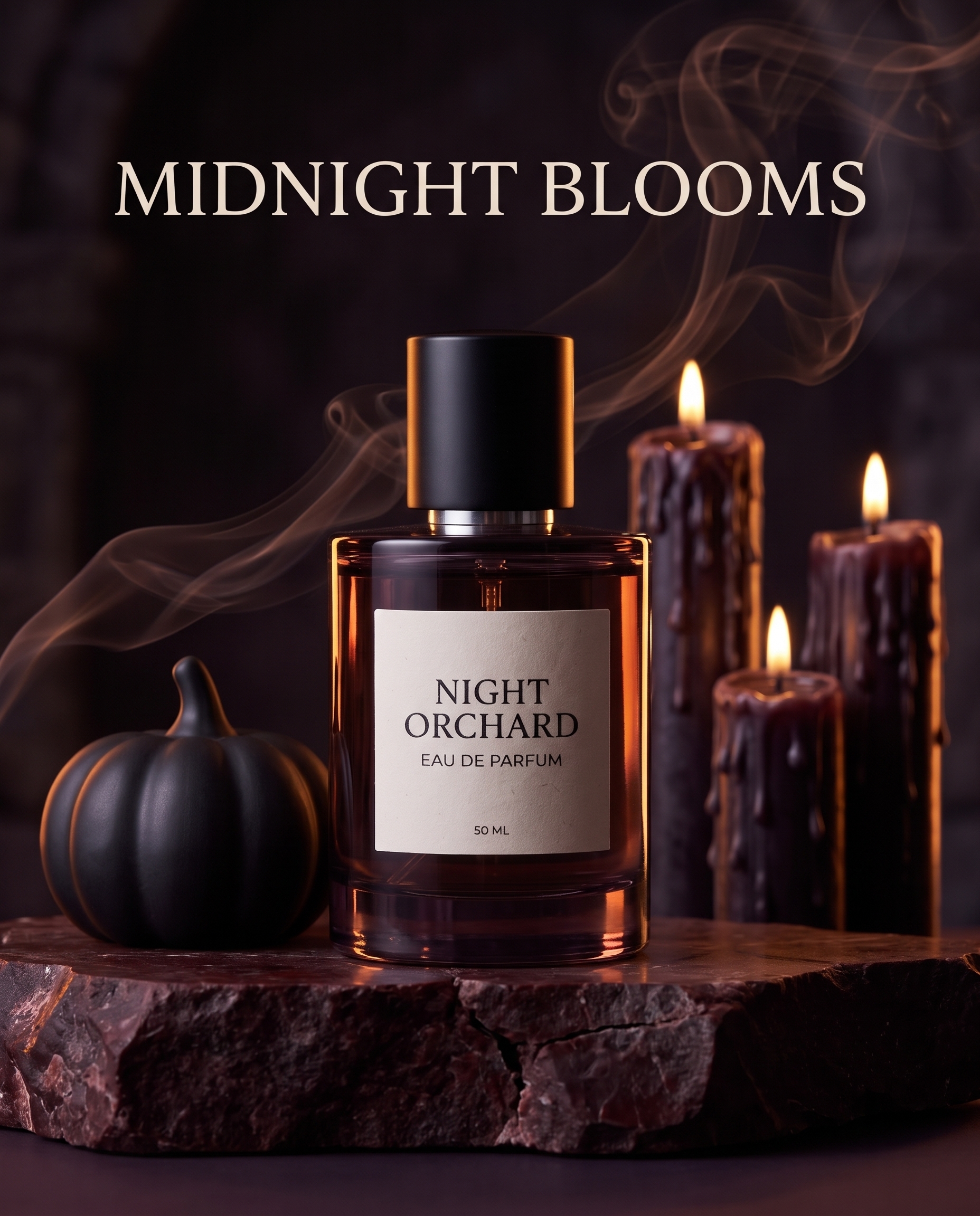 |
This route is the most recognizably premium. It suits beauty homepages and launch emails where mood matters but the item still needs to feel physically present.
Route B — Surreal lunar minimalism
| Creative direction | Result |
|---|---|
| Cream moon disk, aubergine field, decorative arcs kept outside the product silhouette, and the footer “AFTER DARK” | 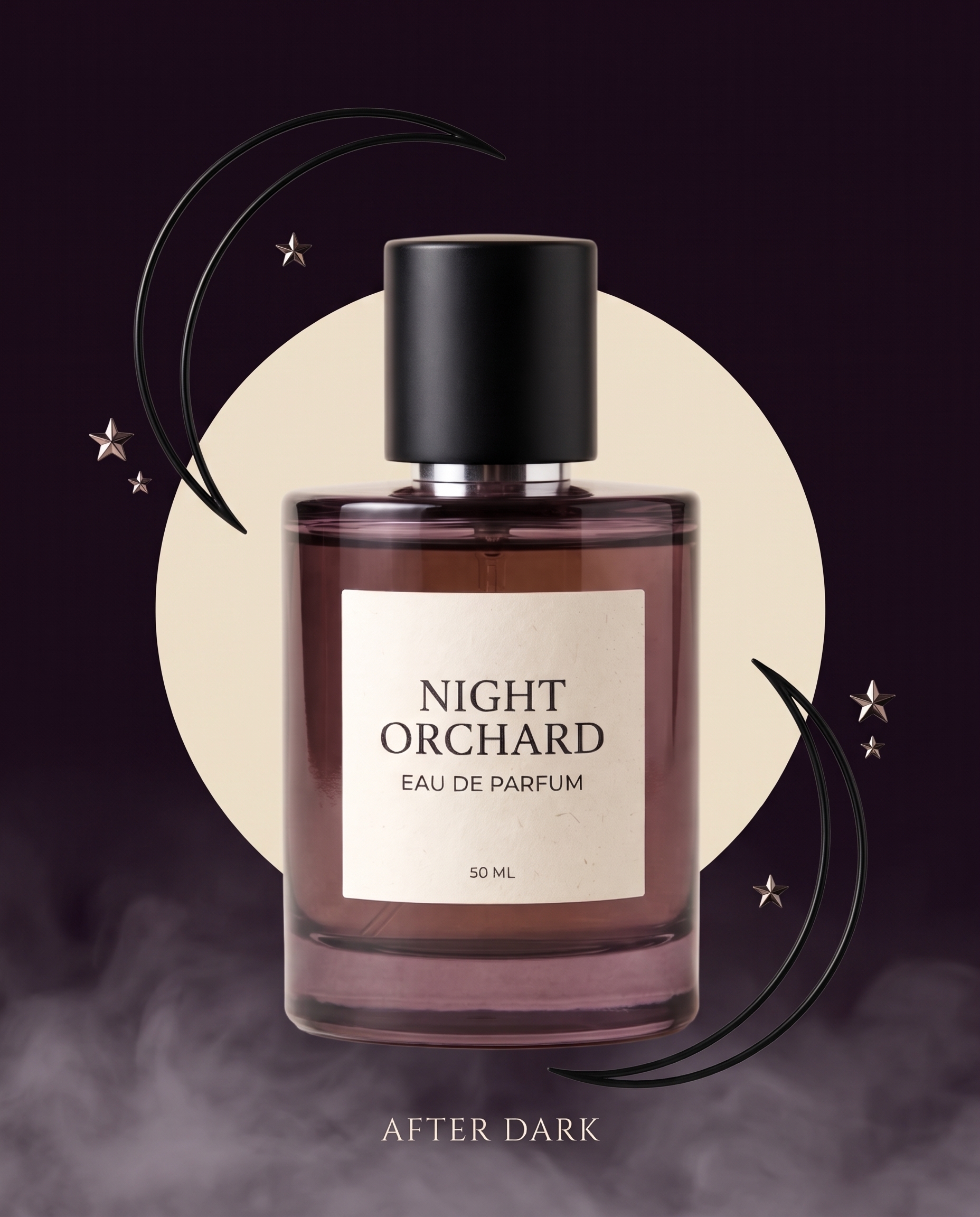 |
This route works when a campaign needs a more conceptual hero image. Notice that the decorative lines stop outside the bottle, leaving the label completely unobstructed.
Route C — Graphic playful mischief
| Creative direction | Result |
|---|---|
| Bone background, cat-shaped cast shadow, restrained wrapped candies, and “A LITTLE WICKED” | 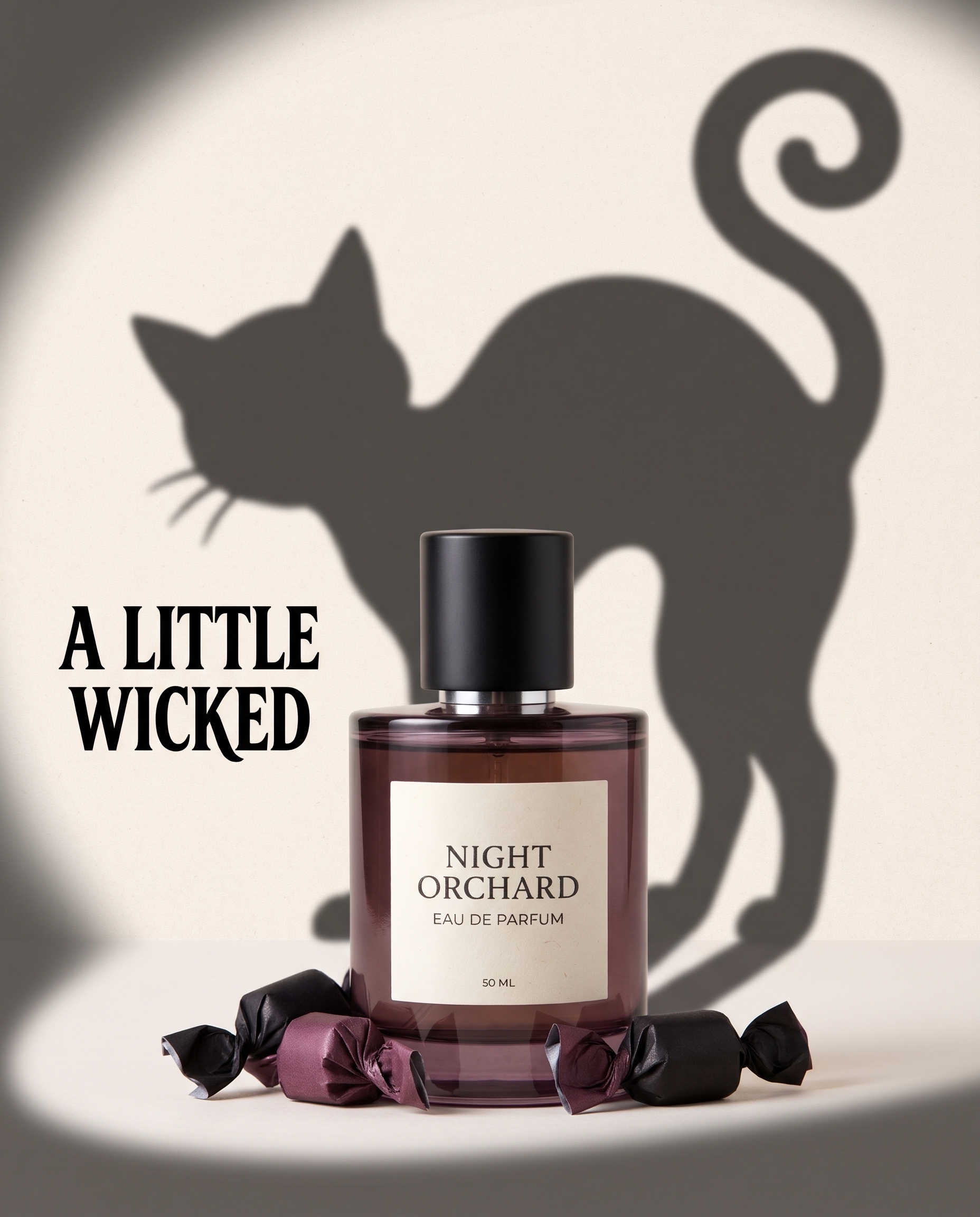 |
This version is cleaner and more social-first. It communicates Halloween with one visual joke instead of a full set.
Step 1 — Upload the cleanest packshot available
Use a front or front-three-quarter product image with readable packaging, clean edges, and a neutral background. The AI should not have to guess the label or cap geometry.
Step 2 — Name what cannot change
Repeat packaging constraints before describing the new set. “Preserve every label word” is more useful than simply saying “keep the product.” For complex layouts, add an explicit empty buffer around the product and prohibit foreground decorations.
Step 3 — Describe one campaign idea per prompt
Use the uploaded perfume bottle as the exact product reference and keep all packaging details unchanged and readable. Create a surreal luxury Halloween poster where the bottle floats before a large cream moon disk. Add two thin black crescent arcs and three tiny metallic stars only in the empty background outside the bottle silhouette. The decorative arcs must stop before reaching either side of the bottle: absolutely no ribbon, line, star, fog, shadow, or decoration may overlap any part of the product, cap, glass, or label. Keep a clean empty buffer around the entire bottle, with the complete label unobstructed and sharply readable. Deep aubergine background, soft fog only at the bottom below the product, refined spotlight, product fully visible and occupying 55 percent of the frame. Add only the exact small footer copy “AFTER DARK” centered below the bottle. No extra bottle, no altered label, no hands, no cartoon bats, no watermark.
Step 4 — Inspect sellability
Zoom in and compare the output with the source. Check the silhouette, cap height, label proportions, every word, and the glass color. Then review headline spelling and make sure props do not imply a different scent, size, or product variant.