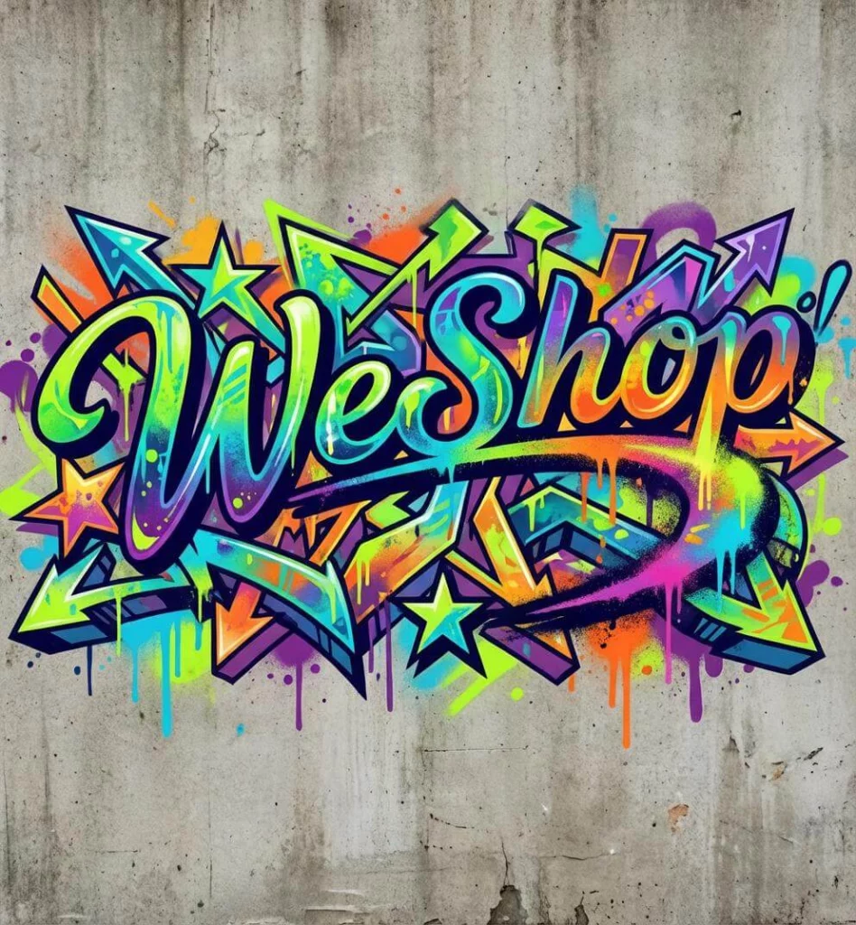
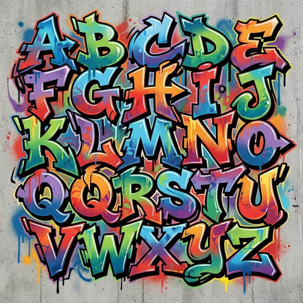
A wildstyle graffiti generator should do more than make a word look loud. It can help you explore connected letters and sharp extensions. It can also test outlines, color fills, and depth. Yet the word underneath must remain intact.
That balance matters. Wildstyle often hides familiar letter shapes inside overlaps, arrows, curves, and add-ons. However, decoration should not erase the letter skeleton. If viewers need a caption to discover the word, the design may have moved beyond the brief.
WeShop AI can act as a digital lettering lab. You can test names, poster titles, music graphics, merch concepts, and social visuals. However, do not simply request “more graffiti.” First, decide which parts of the word must stay clear. Then, raise the detail level.
What a Wildstyle Graffiti Generator Should Protect
Every wildstyle piece has a visual hierarchy. The wildstyle graffiti generator may add energy, but the main word still needs an anchor. Start by checking five layers.
| Letter layer | What it controls | What can go wrong |
|---|---|---|
| Skeleton | The basic shape of each letter | Letters merge or change into other characters |
| Connection | How letters overlap and flow together | Links look like extra letters |
| Keyline | The strong outline around the word | Fill colors swallow the main shape |
| Depth | Shadows, blocks, and 3D direction | Each letter appears to follow a different angle |
| Add-ons | Arrows, spikes, loops, and extensions | Decoration becomes more visible than the word |
Before generation, write the intended word in plain uppercase text. Then, mark any letter that is easy to confuse. An “R” may lose its leg. An “E” can become a block. Meanwhile, repeated letters may fuse into one shape. These are the details to protect in the prompt and review.
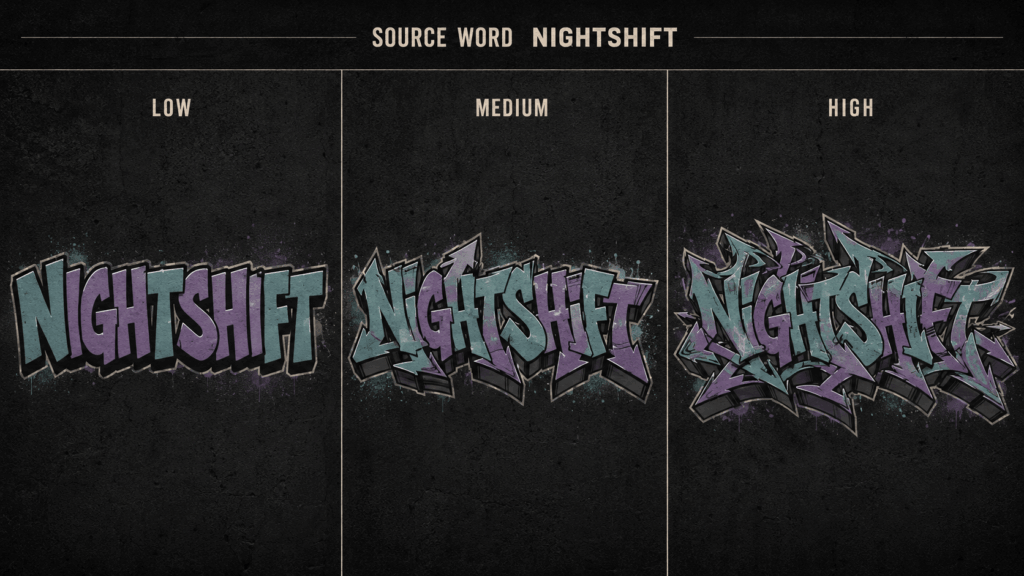
This first comparison should answer one question. How much detail can the word carry before it becomes hard to read? A short name may support dense links. A longer phrase usually needs more open space and fewer add-ons.
Build the Letter Skeleton Before the Effects
Color is tempting, but it should come later. First, define the word, letter weight, direction, and spacing. Next, choose the connection style. Only then should you add fill, highlights, shadows, wall texture, or paint effects.
A useful creative brief can fit on one card:
| Brief field | Example direction |
| Exact text | One short word written exactly as supplied |
| Readability | Every letter remains identifiable |
| Structure | Interlocking forms with controlled extensions |
| Outline | One thick dark keyline and one thin outer edge |
| Fill | Two related colors with one highlight color |
| Depth | Shallow 3D blocks moving in one direction |
| Background | Plain wall texture or clean solid field |
| Final use | Square cover, vertical poster, or merchandise graphic |
This brief stops the wildstyle graffiti generator from solving every choice at once. It also gives you a stable base. Later versions can grow from that base.
A Wildstyle Graffiti Generator Prompt That Controls Complexity
Weak prompts describe mood but ignore structure. “Neon graffiti with drips” may produce a colorful image, yet it says nothing about spelling, spacing, or letter order.
Use a prompt with visible priorities:
Create wildstyle graffiti lettering for the exact word “NIGHTSHIFT.” Keep every letter clear and in the correct order. Use controlled interlocking links and sharp arrow forms. Add a thick dark keyline, teal and violet fill, and silver highlights. Keep the 3D depth shallow. Leave clear space around the word. Center the full design inside the frame. Do not add, remove, merge, crop, or misspell letters.
The wildstyle graffiti generator may still produce an imperfect word. Therefore, treat spelling instructions as guidance, not a guarantee. Review the output letter by letter before refining the color or background.
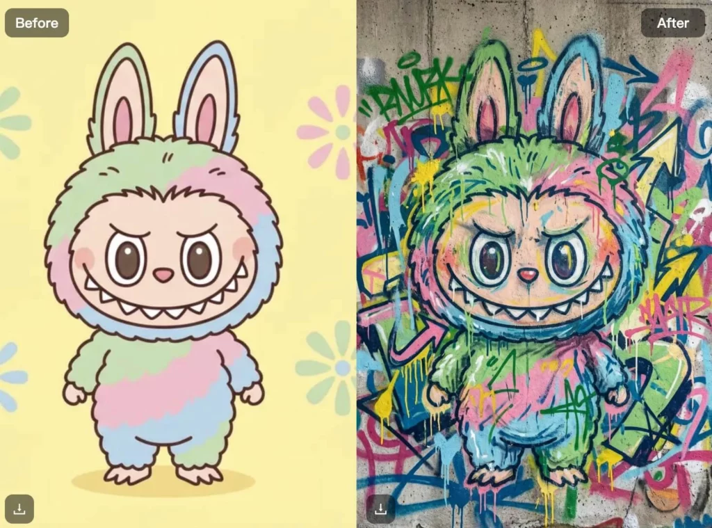
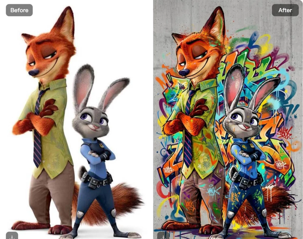
If the current WeShop AI mode shows style, color, gradient, or layout controls, use them to support the same brief. Do not change every control at once. Make one clear change. Then, it is easier to see why the next result improved or failed. add instant personality and contrast, helping content stand out in crowded feeds—without manual illustration.
Compare Three Directions from the Same Word
One successful image does not prove that the design system is flexible. Run the same word through the wildstyle graffiti generator in three clear directions.
Readable entry version
Use a strong keyline, limited overlap, and very few arrows. This version works as the control. If the wildstyle graffiti generator cannot preserve the word here, the source brief needs revision.
Balanced wildstyle version
Add more links between letters. Keep one depth direction and a tighter shape. This version often suits posters, covers, and large social graphics. It keeps both character and structure.
Dense display version
Push the extensions, internal fills, and layered outlines further. However, use this version only where the artwork can appear large. Dense letterforms often lose their identity in small thumbnails.
Do not compare versions with different words, palettes, and backgrounds. Too many changing variables make the comparison meaningless. Instead, keep the text and core colors stable while changing only the structural complexity.
Design for a Poster, Cover, or Merchandise Graphic
A generated word is not yet a finished asset. Before leaving the wildstyle graffiti generator, decide where the design will appear. The destination changes its spacing, edges, and level of detail.
| Destination | Design pressure | Review question |
| Square music cover | The title competes with artist names and artwork | Can the main word still read at thumbnail size? |
| Vertical event poster | Text must work within a tall hierarchy | Is there enough room for date and venue details? |
| Merchandise graphic | The silhouette and color count affect production | Do thin lines or small gaps disappear at print size? |
| Social thumbnail | The image is viewed quickly and often very small | Does the word survive without a supporting caption? |
For a production test, place the same output into its intended layout. Do not judge it only on a full-screen generation canvas. Also, leave safe space around the artwork so important extensions are not cut off during cropping.
Where Wildstyle Graffiti Generator Outputs Break
The most useful review is not “Do I like it?” Ask, “Can I explain what failed?” Use the matrix below before you select a final wildstyle graffiti generator result.
| Failure | What to inspect | Better next direction |
| Misspelled word | Missing, repeated, or transformed letters | Shorten the text and repeat the exact spelling instruction |
| Fused letters | Connections cover the core skeleton | Reduce overlaps and request clearer spacing |
| Random extra marks | Arrows and drips resemble characters | Limit add-ons and keep them outside the keyline |
| Weak silhouette | Every edge has the same visual weight | Strengthen one main outline and simplify the outer edge |
| Conflicting depth | Shadows point in several directions | Request one shallow and consistent 3D direction |
| Muddy palette | Fill, outline, and background have similar values | Separate the word from the background with contrast |
| Cropped extensions | The design touches the frame | Request centered composition and clear outer space |
Fix structure before you add more texture. A worn wall, spray mist, or paint drip can make the image feel busier. However, it cannot repair a broken “S.” It cannot restore a missing letter either.
Keep the Culture and the Rights in View
AI output should be described honestly. If the design was generated digitally, call it AI-assisted graffiti lettering or a graffiti-inspired graphic. Do not present it as a hand-painted wall piece or claim another artist’s process.
Avoid prompts that ask the wildstyle graffiti generator to copy a living artist. Use structural language instead. Describe interlocking letters, angular extensions, layered keylines, controlled 3D blocks, or a limited palette. This gives the prompt direction without turning a creator’s identity into a preset.
Only use names, logos, photos, and brand assets that you own or may use. Before selling prints or merch, review the current tool terms. Also, confirm the rights for each uploaded or added asset. Will the concept be painted on a real wall or placed in public? Get permission for the surface and follow local rules.
Choose the Version That Survives Real Use
The strongest result is not always the most complex one. It is the version that keeps its letter structure, mood, and silhouette after it leaves the generation screen.
Before export, test the wildstyle graffiti generator output at full size and thumbnail size. Read the word without looking at the prompt. Check every letter in order. Then, place the design into its final layout and inspect the edges, contrast, and empty space.
If the word becomes unclear, return to the skeleton rather than adding another effect. If it remains readable, build controlled variations around that stable base. This turns the wildstyle graffiti generator into a practical lettering lab instead of a random style button.
Go to WeShop AI For Exploration: