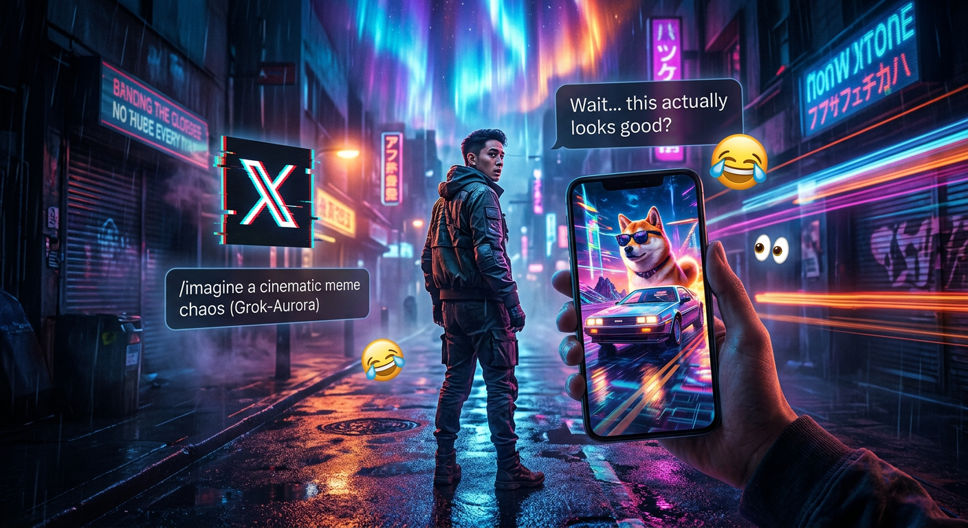
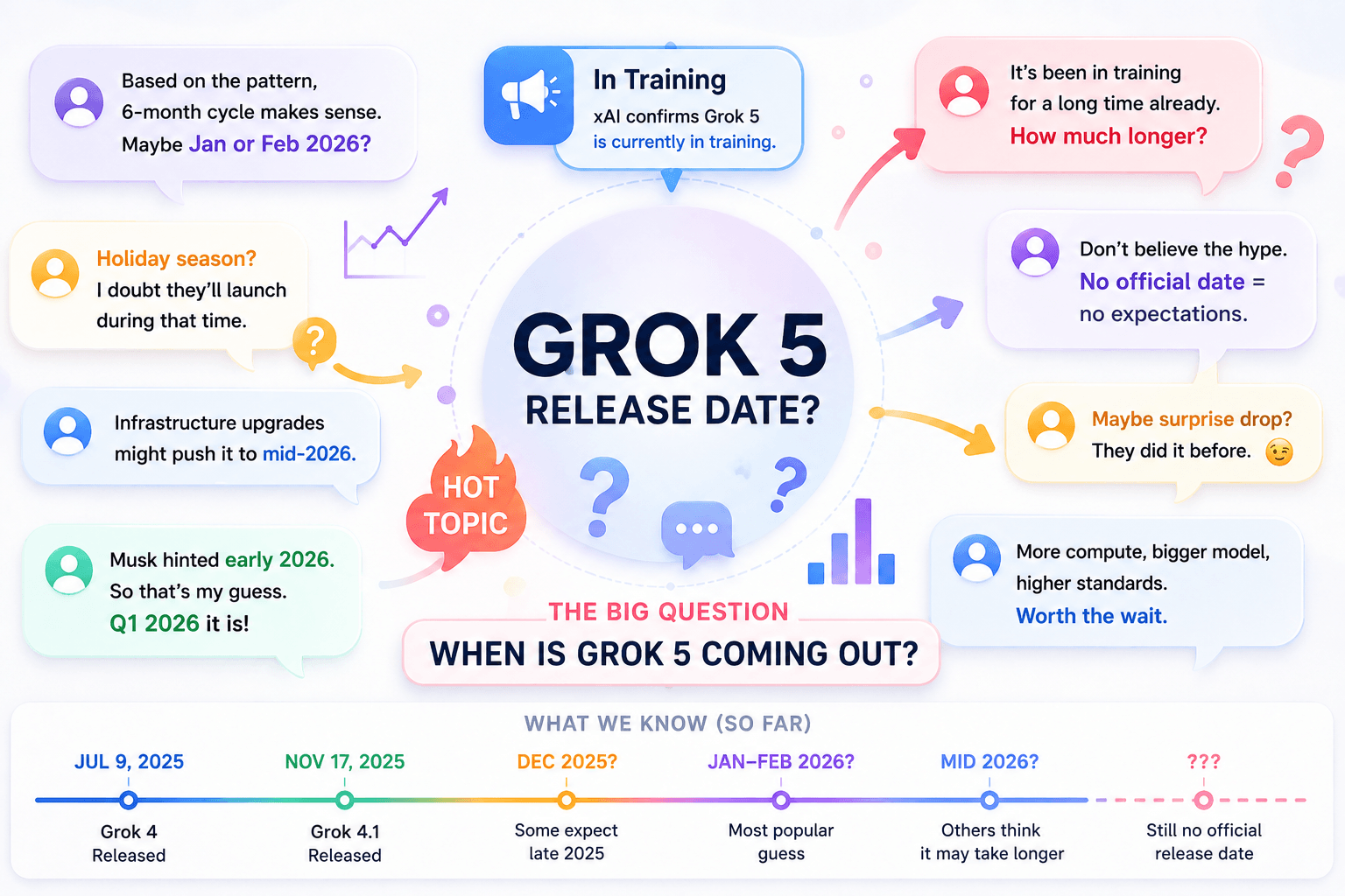
A Grok AI Image Generator result usually improves when the prompt becomes clearer, not longer. A long block of adjectives can still produce the wrong camera angle, weak composition, or a product that changes shape.
The better approach is to decide what the image needs to communicate first.
Start with the subject. Then choose the scene, composition, light, and visual character. After the first generation, change one variable at a time instead of rewriting everything.
That turns image generation into a process you can actually control.
Grok Imagine now supports image creation from text and image references, while current xAI documentation also describes controls for composition, lighting, style, aspect ratio, and image editing.
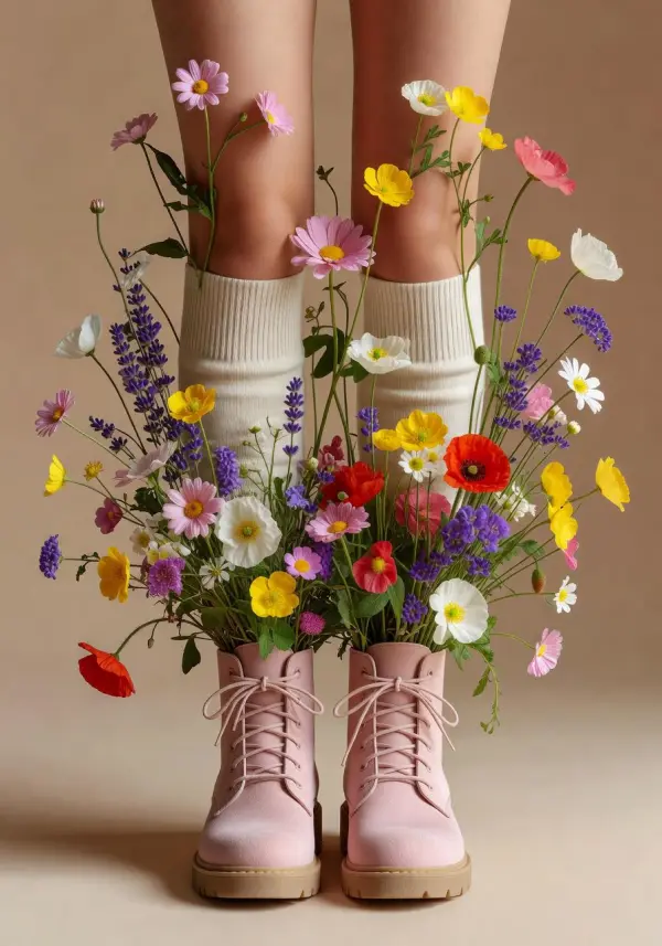
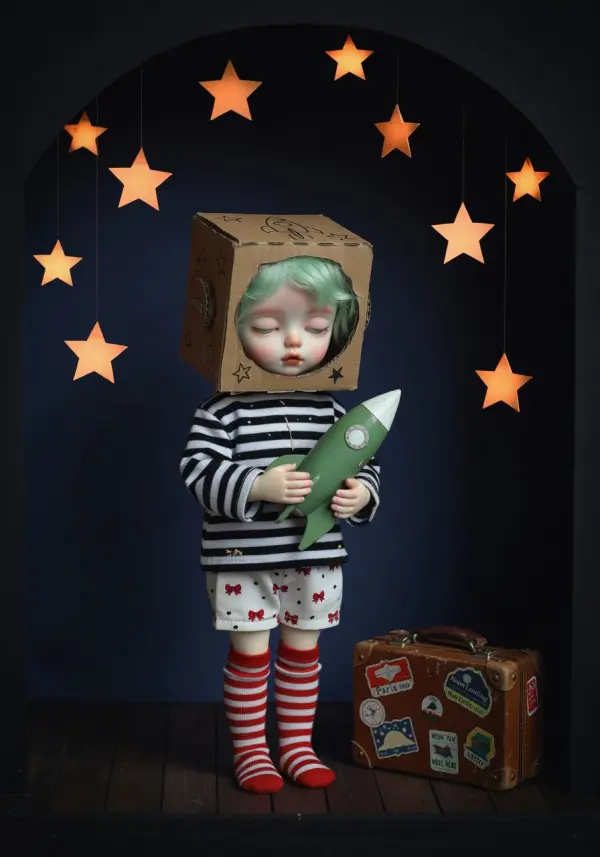
A Grok AI Image Generator Prompt Is a Set of Decisions
A prompt does not need to describe everything in the world.
It needs to answer the decisions that matter for the image.
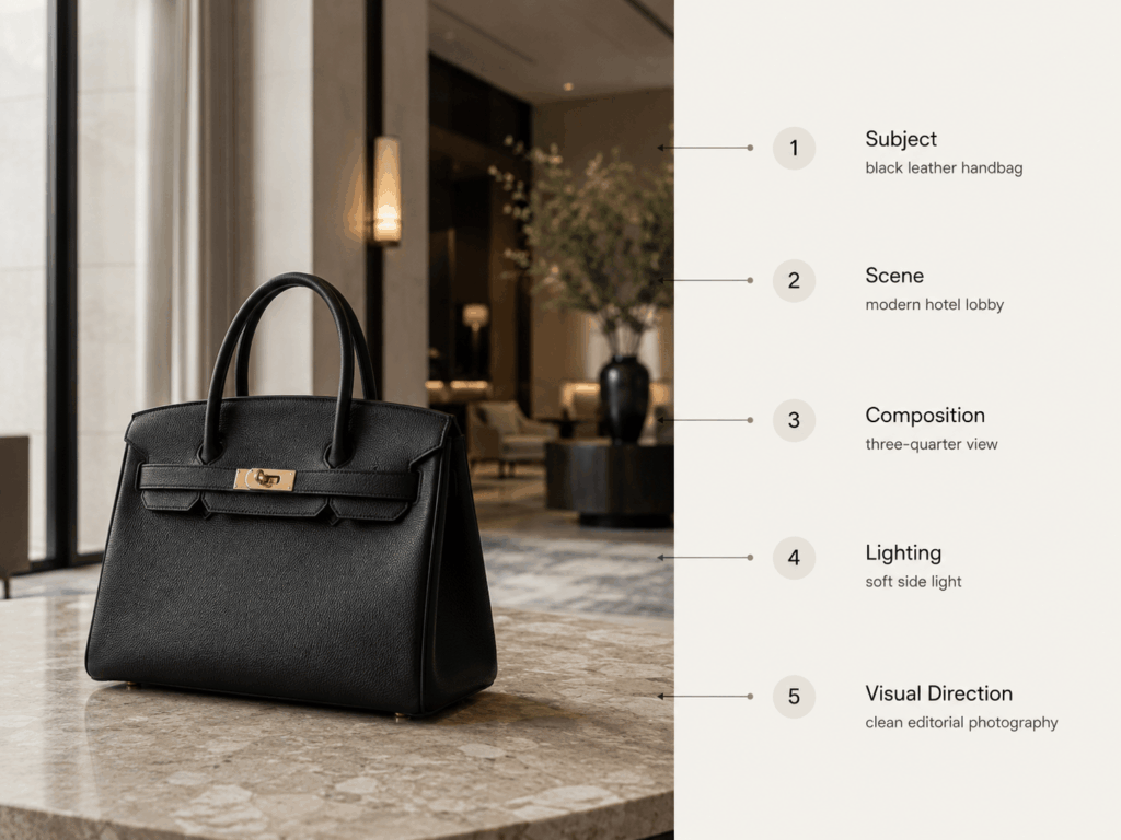
For most generations, five parts are enough:
| Prompt part | Question to answer | Example |
|---|---|---|
| Subject | What is the main thing? | black leather handbag |
| Scene | Where is it? | modern hotel lobby |
| Composition | How is it framed? | three-quarter product view |
| Lighting | What shapes the image? | soft side light |
| Visual direction | What should it feel like? | clean editorial photography |
Put those together:
Black leather handbag on a stone side table in a modern hotel lobby, three-quarter product view, soft side light with a natural shadow, restrained editorial photography, clean neutral palette.
That prompt is useful because every phrase has a job.
Compare it with:
Stunning, amazing, professional, cinematic, beautiful, luxury, high quality, ultra realistic, masterpiece handbag.
The second version contains more words. However, it gives the generation less useful direction.
Build the Grok AI Image Generator Prompt From the Subject Out
Start with the subject and protect its important traits.
For a product, that could mean:
Preserve the rectangular handbag shape, black leather texture, short handles, and silver hardware.
Then add the scene:
Place it on a dark stone side table in a modern hotel lobby.
Next, control the camera:
Three-quarter angle, eye-level camera, product filling about half the frame.
Finally, add light:
Soft daylight from the left with a visible but gentle shadow.
This order makes later corrections much easier.
If the lighting is wrong, you can change the light sentence.
If the composition is wrong, change the camera sentence.
There is no need to rebuild the entire prompt.
Refine the First Grok AI Image Generator Result
The first Grok AI Image Generator result does not need to be perfect. It only needs to show whether the main direction is working.
Start by checking the subject. If the product shape, color, or material already looks right, keep those parts stable. Then focus on the weakest part of the image.
For example, if the product is too small, change the framing:
Bring the handbag closer to the camera and make it the main focus of the frame.
If the lighting feels flat, adjust the light instead:
Add soft side light from the left with a natural shadow under the product.
When the background is too busy, simplify the scene:
Keep the handbag unchanged. Use a minimal hotel interior with fewer objects and more open space.
The same approach works for camera angle. Rather than rewriting the whole prompt, add one clear direction such as:
Use a three-quarter product view at eye level.
This makes the next generation easier to judge because you know what you asked the model to change.
A useful rule is simple: keep what already works and rewrite only what does not.
If the subject itself keeps changing, simplify the prompt first. Remove extra style words, background objects, or competing visual ideas. Then generate again with a clearer priority.
This usually gives you more control than adding another long paragraph to the prompt.
Use the Best Examples as Visual References, Not Just Inspiration
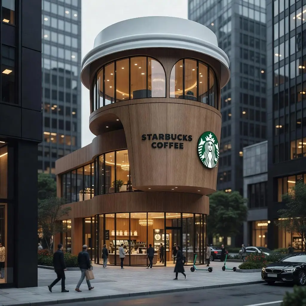
The current WeShop Grok Imagine page already contains examples for product imagery, creative posters, social graphics, and different visual styles.
Those examples are more useful when you study why an image works.
Do not simply think:
I like this image.
Instead, break it down.
For a product example, look at:
- how large the product is in the frame
- where the light comes from
- how much background detail is visible
- whether the angle is front, side, or three-quarter
- how strong the shadow is
- whether the image feels commercial, editorial, or casual
For a poster-style image, look at hierarchy.
Where does your eye go first?
Is the subject centered?
Does the background support the focal point or compete with it?
You can then borrow those decisions without trying to recreate the exact image.
Reference Images Help When Words Are Doing Too Much Work
Text is useful when you are inventing a scene from scratch.
However, there are times when the image already contains something you want to keep.
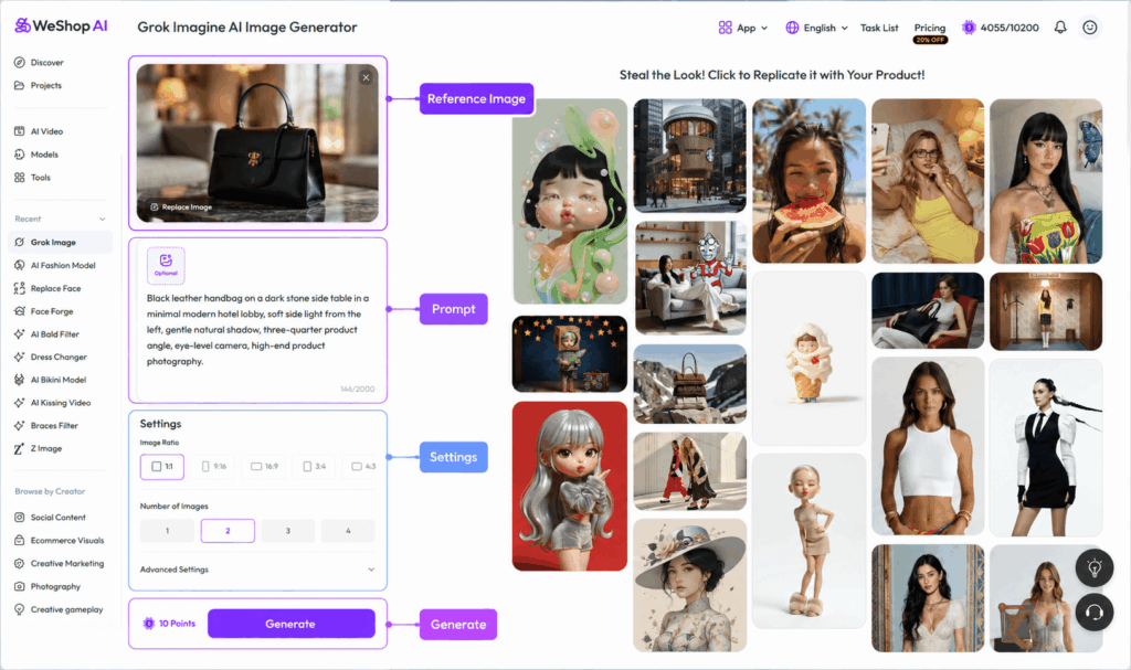
Current WeShop API documentation for Grok Imagine supports an optional reference image together with a required text description.
That changes the way you should write the instruction.
Suppose you already have a product photo.
You may not need to describe the product again in twenty lines.
Instead, tell the generation what to keep and what to change.
For example:
Keep the product shape, leather texture, black color, handles, and metal hardware unchanged. Replace the current background with a quiet luxury hotel interior. Use soft morning window light and keep the original product proportions.
The reference image carries part of the visual information.
The text carries the change.
This is often cleaner than asking the model to recreate an exact product from text alone.
When Text Alone Is Better
Start from text when:
- the idea does not exist yet
- you are exploring several visual directions
- exact product fidelity is not required
- you want concept art or early campaign ideas
Use a reference when:
- product shape matters
- a specific subject should remain recognizable
- the starting composition is already useful
- you want to change the environment or treatment rather than reinvent the image
More Detail Is Not Always Better
A common generation mistake is prompt overload.
For example:
Luxury black handbag on marble, dramatic sunset, cyberpunk lighting, Scandinavian hotel, Japanese minimalism, rainy window, tropical plants, neon signs, vintage film, futuristic architecture, soft pastel palette…
Every phrase may sound interesting by itself.
Together, they compete.
The generation has to decide which direction matters most.
A simpler version is easier to control:
Black leather handbag on a stone table in a modern minimalist hotel lobby, warm evening side light, restrained editorial photography.
If the first image works, add another detail.
For example:
Rain visible through the background window.
Then generate again.
This process gives each new instruction a clear purpose.
When a Grok AI Image Generator Result Misses the Prompt
Do not immediately make the prompt twice as long.
First, identify what actually failed.
| Problem | Likely cause | Better next move |
|---|---|---|
| subject is too small | composition is vague | specify subject size or framing |
| product shape changes | too much scene generation competes with subject | simplify background and protect product traits |
| lighting feels flat | no clear light direction | specify source and shadow |
| image looks busy | too many objects or styles | remove secondary details |
| wrong camera angle | viewpoint is not stated | use front, side, top-down, or three-quarter |
| colors drift | palette is vague | name two or three key colors |
| scene feels generic | environment lacks concrete details | add one or two physical materials or objects |
| output ignores one instruction | prompt contains competing directions | remove the weakest instruction and regenerate |
After two or three similar failures, simplify.
A longer prompt is useful only when every part supports the same visual idea.
Otherwise, it becomes noise.
Five Types of Grok AI Image Generator Output Worth Testing
You do not need five nearly identical “Aurora in Action” examples.
Use each generation to test something different.
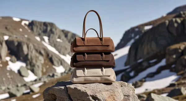
1. Product Photography
Test product scale, material, shadow, and surface detail.
A useful prompt might be:
White ceramic watch on dark stone, three-quarter product angle, soft window light, subtle reflection, clean premium product photography.
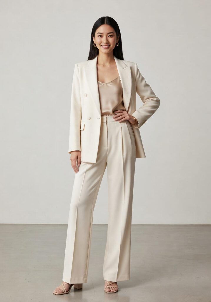
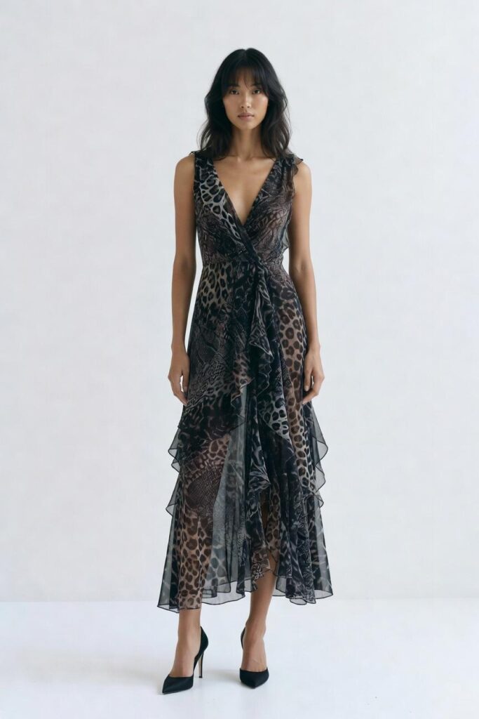
2. Editorial Portrait
Focus on light, framing, background separation, and skin detail.
For example:
Adult fashion model in a charcoal tailored coat, simple concrete interior, soft directional daylight, waist-up editorial portrait, restrained neutral palette.
3. Poster Concept
Here, composition matters more than pure realism.
Try:
Minimal travel poster for a coastal train route, large blue sky, small red train crossing the lower third, bold open space for headline placement, clean graphic composition.
4. Material Study
Keep the subject simple and change the material.
For example:
Sculptural chair made from translucent blue glass, studio background, soft backlight, clear refraction and realistic surface reflections.
This tests whether the material reads clearly.
5. Environment Concept
Use a stronger scene but a simple subject.
Quiet hotel reading lounge at dawn, pale stone walls, walnut furniture, linen seating, soft cool daylight, wide architectural composition.
Each example now has a reason to exist.
That is much more useful than showing five images with the same generic explanation.
Check the Image Before You Generate More Variations
Once an image looks good, stop looking only at the overall mood.
Zoom in.
For product visuals, check:
- shape
- proportions
- logos and text
- material texture
- reflections
- shadows
- edges
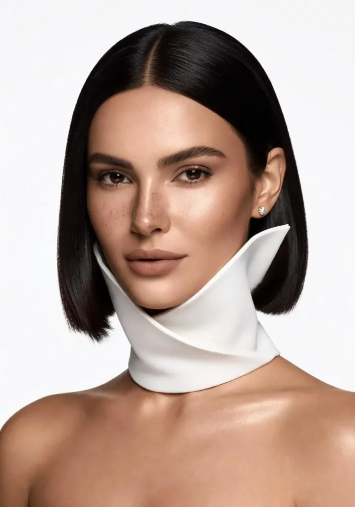
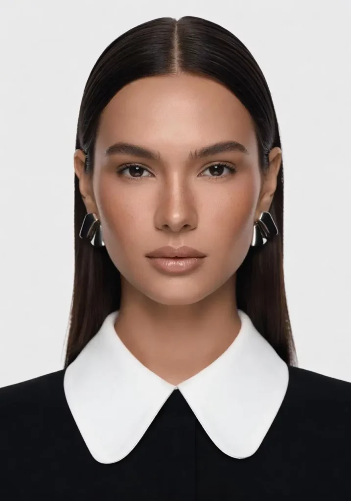
For portraits, check:
- eyes
- teeth
- hands
- hair
- clothing edges
- background around the body
For posters and graphics, check:
- text
- alignment
- visual hierarchy
- object count
- empty space
- edge cropping
If the base image fails, generating another ten versions is not useful.
Fix the base direction first.
Then create variations.
Turn One Good Generation Into a Small Visual System
Once a base direction works, variations become useful.
Keep three things stable:
subject + camera + visual language
Then change one campaign variable.
For example:
Base
Black leather handbag, three-quarter angle, hotel lobby, soft daylight.
Variation 1
Change the background to a boutique entrance.
Variation 2
Keep the location, but change the palette from warm stone to cool gray.
Variation 3
Keep everything else and create a wider composition for a website hero.
This creates related assets rather than random images.
The same idea works for social graphics, concept art, and campaign mood boards.
Current Grok Imagine documentation also supports iterative image generation and editing, so generation does not have to end after the first image.
Where Grok AI Image Generator Fits in a WeShop Workflow
A generated image does not always need another tool.
If the result already works, use it.
However, a few targeted WeShop tools can help when there is a specific problem. The current WeShop workflow includes dedicated tools for image enhancement, background removal, image expansion, and image-to-video generation.
For example:
Need a different canvas shape?
Use Expand Image after the base composition is approved.
Need product isolation?
Use Background Remover rather than asking the generator to recreate the whole product.
Need general image cleanup?
Use AI Photo Enhancer only after reviewing the generated image.
Want motion from the final still?
Move the approved image into an image-to-video workflow.
The important part is the order.
Do not keep adding tools before the original image is good.
First solve generation.
Then solve formatting or cleanup.
Use Generated Images With the Same Review You Would Give Any Creative Asset
For commercial work, do not assume that a generated image is automatically ready to publish.
Check:
- brand accuracy
- product details
- source-image permissions
- text and logos
- misleading visual claims
- the current platform terms for your intended use
For high-value campaigns, legal or brand review may also be appropriate.
There is no need to make a blanket claim that every AI-generated image is automatically free of copyright or licensing concerns.
The Best Grok AI Image Generator Prompt Is Usually the One You Can Debug
A useful prompt gives you control over decisions.
If the result fails, you should be able to point to the part that needs changing.
Maybe the camera is too close.
Maybe the background is too busy.
Perhaps the light is coming from the wrong direction.
Or the prompt simply contains too many competing ideas.
Fix that part first.
Then generate again.
The Grok AI Image Generator becomes much more useful when you stop treating every generation as a lucky draw. Build the image in layers. Test one variable at a time. Use reference images when visual fidelity matters. Finally, inspect the output before creating more variations.
That process is less exciting than asking for “the perfect image in one click.”
It is also much more repeatable.
Go to WeShop AI For Exploration: