Why do some thumbnails instantly make people want to click, while yours always feel like they are missing something? More often than not, it’s not because your content is bad—it’s because your cover lost the battle at first glance.
Today, we are teaming up with the wizards at WeShop AI to unpack the entire process from brainstorming to final export. Even if you have zero design background, this guide will help you create high-converting thumbnails with ease.
What Does a Viral Cover Actually Look Like?
When users scroll through their social media feeds, you have less than 0.5 seconds to capture their attention. A successful AI cover design must accomplish three things in that split second:
- Grab the Eye: Deliver a strong visual impact or natural warmth that forces the user’s thumb to stop scrolling.
- Deliver the Value: Clearly show the core benefit so users instantly know what they will get by clicking through.
- Set the Right Expectation: Hint at the content’s vibe—whether it’s an actionable tutorial, a funny meme, or a heartwarming story—to attract the right target audience.
Achieving these three goals doesn’t require a degree in graphic design. The secret lies in using the right framework and the right tools.
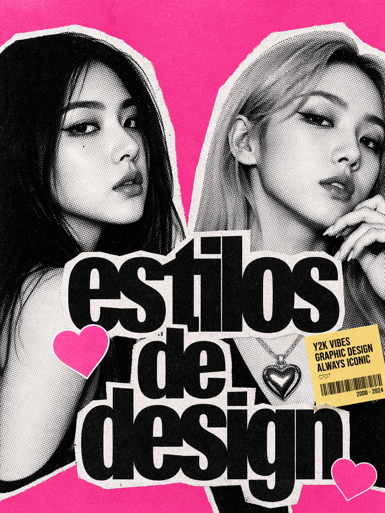
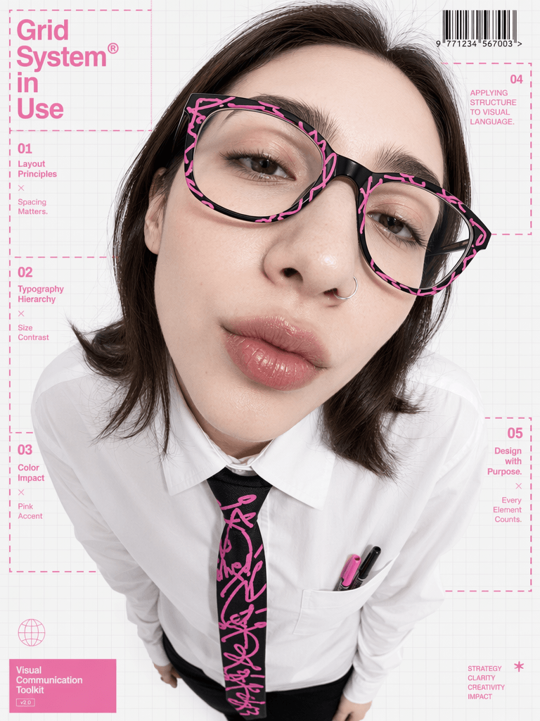
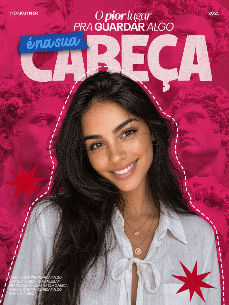
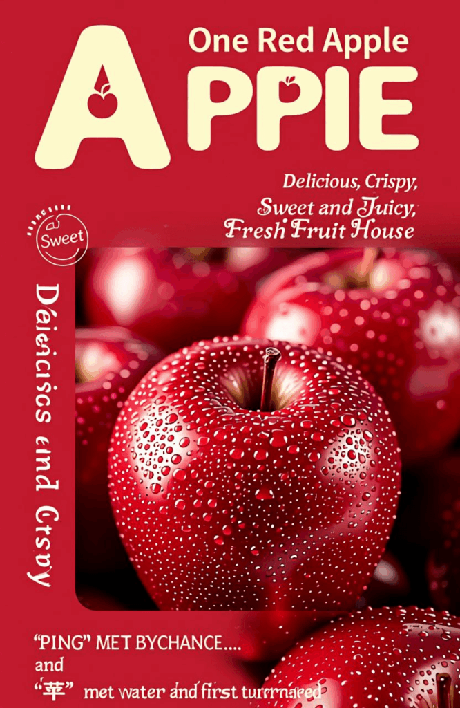

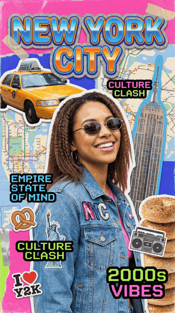
Preparation: Required Tools & Assets
Before diving in, let’s gather your design building blocks:
| Asset / Tool | Purpose | Required? | Notes |
| WeShop AI | Primary design tool | Yes | Bookmark the official site: https://www.weshop.ai/ |
| 1 Core Image | Visual centerpiece | Recommended | Can be a portrait, product shot, or scene to anchor the cover. |
| Cover Copy / Text | Core message delivery | Yes | Keep it under 20 characters (Main title + Subtitle). |
| Brand Colors/Logo | Branding consistency | Optional | Helps maintain visual identity across different channels. |
Step-by-Step Guide to Viral Cover Design
Step 1: Define Dimensions and Platform Optimization
Different platforms require completely different dimensions. Choosing the wrong size at the beginning makes everything else a waste of time. Stretched images or cropped text instantly ruin your click-through rate. Here are the standard specs for major platforms:
- Xiaohongshu (RED)
- Recommended Size: 1242 × 1660 px (3:4 aspect ratio)
- Pro Tip: Standard vertical layout. Since titles and UI elements block the bottom, keep your text and core visuals in the upper half of the canvas.
- WeChat Official Account
- Recommended Size: 900 × 383 px (2.35:1 aspect ratio)
- Pro Tip: Ultra-wide horizontal layout. Keep your visual focus tight; the center area is what matters most.
- Bilibili / Video Platforms
- Recommended Size: 1920 × 1080 px (16:9 aspect ratio)
- Pro Tip: Standard landscape. The video duration badge sits in the bottom right corner, so make sure your text avoids the bottom right.
- TikTok / Shorts / Reels
- Recommended Size: 1080 × 1920 px (9:16 aspect ratio)
- Pro Tip: Full vertical view. With overlays on the bottom and sides, keep your visual weight shifted slightly upward.
- YouTube Thumbnail
- Recommended Size: 2560 × 1440 px (16:9 aspect ratio)
- Pro Tip: Wide display. Edges can get slightly cropped on mobile devices, so avoid putting small text right on the borders.
Step 2: Find Inspiration—Don’t Design from Scratch
The biggest mistake in viral thumbnail design is trying to reinvent the wheel. A much faster approach is to find 3 to 5 successful covers in your niche and deconstruct their DNA.
Analyze them across these four dimensions:
- Image Style: Are they using real human models, custom illustrations, macro product close-ups, or typography-heavy designs?
- Color Palette: What are their primary, secondary, and accent colors? (Apply the classic 60-30-10 rule).
- Typography: What bold font are they using for the headline? What clean, highly readable font supports it?
- Information Hierarchy: What is the visual path? What does the viewer notice first, second, and last?
💡 Case Study: The Viral Food Content Formula
- Visuals: High-definition close-ups of food in warm tones to trigger hunger.
- Headline: Bold, oversized text saying “Done in 5 Mins” + smaller text reading “Lazy Breakfast”. Clear and direct.
- Colors: Red + Yellow + White (the classic fast-food combo that sparks appetite and excitement).
- Accents: Hand-drawn arrows or bright circles to immediately isolate the hero element.
Step 3: Build the Skeleton — The Image Layer
The hierarchy of a cover is always: Image > Headline > Fine Details. We must secure a solid background image first.
Depending on your raw assets, you can approach this in two ways using the WeShop AI tutorial workflow:
Scenario A: You already have high-quality product or portrait photos
- Action: Upload them directly to the WeShop GPT image tool for intelligent background replacement and seamless blending.
- Pro Tip: Use the “Remove Background” feature to cleanly isolate your subject, ensuring it fits perfectly into its new AI-generated environment without looking pasted on.
Scenario B: You need a completely new, text-only, or illustrative cover
- Action: Use WeShop’s dedicated AI generation models to create exactly what you need from scratch. Choose the specific tool link based on the style and quality you want:
- 👉 General AI Image Generation: See the button above to explore GPT Image 2
- 👉 Creative & Stylized Art: https://www.weshop.ai/apps/nano-banana2
- 👉 Ultra-High Precision Graphics: https://www.weshop.ai/apps/imagen4-image-generator
- 👉 Qwen Advanced Image Editing: https://www.weshop.ai/apps/qwen-image-edit
📸 Expert Framing Tricks:
- Human Subjects: Position the subject’s eyes in the upper half of the frame, and make sure their gaze or face points toward the headline to naturally guide the reader’s eye.
- Product Shots: Leave breathing room. Always leave 30-40% negative space for text placement.
- Landscape/Scenes: Use the rule of thirds. Place your subject slightly off-center (left or right). Perfectly centered compositions often look flat and unengaging on social feeds.
Step 4: Add Text — The Headline Is the Soul
Your headline is the most critical element of your cover, but it is also where most creators mess up. Keep these two rules in mind:
Rule 1: Bigger is Better
- Contrast: The main title font size should be at least 3 to 4 times larger than your subtitle to create an instant visual hierarchy.
- Thumb-Size Readability: Make sure the headline can be read even when scaled down to a tiny mobile thumbnail. A user should understand it just by glancing at the first 4 words.
- Front-Load Keywords: Put high-converting hook words (like “Tutorial“, “Guide“, “Review“, or “Mistakes to Avoid“) at the very beginning of your phrase.
Rule 2: Keep It Concise
- Main Headline: Keep it under 10 characters/words for maximum impact.
- Subtitle: Keep it under 15 characters/words to support the main hook or inject emotional value.
- Total Text Volume: Try to keep the total text on the cover under 20 words. More negative space means a more premium, professional look.
Step 5: Polish and Details — The Pro Difference
If you follow the first four steps, your cover will easily pass the baseline test. However, the gap between an average cover and a viral one often comes down to the last 5% of details.
Here are some industry secrets to instantly elevate your design:
- Hand-Drawn Accents: Add subtle “arrows”, “circles”, or “doodles” to call out the most interesting part of your image. This instantly adds a relatable, human touch.
- Brand Watermarks: Place a clean logo or handle in a corner. It prevents content theft and builds long-term brand recall.
- Emphasize Numbers: If your copy includes numbers, make terms like “3 Steps” or “5 Mins” larger and change their color (e.g., to a vibrant yellow or neon orange).
- Add Film Grain (Micro-texture): Avoid the cheap, overly smooth digital look. Once your design is finished, use editing software (like Canva’s effects) to search for “grain” or “film” filters. Adding just a touch of texture gives it a high-end magazine feel.
Step 6: Bring It All Together with the Perfect Prompt
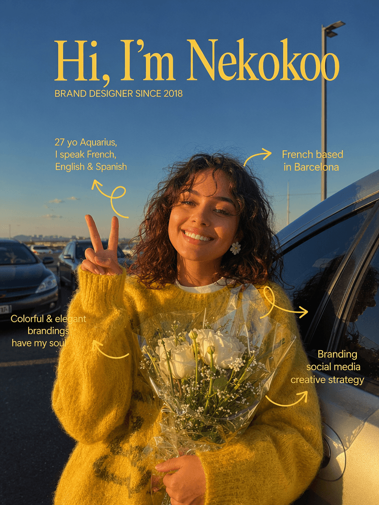
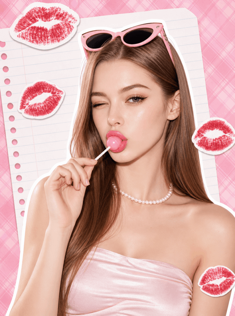
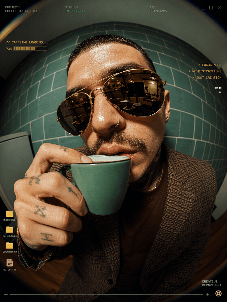
By harnessing the power of WeShop AI, you can generate stunning results—whether you need high-fidelity human models or purely abstract background concepts.
With Model Showcase
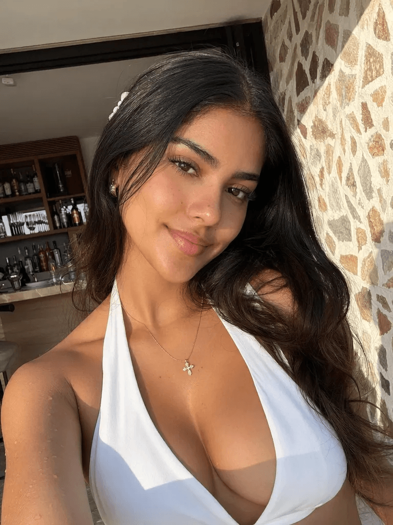
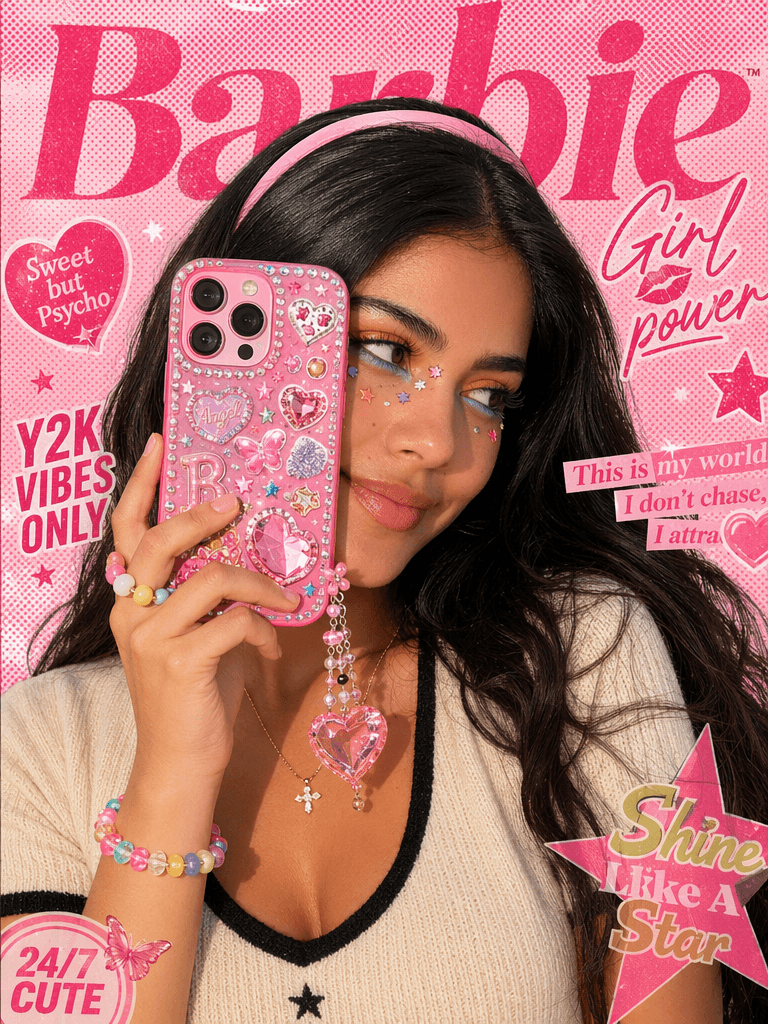
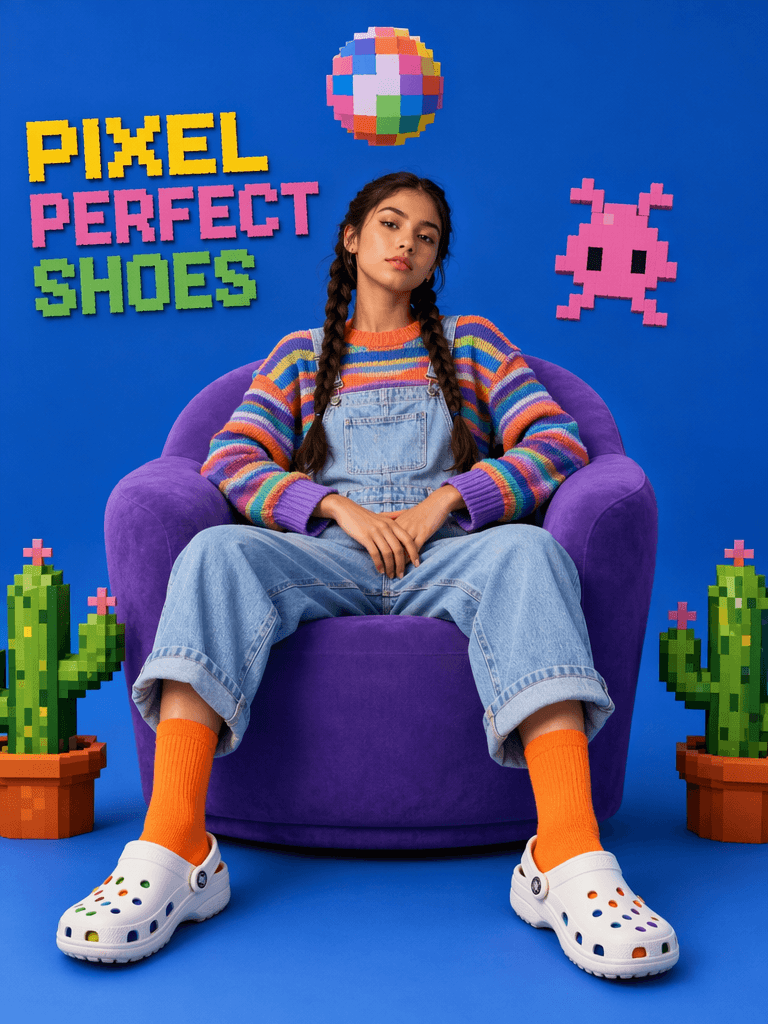
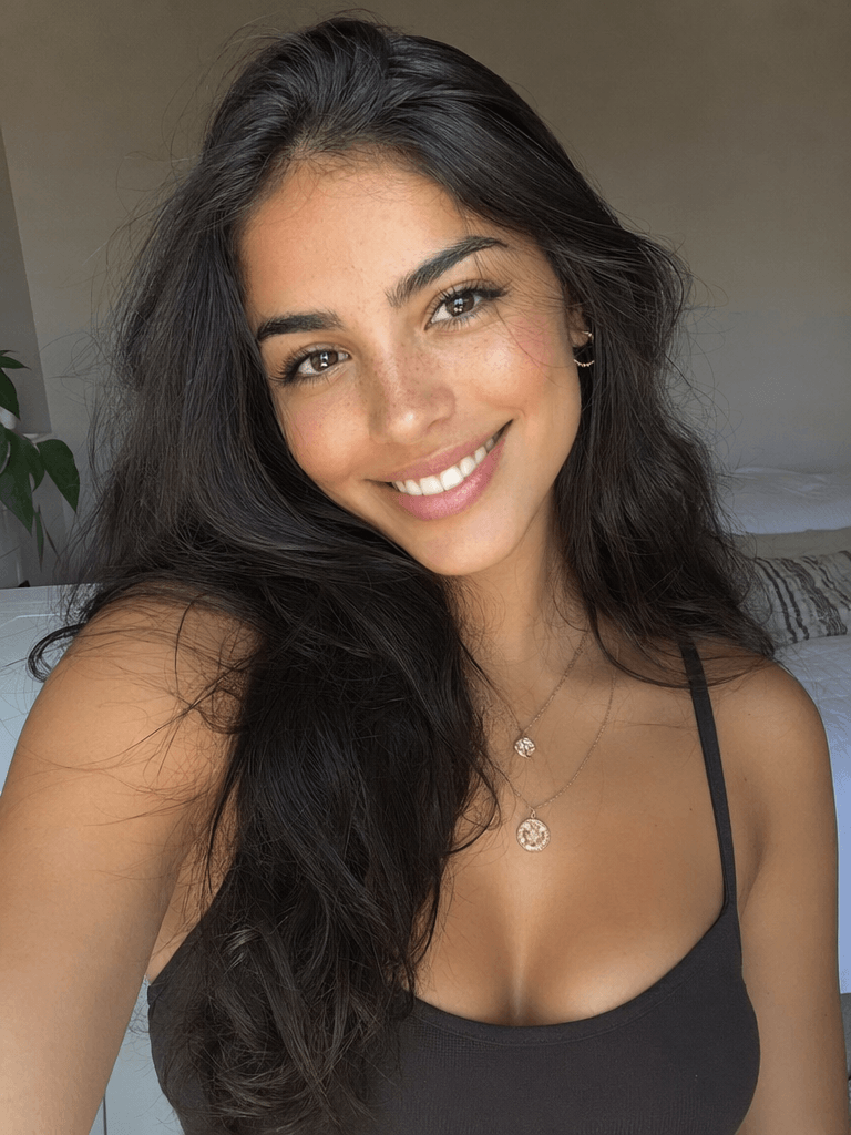
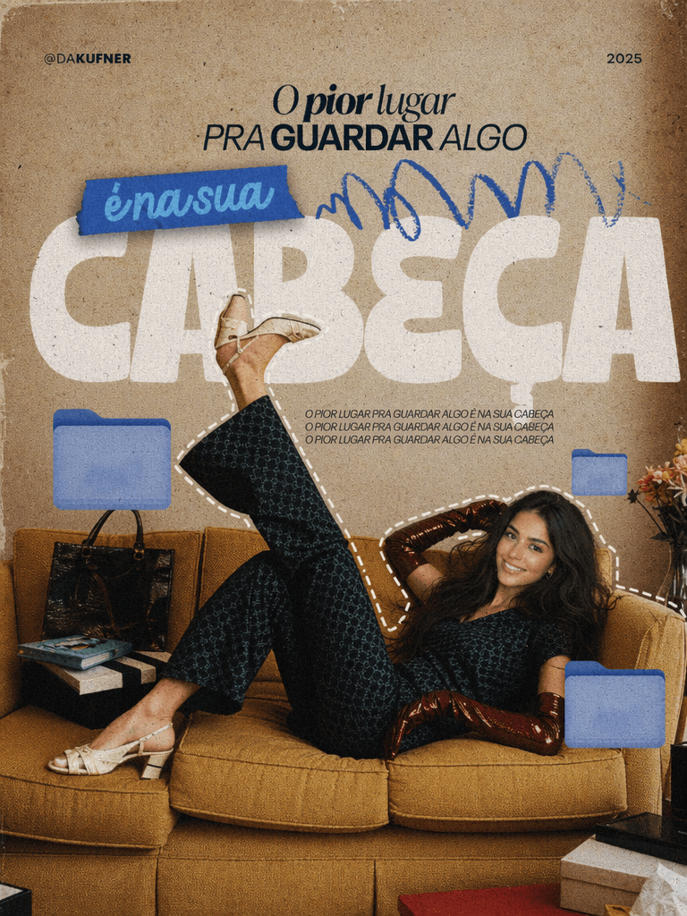
Without Model Showcase
Conclusion & CTA
Before discovering modern AI tools, I used to think that creating a beautiful AI cover design meant spending hours mastering complex software like Photoshop. But after designing my first viral thumbnail with WeShop, I realized the truth—great design isn’t about how complicated your tools are; it’s about having a clear framework and an intuitive workflow.
Now, it’s your turn to create something amazing:
- Launch WeShop AI: Head over to WeShop AI website(works perfectly on both web browsers and mobile apps).
- Pick your next video or article and extract the single most powerful keyword.
- Follow our 5-step framework to build a high-converting, premium cover.
- A/B test it against your old designs and see your click-through rate soar!
Got questions about prompts or styling? Drop a comment below, and let’s master the art of AI cover creation together!
Go to WeShop AI For Exploration: