Aesthetic Facebook Cover Photo: Expand Any Image with AI
An aesthetic Facebook cover photo needs more than a pretty filter. It must fit a wide space without cutting off the subject. It must also leave room for a brand message, logo, or clear visual pause. Yet many source photos are vertical or square. A hard crop may remove the best details, while stretching can damage the image.
AI outpainting offers a better option. Instead of forcing the source into a banner, it adds new image area around it. WeShop AI Image Expander is built to extend image borders for new crops, social formats, ads, and banners. Therefore, one strong portrait, product photo, or lifestyle image can become a wider cover without changing its core subject.
Why an Aesthetic Facebook Cover Photo Needs Space
An aesthetic Facebook cover photo is not a standard photo post. It sits behind page controls and appears differently across screens. As a result, the design needs three clear layers:
- Anchor: the person, product, or scene that carries the message;
- Breathing room: quiet space that keeps the cover easy to scan;
- Brand cue: color, type, logo, or campaign detail that gives the image a purpose.
First, decide which layer matters most. A fashion seller may use the model as the anchor and reserve one side for a campaign line. A creator may keep the portrait simple and let color set the mood. Meanwhile, a product brand may need clean space around the item so page controls do not compete with it.
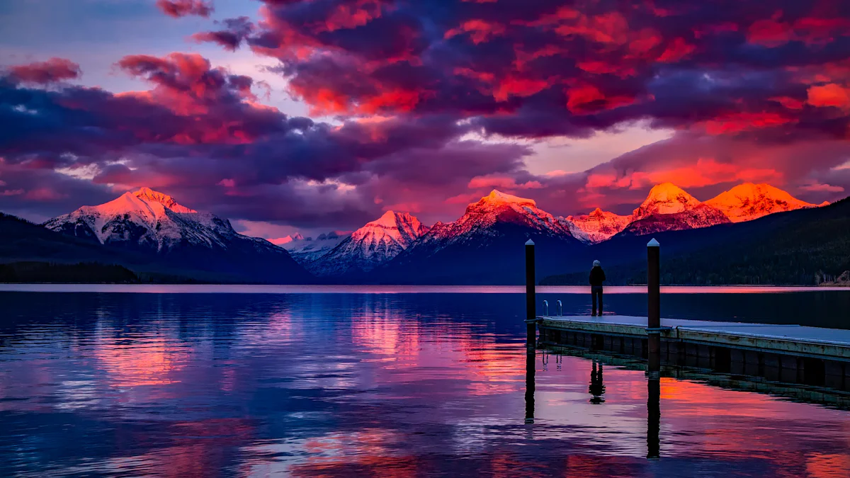
A balanced layout does not have to be symmetrical. In fact, an off-center subject often works better for a wide banner. It creates space for text and gives the eye a clear path through the frame. However, the empty area should still match the source light, texture, and color.
Build the Banner Before You Expand the Image
Do not begin by choosing a random filter. Instead, write a short cover brief. It should state what stays, what expands, and where the new space will appear.

Aesthetic Facebook Cover Photo Brief: Five Decisions
Use these five decisions before you open the tool:
| Decision | What to define | Practical example |
|---|---|---|
| Subject | What cannot be changed or covered? | Keep the person, product, face, or logo clear. |
| Direction | Where should the canvas grow? | Extend more space to the left for a headline. |
| Background | What should fill the new area? | Continue the wall, studio sweep, sky, or soft texture. |
| Continuity | What must match the source? | Keep the same light, shadow, grain, and color mood. |
| Exclusions | What should not appear? | Do not add text, logos, people, products, or extra props. |
This brief prevents the expanded area from becoming random decoration. It also gives every new element a role in the final cover.
When the current workspace provides a prompt field, use clear physical direction. For example:
Expand this image into a wide Facebook cover. Keep the main subject unchanged and place it away from the outer edge. Extend the existing background into the new space. Match the original light, shadows, texture, and muted color palette. Leave one side clean for optional text. Do not add words, logos, people, products, or new objects.
If the first result adds too much detail, simplify the brief. For instance, ask for a plain background extension before adding any campaign style. A clean base is easier to edit than a busy banner.
Design for Facebook’s Responsive Crop
For an aesthetic Facebook cover photo, a practical starting canvas is 851 × 315 pixels. However, Facebook can crop the image differently across desktop and mobile screens. For that reason, do not place a face, product, logo, or important text against an outer edge.
Keep the Aesthetic Facebook Cover Photo Inside the Safe Zone
Think of the center as the protected area. Keep key details there, while allowing the outer background to act as flexible space. Also, preview the result on both a computer and a phone before publishing. A cover that looks balanced on a large screen may feel tight on mobile.
Use this quick placement rule:
Check the crop again after Facebook processes the upload.
Keep faces and products away from the extreme left and right edges.
Use large, simple text if the cover needs a message.
Avoid placing key details near page controls or profile-image overlap areas.
Let color and background texture extend beyond the safe area.
From One Source Photo to Two Cover Directions
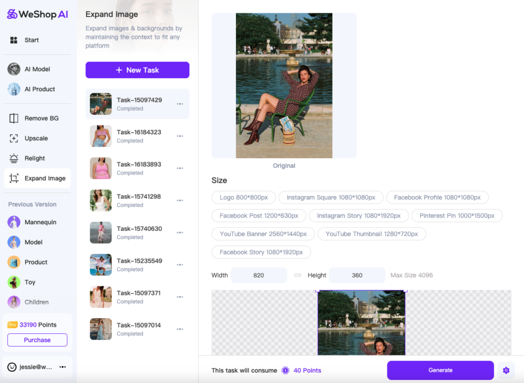
Now apply the brief to the portrait source used in this article. The input is vertical, while the final use is a wide page banner. Cropping alone would remove much of the scene. Therefore, the better task is to preserve the subject and build new space around it.
Open WeShop AI Image Expander and upload the source image. Then extend the canvas into a wide banner shape. Keep the main subject stable. Next, guide the new background so it follows the source color and light. If a result changes the face, clothing, product, or major object, do not treat it as finished.
The two generated covers should be viewed as different layout directions, not as proof of business performance. One may provide better negative space. The other may create a more even visual rhythm. Therefore, choose the result based on the page goal.



Compare Results Without Chasing Novelty
The newest-looking result is not always the strongest aesthetic Facebook cover photo. Instead, review each version with three checks.
Composition: Is the subject easy to find? Is there useful space for a message? Does the frame feel balanced after the expansion?
Continuity: Do the background, light, texture, and perspective connect with the source? Look for repeated patterns, broken lines, strange shadows, or objects that appear twice.
Brand fit: Does the color mood support the page? Can the result sit beside current campaign images without looking unrelated? If text will be added later, is the quiet area clean enough?
In addition, compare the source and result at full size. Check the face, garment edges, product shape, small logos, and any text already inside the original photo. AI outpainting should add space. It should not quietly rewrite the details that matter.
If the expansion is good but one small artifact remains, fix only that area. However, generate a new version when the whole background direction feels wrong. A narrow repair cannot rescue a weak composition.
Keep the Cover Style Consistent
An aesthetic does not come from using the same heavy filter on every image. Instead, it comes from a small set of repeated choices. Keep two or three core colors. Use one clear type system. Maintain a similar level of contrast. Also, decide whether your page should feel polished, playful, calm, bold, or editorial.
Seasonal updates can still fit the system. For example, a summer cover may use brighter light, while a winter cover may feel cooler. Yet the logo placement, type, and framing rules can stay stable. This balance keeps the page fresh without losing its identity.
For ecommerce brands, the product should remain the visual priority. A background can support the campaign, but it should not compete with the item. Therefore, review product color, shape, texture, and logo before using the cover on a live page.
Final Checks for an Aesthetic Facebook Cover Photo
Before publishing, review the cover in this order:
- Confirm that the subject and brand details match the source.
- Preview the desktop and mobile crops.
- Check that important text and logos stay in the safe area.
- Look for repeated textures, broken edges, or added objects.
- Test whether the cover still works at a smaller screen size.
- Remove any editor notes before the final upload.
Finally, judge the cover by its job. A strong aesthetic Facebook cover photo should make the page clear, recognizable, and visually complete. It should also protect the original subject while using the wider canvas with purpose.
WeShop AI Image Expander helps turn a strong source image into a banner-ready layout. Start with a simple brief, extend only the space you need, and compare each result with the original. As a result, your cover can feel designed for the format rather than forced into it.
Go to WeShop AI For Exploration: