A growing product line needs variety. It also needs a clear family look. Yet each new flavor, scent, size, or limited edition can weaken the system. AI Packaging Design Generator helps brands test those changes before they choose a final direction.
The goal is not to make every package identical. Each product still needs its own role. However, shoppers should see one brand first and separate products second. That balance matters on a shelf, in a product grid, and on a phone screen.
This article uses one simple test. When several packages sit together, do they still look like one brand?
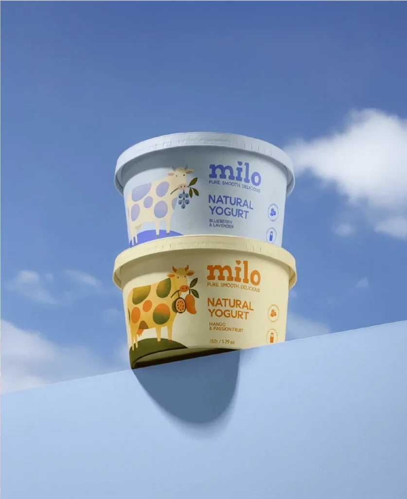
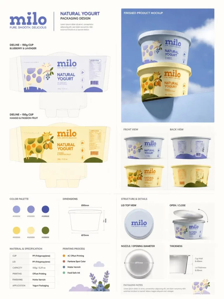
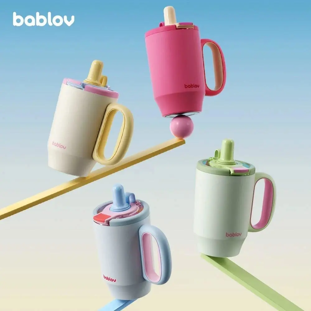
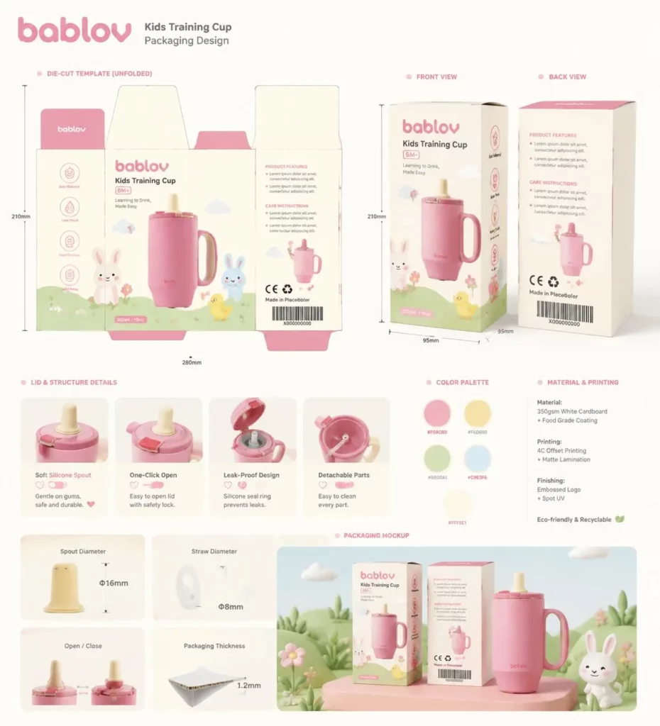
Why Packaging Families Fall Apart
One package can look polished by itself. Still, it may fail when placed beside the rest of the line.
Imagine a granola brand with one strong pouch design. Then the berry flavor gets a new font and a large fruit image. The maple flavor gets a new label shape. Next, the honey flavor moves the logo and changes the material.
Each choice may look fine on its own. Together, though, the products no longer share a clear visual parent.
The opposite problem is common too. Some brands copy one layout across every SKU. They only change a small flavor name. As a result, shoppers must read each package closely. They may even pick the wrong item.
A strong product family needs two systems. One builds brand recognition. The other helps shoppers tell products apart.
Build the Brand Skeleton Before the Variations
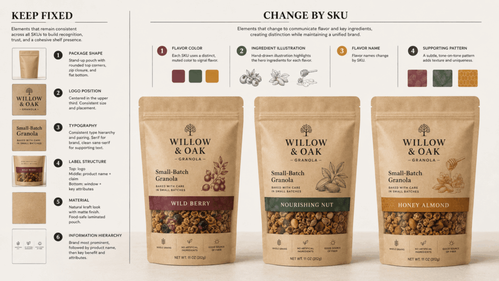
First, decide which elements should stay fixed.
The brand skeleton often includes the logo position, package shape, main font, product-name order, and key information areas. It can also include the overall tone and material style. These parts help shoppers recognize the brand fast.
Other elements can change from one SKU to another. These may include the main color, ingredient image, flavor name, pattern, or number.
For example, three yogurt flavors can use the same cup shape and logo size. They can also share one label layout and one illustration style. Then each flavor can use a different color pair and fruit image.
The rule is simple. Keep the recognition system stable. Change only what shoppers need for product choice.
Four Signs the Brand Has Disappeared
Packaging drift often appears through a few clear mistakes.
The logo keeps moving. One SKU places it at the top. Another centers it. A third makes it too small to notice.
The reading order changes. One package leads with the brand name. Another makes the flavor or product benefit more important.
The visual style resets. One SKU uses a photo. Another uses a flat drawing. A third uses only type. There is no clear link between them.
The mockup style also changes. Different camera angles, lighting, backgrounds, and package sizes can hide a weak system. They make the products look more varied than they really are.
One rule can change without breaking the family. Still, several changes at once can erase the connection. When shoppers must read the brand name to see the link, the packaging is no longer doing enough work.
Test the System With AI Packaging Design Generator
AI Packaging Design Generator works best when the brand system is already clear.
Start with the product type, package format, target buyer, material, brand mood, colors, and font direction. Add a logo, product image, sketch, or reference image when possible.
Treat the first result as a master concept. Do not treat it as the final answer. Review the structure and decide which parts must stay the same. Then create related versions for other flavors, scents, sizes, or editions.
The tool can create packaging ideas and 3D mockup views. This makes comparison easier. Teams can review front views, angled views, and product scenes before choosing a direction.
What AI Packaging Design Generator Should Preserve
Ask the tool to keep the parts that define the family.
These may include the package shape, camera angle, logo position, label size, font family, background, lighting, and material finish. Clear instructions can reduce unwanted changes.
A skincare line may use both bottles and jars. Even so, the same frosted finish, gold details, black type, and clean spacing can connect the full range.
A stable camera view also helps. A dramatic angle can make one idea look stronger than it is. Consistent views make the review fair.
What Each SKU Can Change
Next, give each product one or two clear signals.
A flavor line may change its main color and ingredient image. A skincare range may change the cap color and product name. A candle line may keep the jar fixed and change the label color and scent icon.
Do not change everything at once. If the color, font, logo size, layout, image style, and package shape all change, it becomes hard to find the real problem.
Instead, create controlled versions. Compare them side by side. Then keep the option that gives the clearest difference with the fewest changes.
Run the Three-Second Shelf Test
A product family should work before a shopper reads the small text.
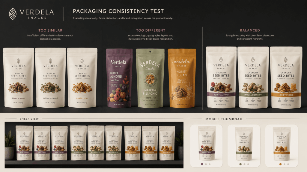
Place every version in one row or in a simple shelf scene. Look away. Then look back for three seconds.
First, ask whether the products clearly belong together. Next, check whether each SKU is easy to tell apart. Finally, see whether one design pulls too much attention from the rest.
Repeat the test at thumbnail size. Product images often appear small in search pages, mobile feeds, and online stores. A difference that looks clear in a large image may vanish on a phone.
Most results fall into three groups.
Too similar means the brand is clear, but product choice is hard.
Too different means every SKU has character, but the brand link is weak.
Balanced means shoppers can see the family and find the right product without close reading.
Use AI Packaging Design Generator as a Review Tool
AI Packaging Design Generator can shorten the gap between an idea and a useful visual test. Its best role, however, is concept review.
A team can check whether a new flavor still belongs to the line. It can compare a bold option with a simple one. It can also test whether a better material, cleaner label, or stronger color system improves the family.
Still, a generated mockup is not a print-ready file. Exact logos, legal copy, ingredient lists, sizes, dielines, bleed, color profiles, and barcodes still need review. A packaging designer should prepare and check the final production files.
This split makes the process stronger. The tool helps the team decide what the packaging should become. Then a specialist makes sure it can be printed and produced well.
Keep the Family Resemblance
Strong packaging variations should extend the brand, not compete with it.
Start with a stable brand skeleton. Give each SKU one clear signal. Review the full family together. Then test it on a shelf and at thumbnail size.
AI Packaging Design Generator makes this process faster and easier to see. It helps founders, marketers, and design teams explore packaging ideas. It also helps them compare related versions and catch visual drift early.
The final test is simple. Each package should have its own purpose. Yet none of them should look adopted.
Go to WeShop AI For Exploration: